Angular Material Progress Bar
The <mat-progress-bar> is a horizontal progress-bar used for indicating the progress and activity.
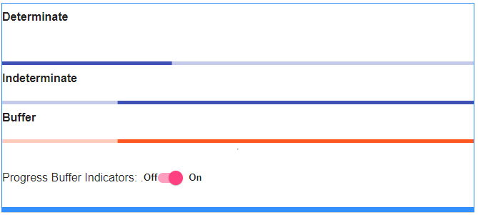
Progress Bar Modes
It supports four modes: determinate, indeterminate, buffer, and query.
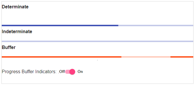
Determinate
Determinate operations are those where the percentage of the operation is complete.
app.component.html
app.component.ts
Output:
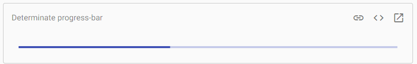
It is the default mode, and the value property represents the progress.
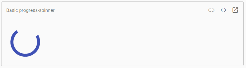
Indeterminate
In an Indeterminate operation, the user is asked to wait until the previous one finishes, and it is not necessary to indicate how much time it will use the indefinite pointer.
app.component.html
app.component.ts
Output:
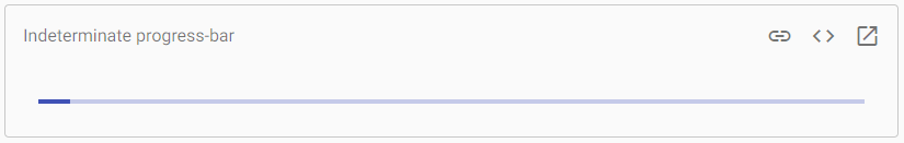
In this mode, the value property is ignored.
Buffer
Use the buffer mode of the progress-bar to indicate the activity or loading of the server.
app.component.html
app.component.ts
Output:
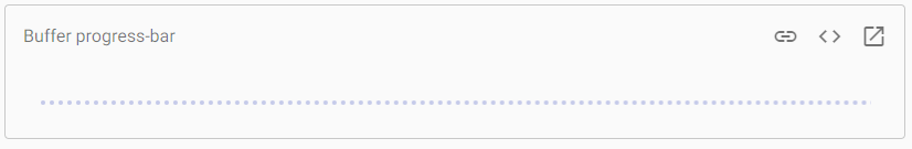
In the “buffer” mode, the value determines the primary bar’s progress, while the buffer is used to show the buffering progress.
Query
Use the query-mode of the progress-bar to indicate pre-loading before the actual loading begins.
app.component.html
app.component.ts
Output:
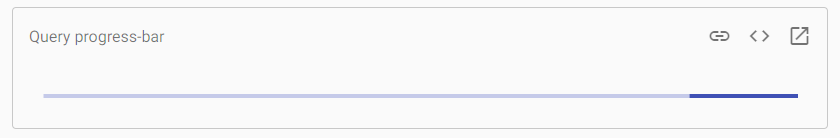
In “Query” mode, the progress-bar inversion presents as an indefinite bar. After the response progress is available, the mode must be determined to express the progress. In this mode, the value property is ignored.
Theming
Using the color property, the color of the progress bar will change. By default, progress-bars use the theme’s primary color. It can be changed to accent or warn.
Accessibility
Each progress bar should be given a meaningful label by area-label or area-labeledby.
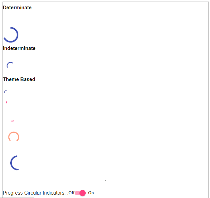
<Mat-progress-spinner> and <mat-spinner> are a circular indicator of activity or progress. The md-progress-circular and md-progress-linear are the progress directives, and they show loading content messages in the application.
The following table shows the parameters and description of many attributes of md-progress-circular.
| Sr.No | Parameter | Description |
|---|---|---|
| 1 | *md-mode | Select one of two modes: ‘determinate’ and ‘ Indeterminate. ‘ If the md-mode value is specified as undefined or 1 of two valid modes, .ng-hide will auto-apply as a style to the component; md-mode = “indeterminate” will be injected automatically as an attribute. If value = “is also specified, then md-mode =” determined “will be auto-injected. |
| 2 | value | Indeterminate mode represents the percentage of circular progress. By default, it is 0. |
| 3 | md-diameter | It specifies the diameter of the circular progress. The value may be a percentage (eg ‘25%’) or a pixel-size value (eg ’48’). If the attribute is not present, then a default value of ’48px’ is assumed. |
| 4 | md-buffer-value | Indeterminate mode, The number represents the percentage of the primary progress bar. By default, It is also 0. |
Example 1:
The example shows the use of the md-progress-circular directive and the uses of circular progress bars.
am_circularprogressbars.htm
Output:
Example: 2
The following example shows the use of linear progress bars.
am_linearprogressbars.htm
Output: