Angular Material typography
What is typography?
Typography is a way of arranging the text legible, readable, and attractive when displayed. The typology of the angular material is based on the guidelines derived from the material design imagery and organized within the typography level. Each level has a size, line height, and font-weight.
CSS classes are provided for typography. You can use them to create visual consistency across your application.
The levels are given below:
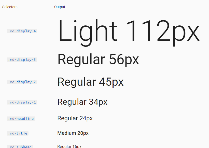
| Name | CSS classes | Description |
|---|---|---|
| display-4 | .mat-display-4 | It is a big, one-off header at the top of the page. |
| display-3 | .mat-display-3 | It is the large, one-off header (e.g, a hero header) at the top of the page. |
| display-2 | .mat-display-2 | It is also a big, closed header at the top of the page (Like: a hero header). |
| display-1 | .mat-display-1 | This is a larger header at the top of the page. |
| headline | .mat-h1, .mat-headline | It is the section corresponding to the <h1> tag. |
| title | .mat-h2, .mat-title | It is corresponding to the <h2> tag. |
| subheading-2 | .mat-h3, .mat-subheading-2 | It is corresponding to the <h3> tag. |
| subheading-1 | .mat-h4, .mat-subheading-1 | It is a section corresponding to the <h4> tag. |
| body-1 | .mat-body, .mat-body-1 | It is base body text. |
| body-2 | .mat-body-strong, .mat-body-2 | It has Bolder body text. |
| caption | .mat-small, .mat-caption | It is smaller body and hint text. |
| button | It is used in components. | Buttons and anchors. |
| input | It is used in components. | Form input fields. |
The typography is collected into a typography configuration which is used to generate the CSS.
First include the Roboto font with the 300, 400 and 500 weights to get started. You can include it from the Google Fonts:
You can add the appropriate CSS classes to the elements that you want to style:
Angular content have not implement any global CSS. To apply the typographic styles of the library more broadly, you can take advantage of the mat-typography CSS class. This class will style the descendant root elements.
Customization
Typography customization is an extension of the sass-based theme of angular content.
According to the examples, the typology configuration is created using the mat-typography-configuration function, the font family and the typographic levels described. Typographic level is defined by a matte-typography-level function, requiring line height, and font-weight. The font-family is in quotes.
When the definition of custom typography is created, it is consumed to generate styles by different sass blends.
You can pass the typography configuration to a matte-core if you are using content theming:
Content typography in your custom CSS
Angular Content includes typography utility and functions that you can use to customize the components:-
- mat-font-size ($ config, $ level) – It gets font-size based on the configuration and level provided.
- mat-font-family ($ config) – It gets the font-family based on the configuration provided.
- mat-line-height ($ config, $ level) – It gets line-height based on the configuration and level provided.
- mat-font-weight ($ config, $ level) – It gets font-weight based on the given config and level.
- mat-typography-level-to-styles ($ config, $ level) – It configured the object and a typography level, and outputs a short-handed CSS font declaration.
General Typography
AngularJS Material uses Roboto font for the components.
Roboto font will not be loaded by AngularJS content. The developer is responsible for loading all the fonts used in the application.
Heading Styles
You should style the <h1> <h6> heading tags with the styling class:
Output: