Area Chart in Excel
MS Excel is one of the most popular and powerful spreadsheet programs with distinct features and functions. Using charts to represent the data graphically is one of such great features in MS Excel. There are different types of charts in Excel, and choosing the right one is sometimes difficult unless we know all the Excel charts.

Area Chart in Excel is one of the few charts that help display the graphical representation of data in Excel. It is typically plotted to showcase the data, which depicts the Time-series relationship. This article discusses the brief introduction of the Area Chart, including its types, examples, and the step-by-step tutorial of creating it in an Excel sheet.
What is an Area Chart in Excel?
An area chart is usually defined as a data visualization feature of MS Excel that collectively showcases the rate of change of one or more variables over a defined period. It typically helps measure the trends of different data sets over time by filling up the area between the x-axis and the line segments using colours. In short, an area chart is a specific line chart with the areas below the lines filled with colours.
When working with multiple line segments, the chart may display a different colour in the area between two consecutive line segments. Being a specific variation of the line chart, the area chart emphasizes the “gaps” between the data and the axis and is mostly used to compare data groups.
The area chart can be displayed in the following two ways:
- Data Plots overlapping on each other
- Data Plots stacked on top of each other
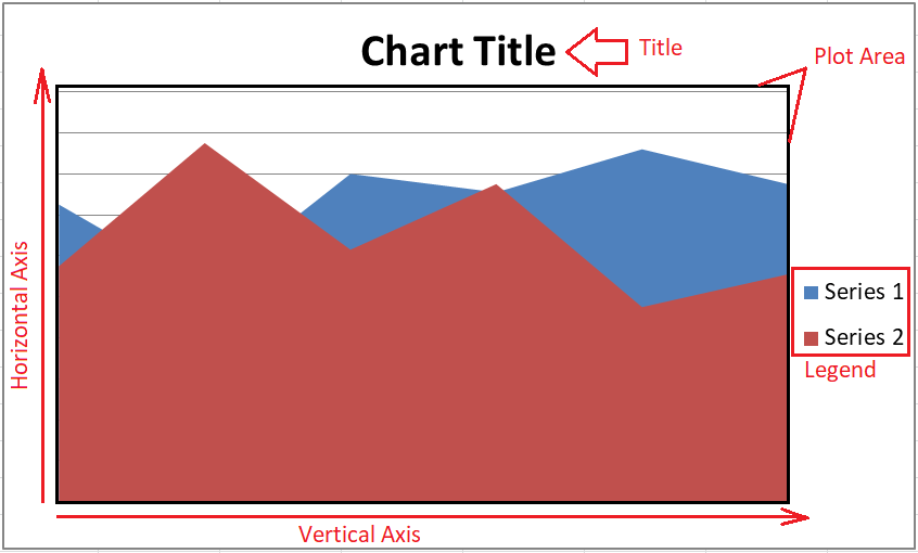
Components of Area Chart
There are five major components of the Area Chart in Excel, as listed below:
- Plot Area: The area in which the data is represented graphically is called the plot area.
- Chart Title: It is the main title of the plotted chart and can be edited as desired.
- Vertical Axis: Vertical Axis represents measurement values in the X-axis. It is also called the X-axis.
- Horizontal Axis: Horizontal Axis represents categories of data in the Y-axis. It is also called the Y-axis, and the series data can be grouped on this axis accordingly.
- Legend: The legend is an informative element that helps list various data groups and differentiate them from one another. It can be placed on any side of the Chart or Plot Area.
Uses of Area Chart
Though there are many scenarios when we can use Area Chart in Excel; however, the following are some of the most common uses of area charts:
- Trend Analysis: Since the area chart is typically plotted in two axes, X and Y, it is mostly used to display a trend with magnitude rather than individual data values. The area chart helps in analyzing the performance of each group that is trending collectively and individually.
- Comparing the data to summarize quick results: Area charts are helpful when we have discrete time-series data. We need to display or aggregate the relationship of each set of data to the whole of the data. For example, suppose we have data for some students and their marks in different subjects during the year. We want to evaluate the data and summarize the results to determine the strength of each student on a specific subject. We can determine each student’s strengths with an area chart by looking at the subject’s highest volume section on the plotted chart.
- Collective Data Analysis: Area charts are also used during collective data analysis. Charts help incorporate a sense of volume into our data by grouping the effective data points. It further helps to view the data points as the area of a specific line segment rather than as line segments of individual data points.
Area Chart Types
There are three main types of Area charts in MS Excel: Simple Area Chart, Stacked Area Chart, and 100% Stacked Area Chart.
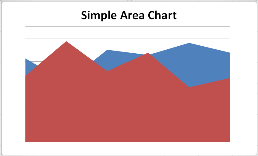
Simple Area Chart
Simple Area Chart is plotted so that the coloured segments of effective chart areas overlap with one another. The data in a simple area chart are drawn on top of one another, making the graph’s coloured areas intersect.
It is good to plot a simple area chart with the smallest values at last place, making it visible on the top of other plotted data. Besides, if we plot the smallest data areas first, the larger data areas will overlap the smallest areas and make them completely invisible. However, we can use the transparency feature to make all the charts partially visible. This way, none of the chart areas are hidden.
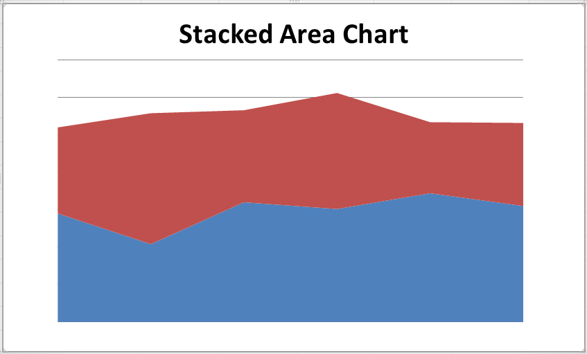
Stacked Area Chart
A stacked Area Chart is a typical area chart that displays the data plots by combining the data groups to become an extension of one another. In simple words, the coloured segments (data plots) are drawn on top of each other.
We must subtract the upper plotted data from the data of the previous segment while taking accurate data values on the Y-axis of the front (or last) segment in the Stacked Area Charts. This type of area chart is mostly used to highlight changes between categories. However, it is somewhat difficult to compare the relative placement of data points in a stacked area chart.
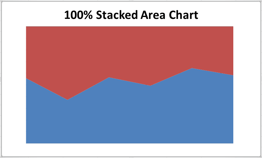
100% Stacked Area Chart
100% Stacked Area Chart is an extended version of the stacked area chart in Excel. It is almost similar to a stacked area chart with one major change: the vertical axis scale in the 100% stacked area chart is represented as a percentage of the whole data.
The area segment in the 100% stacked area charts typically consumes the whole of the chart area. This type of area chart is primarily used to calculate or determine the percentage estimate of data trends. However, while reading or analyzing trends on these charts, we need to further calculate before concluding.
All these charts are plotted in a 2-D format; however, we can select the 3-D version of any charts from the Chart section. Based on a 3-D format, the area charts are named 3-D Area Chart, Stacked 3-D Area Chart, and 100% Stacked 3-D Area Chart. The only difference is that the 3-D area chart contains three axes, such as X, Y and Z. Therefore, users/ readers can also see the top and side view of the Area Charts.
How to create an Area Chart in Excel?
Since there are three different types of area charts in Excel, we need to understand those using three different examples and their respective steps to insert them into Excel:
Example 1: Creating a Simple Area Chart
We need to perform the following steps to create a simple area chart in Excel:
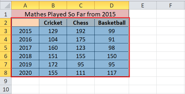
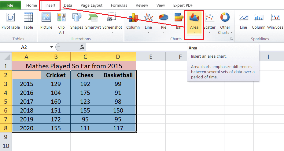
- First, we need to enter the data into an Excel sheet. We must select or highlight the whole data or an effective data range to create the chart.

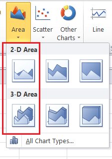
- Next, we need to navigate to the Insert tab and choose an option Area from the Charts section, as shown below:
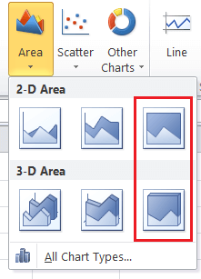
- After we click the Area option, we will see other chart options under the drop-down list. To create a simple area chart, we need to select the first tile under 2-D or 3-D Area accordingly.
In our case, we select the 2-D Simple Area Chart.
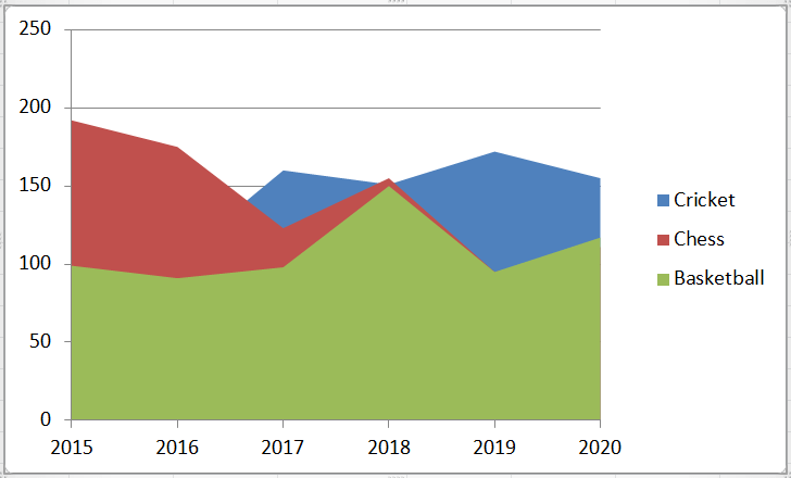
As soon as we click the desired chart type, the same will be inserted within the active sheet in no time. Our example area chart will get populated like the following image:

Example 2: Creating a Stacked Area Chart
We need to perform the following steps to create a stacked area chart in Excel:
- Creating a stacked area chart is almost similar to creating a simple area chart in Excel. First, we need to enter the data in the Excel sheet, select the data or a data range, navigate to the Insert tab and click the option Area under the Chart section.
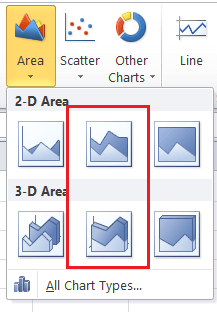
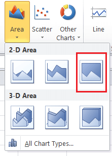
- However, when selecting the chart type from the Area drop-down list, we must choose the second tile under the 2-D or 3-D Area category, respectively.
- In our example, we select the 2-D Stacked Area Chart like below:
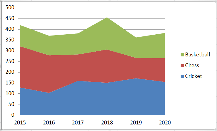
- After selecting the desired chart, our Stacked Area Chart is plotted within the sheet, as shown below:
In the above image, we can determine the relationship between the data and years over time. This typically showcases the trend of games with the corresponding years.
Example 3: Creating a 100% Stacked Area Chart
We need to perform the following steps to create a 100% stacked area chart in Excel:
- Like the above two examples, we need to enter the data in the Excel sheet, select the valid data, navigate to the Insert tab and click the option Area under the Chart section.
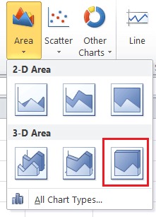
- Next, we must select the last tile from the Area drop-down list under the 2-D or 3-D Area category, as desired.
- In our example, we select the option 100% Stacked 2-D Area Chart.
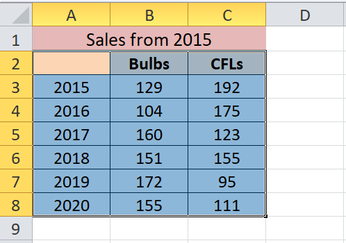
Our example data will look like this:
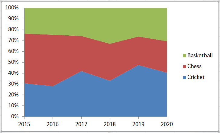
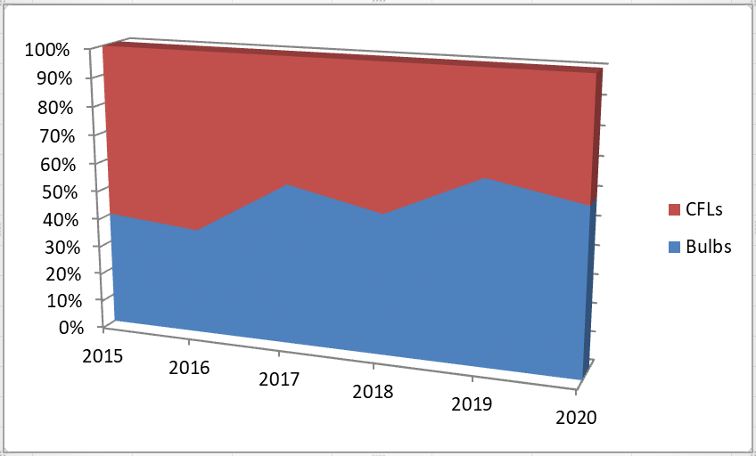
Now, consider the following data with the sales of two different products over time. We need to create a 100% Stacked 3-D Area Chart.
For this, we select the option 100% Stacked 3-D Area Chart.
This typically helps in displaying the trend of the percentage each product contribute concerning the years, as shown below:
This way, we can create three different types of area charts in Excel, which mainly help to show trends and not value-wise data representation.
Customizing an Area Chart in Excel
Customizing the Area Chart and its elements is similar to modifying other charts present in Excel. Additionally, Excel charts can be edited or customized through different means. The following are some essential methods to customize an Area Chart in Excel with ease:
Double-Clicking
It is the most basic feature of modifying or editing any element of charts in Excel. Whenever we double-click on any chart item, it displays a side panel with different editing options relevant to the selected element. Once the side panel is displayed, we can select or activate another element with just a click and get its respective editing options. We don’t need to double-click again and again.
The side panel consists of element-specific editing options and some typical formatting options like editing colours and effects. The side panel will usually pop up from the right side of the active Excel window, as shown in the image below:
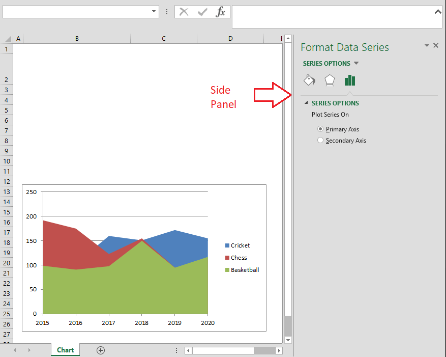
In Excel 2010 and earlier versions, we get a pop-up window instead of the side panel.
Right-Click (Context) Menu
Another typical method to access customizing options for a chart and its element is right-clicking using the mouse. When we right-click on any element or chart itself, we get the contextual menu. The contextual menu or the context menu displays some quick options to modify basic element stylings like colours and other formattings. Furthermore, we can activate the side panel for a detailed option view.
To access a side panel from the context menu, we need to select an option that starts with the text ‘Format’. For instance, the following image has the ‘Format Data Series’ option, starting with the text Format.
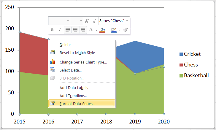
Similarly, we can get other menu options based on the selected element in an Area Chart.
Chart Shortcuts
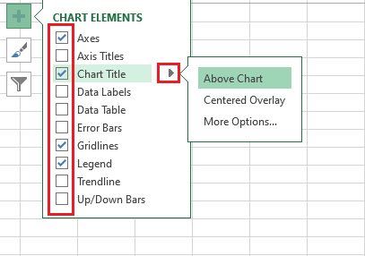
In Excel 2013 or later versions, we also get an option to use Chart Shortcuts. It is identified by the Plus (+) sign and is located on the right side of the plotted chart by default. It contains several chart elements with the checkboxes before their names. We can insert/ remove specific elements, apply built-in chart styles or colour sets, and filter values by marking or unmarking the respective checkboxes.
The best part of using the Chart Shortcuts is that we can see a preview or effect of options that we wish to apply as soon as we hover onto the checkboxes or the options. In the following image, we only move a cursor on the Data Labels option, and the labels preview is displayed on the chart even before applying them.
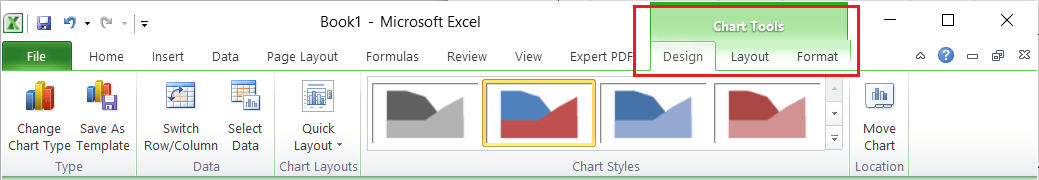
Ribbon
The Ribbon is the most basic area to access almost all the Excel options. After the chart has been inserted, Excel automatically inserts some new tab(s) on Ribbon. The inserted tabs only contain specific chart related options under the category CHART TOOLS. The category further consists of two tabs, namely the DESIGN tab and the FORMAT tab. However, in Excel 2010 and earlier, there are three tabs where the LAYOUT is an additional tab. The layout tab and its options are merged under the DESIGN tab in later Excel versions.
The DESIGN tab mainly includes adding chart elements, layouts, colours, styles, and other essential options to modify data or even the chart itself. On the other side, the FORMAT tab contains some generic options common with many other objects.
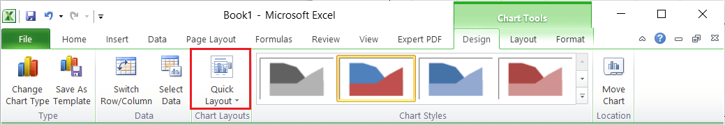
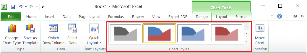
Changing Layouts and Styles of Area Chart at Once
Preset layouts and built-in styling options are always good options to change layouts and styling or the area chart quickly. We can select the desired styling or a specific layout from the DESIGN tab under the CHART TOOLS. Alternately, we can access the same by clicking the brush icon from the Chart shortcuts.
The quick layout option looks like this:
The styles can be selected directly from the section displayed below:
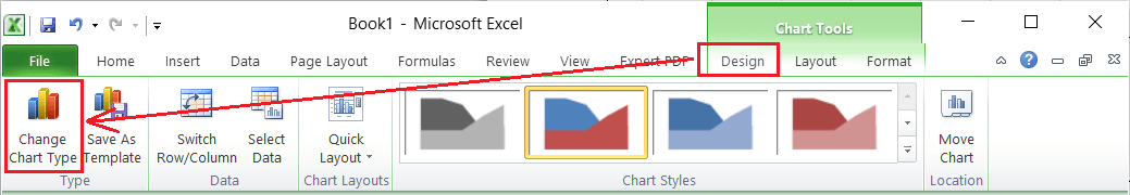
Changing Chart Type
Changing a chart is an easier process in MS Excel. Once we have inserted a chart, we need to select the chart and navigate the DESIGN tab. Here, we need to select the option ‘Change Chart Type’, as shown in the below image:
After selecting the specific option, we will see all the chart types. We can select any desired charts from the list, and the corresponding chart will be instantly inserted into a sheet. Also, when we move a cursor to any specific chart, we will see a respective preview even before clicking on it.
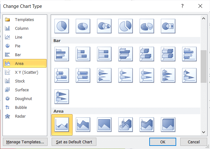
This way, we can change between different area charts or even with an entirely new chart type.
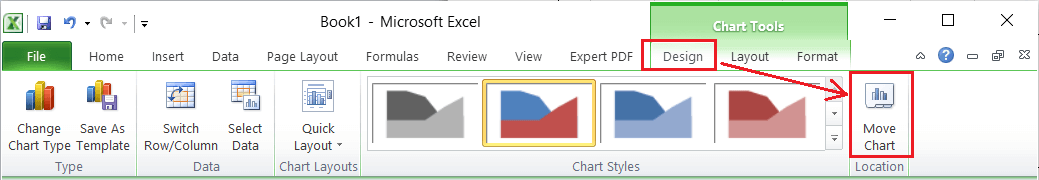
Moving an Area Chart to another Sheet
When we create a new chart in Excel, it is created in the same sheet as the selected data. However, Excel allows us to move a chart into another sheet within the same workbook. For this, we need to click the Move Chart option under the DESIGN tab on the Ribbon. Alternately, we can select the Move Chart option from the right-click menu of the selected chart. However, we must right-click on an empty area of the chart to access the appropriate chart options.
After clicking the Move Chart option, we get the Move Chart dialogue box with the following two options:
- New Sheet: Selecting this option will create a new sheet with a specified name and move the selected chart into it.
- Object in: Selecting this option allows us to choose the name of an existing sheet from the drop-down list to move the chart there.
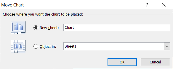
We can choose any of the desired options and click the OK button. The selected chart will be moved to a corresponding sheet instantly.
Advantages of using the Area Chart in Excel
The following are the advantages of using the Area Chart in Excel:
- With the Area Chart in Excel, we can easily showcase the trend followed by each specific product in different categories.
- The overlapped data in the Area Chart can also be read, which further helps to understand the analysis. This becomes possible because of different colours and the appropriately supplied values.
- The Stacked Area in the Area Chart is easy to read or understand compared to the overlapped data. However, reading it requires more effort than it is taken for a two-category chart.
Disadvantages of using the Area Chart in Excel
The following are the advantages of using the Area Chart in Excel:
- It can sometimes be challenging to understand the chart and read its data appropriately to get proper overcome, depending on the complexity of the supplied data.
- To extract the value or data of a plotted area chart, we must read the respective plots to compare. Not everyone is used to comparing the multiple plots within the same chart.
Important Things to Remember when using the Area Chart
- The user/ reader must have a basic understanding of charts to understand the plotted area chart.
- The data in the area chart should be compared with each other concerning time.