Bootstrap 4 – Buttons
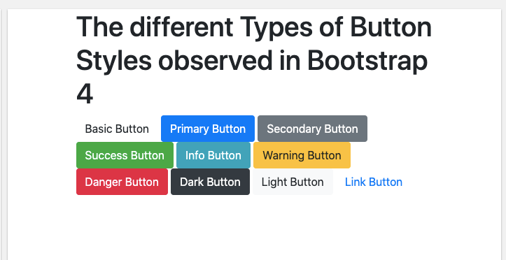
In Bootstrap 4, users can also add buttons to their web pages. There are various different types of buttons that can be applied to the web pages. Those buttons are listed below:
- Basic Button
- Primary Button
- Secondary Button
- Success Button
- Information Button
- Warning Button
- Danger Button
- Dark Button
- Light Button
- Link Button
The Sample Code to display all these button styles is given below:
The Output of the above given sample code will be:
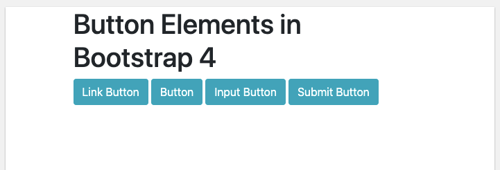
Buttons with Elements:
In addition to that, these buttons can sometimes be used with the elements such as <a> for links, <input> for input buttons, and so on.
For example:
The Output for this example will be:
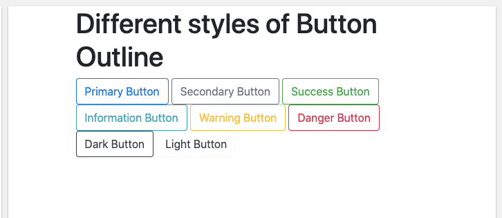
Buttons with Outlines:
In Bootstrap 4, a user can also add only the outlines to the buttons. There is total 8 types of buttons with outline currently available with Bootstrap 4. Upon hovering on these buttons, the user will see the color of the outline inside the button.
The different types of outline buttons are given below:
- Primary Outline Button
- Secondary Outline Button
- Success Outline Button
- Information Outline Button
- Warning Outline Button
- Danger Outline Button
- Dark Outline Button
- Light Outline Button
The Sample Code to display these outline buttons is given below:
The Output of this sample code will be:
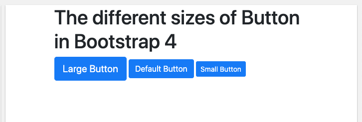
Different Sizes of Buttons:
A user can also resize the size of buttons with the help of using class .btn-large for enlarging the size of the button and class .btn-sm for reducing the size of the button.
For Example:
The Output of the above given code will be:
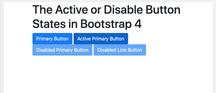
Active Buttons or Disabled Buttons:
In Bootstrap 4, a button can be displayed as active (that appears to be pressed) or disabled (that appears to be unclickable) state.
For active button, the class .active is used to make a button appear pressed, and the disabled attribute makes a button unclickable.
However, the <a> elements do not support the disabled attribute and must therefore use the .disabled class to make it visually appear disabled.
The Sample Class for Active Buttons or Disabled Buttons will be:
The Output of the above given code will be:
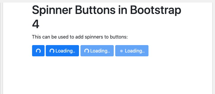
Spinner Buttons:
A user can add spinners in buttons as well in Bootstrap 4.
The Sample Code for Spinner Buttons is given below:
The Output of the above given code will be: