Bootstrap 4 – Dropdowns
A drop-down list or drop-down menu can be defined as a graphical control element, which is somewhat similar to a list box, that gives access to a user to choose one value from a list or a menu.
In Bootstrap 4, there are different types of dropdowns that can be used, the list of those is given below:
- Basic Dropdown
- Dropdown with a divider
- Dropdown with a header
- Dropdown with disabled and active elements
- Dropdown in any position i.e., right, left, and up
- Group Buttons with Dropdown
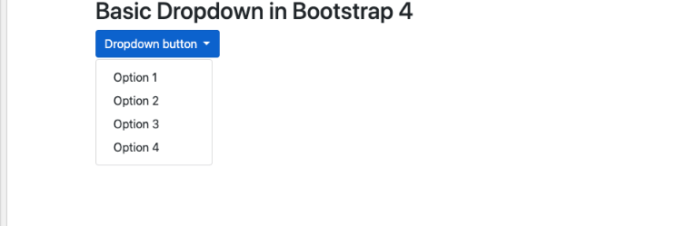
Basic Dropdown:
A Basic Dropdown is a dropdown menu that is toggleable and gives user the access to choose an option from a predefined list of options. In the basic dropdown menu, .dropdown class is used which indicates a dropdown menu.
A user can also open the dropdown menu by using a button or a link with a class .dropdown-toggle and the data-toggle=”dropdown” attribute.
A user has to add the .dropdown-menu class to a <div> element to actually build the dropdown menu. Then add the .dropdown-item class to each element such as links or buttons inside the dropdown menu.
The Sample code for Basic Dropdown Menu is given below:
The Output of this will be:
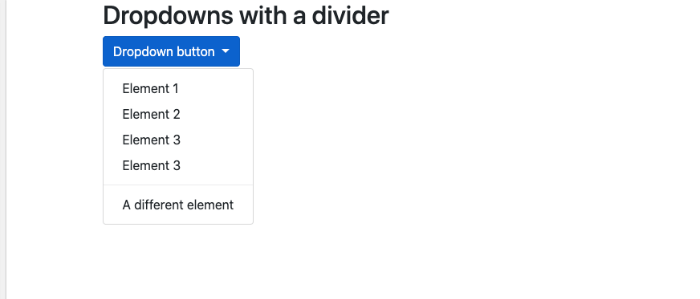
Dropdown with a divider:
By using dropdown with a divider, a user can create separate groups of related menu items with a divider. The separation is shown with the help of a thin horizontal line.
The Sample Code for Dropdown with a divider is given below:
The Output of the sample code will be:
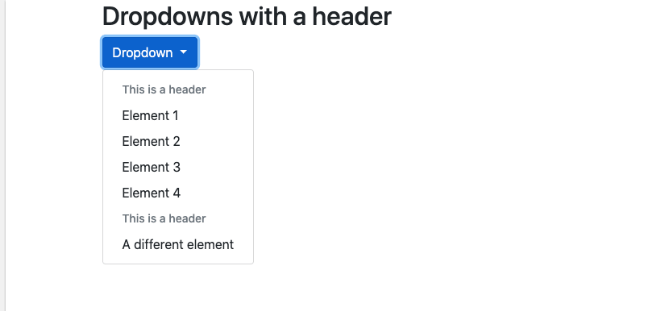
Dropdown with a header:
A user can add headers inside the dropdown menu by using the .dropdown-header class.
The Sample Code for Dropdown with a header is given below:
The Output of the Sample Code will be:
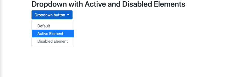
Dropdown with disabled and active elements:
In Dropdown with disabled and active elements, the elements highlight a specific dropdown item with the .active class by adding a blue background color.
And similarly, in order to disable an item in the dropdown menu, a user has to use the .disabled class that gets a light-grey text color and a “no-parking-sign” icon on hovering.
The Sample Code for Dropdown with disabled and active elements is given below:
The Output of the Sample Code will be:
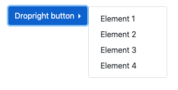
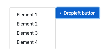
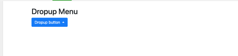
Dropdown in any position i.e., right, left, and up:
A user can also create a “drop right” or “drop left” menu, by adding .dropright or .dropleft class to the dropdown element.
In addition to that, if a user wants the dropdown menu to expand upwards instead of downwards, change the <div> element with class=”dropdown” to “dropup”
The caret/arrow is added automatically in this dropdown.
The Sample Code for Dropdown in any position i.e., right or left:
Output:
Output:
The Sample Code for Dropup Menu is given below:
The Output of the Sample Code will be:
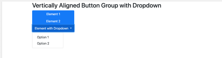
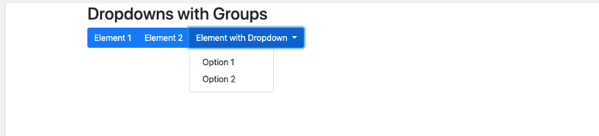
Group Buttons with Dropdown:
For Grouping buttons with dropdowns, a user has to add several buttons and add dropdown feature to one of these buttons.
The Sample Code for Group Buttons with Dropdown is given below:
The Output of the Sample Code will be:
A user can also create vertically aligned button dropdowns. An example of that is given below:
The Output of this code will be: