Bootstrap 4 Flexbox
In this article, we will understand the working of bootstrap 4 flexbox in detail.
What do you mean by Bootstrap 4 Flexbox?
In Bootstrap 4, flex box is used to control the layout and alignment specification of Bootstrap 4 components. This box makes it easier to design flexible responsive layout structures without using float or positioning attributes.
Let’s take the following examples of Bootstrap 4 FlexBox.
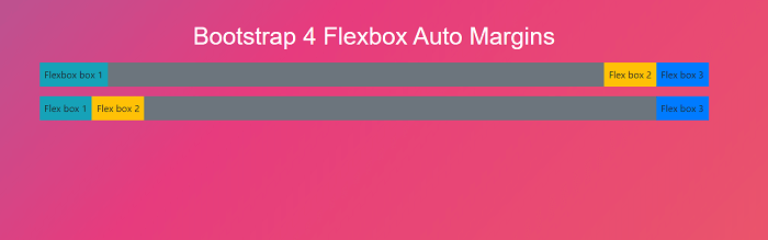
Example 1:
Explanation:
In the above example, we have created an auto margins flexbox with the help of bootstrap 4.
Output:
Following is the output of this example:
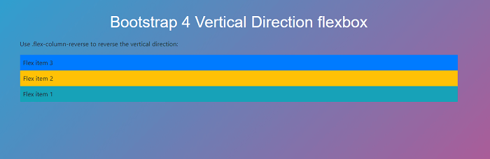
Example 2:
Explanation:
In the above example, we have created a vertical direction flexbox with the help of bootstrap 4.
Output:
Following is the output of this example:
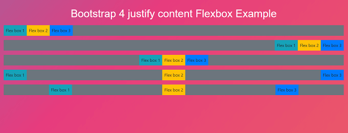
Example 3:
Explanation:
In the above example, we have created a justify content flexbox with the help of bootstrap 4.
Output:
Following is the output of this example:
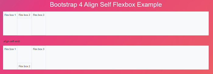
Example 4:
Explanation:
In the above example, we have created an align self-flexbox with the help of bootstrap 4.
Output:
Following is the output of this example: