Bootstrap 4 Grid System
In this article, we will learn about the bootstrap 4 grid system in detail with the help of various examples.
What do you mean by bootstrap 4 grid system?
In Bootstrap 4 grid system is responsive. In a grid system, columns will re-arrange depending on the screen size, i.e., small, large, and extra small, and extra-large. On a big screen, i.e., the desktop and the laptop screen, it might look better with the content organized in three columns, but on a small screen, i.e., tablets, phones, etc., it would be better if the content items were stacked on top of each other.
Bootstrap 4 Grid Classes
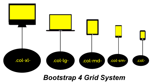
The Bootstrap 4 grid system has five classes:
- .col- This class is used for extra small devices in which screen width is less than 576px, and the number of columns is 12. This class has horizontal behavior and is suitable for portrait phones. In this container width is none.
- .col-sm- This class is used for small devices with screen width equal to or greater than 576px, and the number of columns is 12. This class has collapsed to start, above horizontal breakpoints, and is suitable for landscape phones. In this container width is 540px.
- .col-md– This class is used for medium devices in which screen width is equal to or greater than 768px, and the number of columns is 12. This class has collapsed to start, above horizontal breakpoints, and is suitable for tablets. In this container width is 720px.
- .col-lg- This class is used for large devices in which screen width is equal to or greater than 992px, and the number of columns is 12. This class has collapsed to start, above horizontal breakpoints, and is suitable for laptops. In this container width is 960px.
- .col-xl- This class is used for xlarge devices in which screen width equals or greater than 1200px, and the number of columns is 12. This class has collapsed to start, above horizontal breakpoints, and is suitable for laptops and desktops. In this container width is 1140px.
Let’s take the various example of the bootstrap 4 grid system.
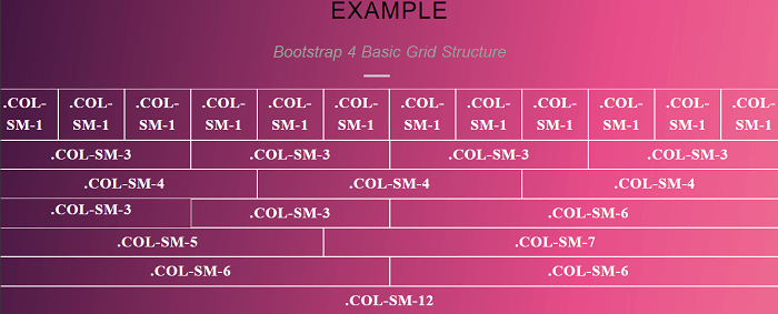
Example 1:
Explanation:
In the above example, we have created an example of bootstrap 4 basic grid structure.
Output:
Following is the output of this example.
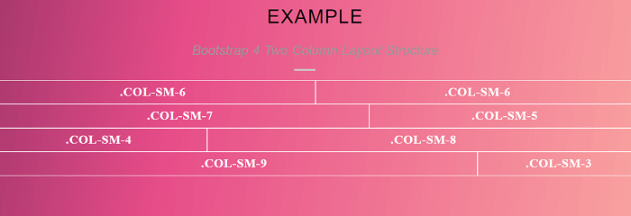
Example 2:
Explanation:
In the above example, we have created an example of bootstrap 4 grid two column layout structure. In this for creating a two column layout structure we created a 1 group of .col-sm 6 and .col-sm 6,, one group of .col-sm 5 and .col-sm 7, one group of .col-sm 4 and .col-sm 8, and last one group of .col-sm 9 and .col-sm 3.
Output:
Following is the output of this example.
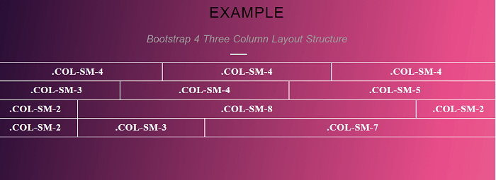
Example 3:
Explanation:
In the above example, we have created an example of bootstrap 4 grid three column layout structure. In this for creating a three column layout structure we created a 1 group of .col-sm 4, .col-sm 4 and .col-sm 4, one group of .col-sm 3, .col-sm 4 and .col-sm 5, one group of .col-sm 2, .col-sm 8 and .col-sm 2, and last one group of .col-sm 2, .col-sm 3 and .col-sm 7.
Output:
Following is the output of this example.