Box Shadow
The box-shadow property in CSS is mainly used to add a shadow effect around an element’s frame. The property is popular for covering the 3D effects of elements present on our web page. We can set multiple effects separated by commas and followed the requirement of proximity. It is generally described the offsets of X and Y relative to the element, color, radius, and blur.
The property of box-shadow allows you to overcast an element with the shadow effect. If a border-radius is specified with box-shadow around any element, the box-shadow takes on the same rounded corners. The ordering is the same as the multiple text shadows in the z-ordering. The first specified shadow is always displayed on top.
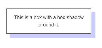
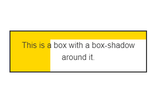
Box shadow has multiple forms. Some of the examples are shown below.
Syntax
The box-shadow property of CSS follows different types of syntax. The syntax followed by the above examples is shown as follows.
The above syntax can be explained in terms specifying the single box shadow using.
- <length> values for two, three and four.
- <offset-x> and <offset-y> are interpreted if only two values are given.
- <blur-radius> is interpreted is third value is given.
- <spread-radius> is interpreted if fourth value is given.
- <color> is an optional value and inset keyword is also optional. To specify more, we need to provide shadows with comma-separations.
Specifying Values
Inset: The inset keyword is used to change the one-sided shadow in a frame. It is drawn inside the border, even for the transparent ones above the background, but below the content that is compressed inside the box.
<offset-x> <offset-y>: These are the <length> values which set the shadow to offset in terms of axis. The <offset-x> is used to specify the horizontal distance and the negative values cast the shadow to the left side of the element. Similarly, <offset-y> is used to specify the vertical distance and the negative values cast the shadow at the top of the element. If both the values are considered to be 0, then the shadow property would generate a blur effect behind the element (provided <blur-radius> or <spread-radius> are already set).
<blur-radius>: The third <length> value which is highly blur reliant. The larger the specified value, the greater is the blur because the shadow turns lighter and bigger. No negative values are allowed and there’s no value specified. 0 is further used to treat the sharp edges. The blur radius is calculated with the color transition of the blur distance perpendicular to the shadow’s edge. It ranges from an endpoint for both inside and outside as well.
<spread-radius>: This is the fourth <length> value. The values in the spread radius are judged on the positive and negative values. Positive values always expand and grow large while the negative specified values will cause the shadow to shrink. If there’s no specified value, 0 is treated as the default value for which the shadow proximity with the same size of the element.
<color>: The <color> is the value that can be specified for all possible notations and keywords. If it is not specified, the default color value is automatically set to the current color.
Examples
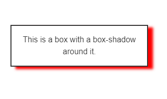
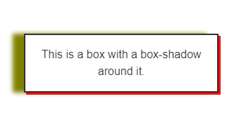
Example 1:
Output:
In this example, we tried to demonstrate the box-shadow property by including three shadows: the drop shadow, the inset shadow, and the regular shadow with an absolute 2px border effect to visualize it better. When the x-offset, y-offset, and the blur effect are set to zero, the shadow formed will be of solid colored outline on all sides. The shadows are therefore drawn for front and back. Similarly, the border-radius is set to zero by default so that shadow itself will form corners. It is important to note that box-shadow doesn’t impact the dimensions of the element. Later, we have added margin to the element so that the shadow doesn’t overlap the borders of the adjacent element.
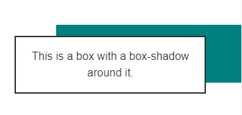
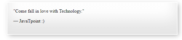
Example 2:
Output:
In this example, we have tried to overcast with the borders to make it clear that the dimensions are not changed while using box-shadow. For this, we need to use padding and margin to showcase these different types of shadows. It can be made constituting the requirement without hampering the dimensions of the element.
Summary
In this tutorial, we have learned from scratch to advanced level of concept for making use of box-shadow into our elemental chart. The box-shadow is popularly used to make great and realistic user interfaces. It improves the overall look of the HTML elements and provides a natural look.
We also came across various types of box shadowing techniques along with their syntactical knowledge. Box shadow is easy to understand and implement as it needs no knowledge of dimensions once we get familiar with it using regularly for our HTML elements. It can thus be said that box-shadow is a dynamic technique for making a visual impact on the frames of any UI element of a web page or a web app.