Column Chart
A Column chart is a graph in Ms Excel that displays vertical bars with access values for bars shown on the left side of the chart. It can also be referred to as a graphical object used to represent the data in the worksheet. Column charts are widely used whenever the user wants to compare values across different categories.
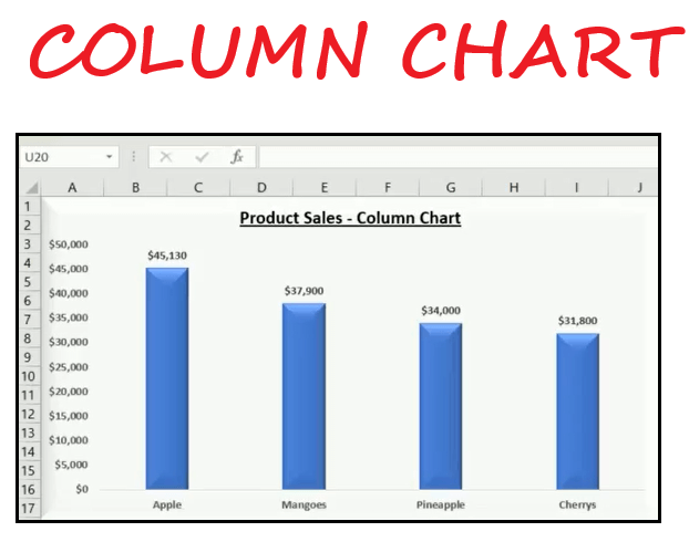
Column charts are mostly used to compare discrete values in excel. As shown in the above figure, each data point of the Column chart is plotted as a vertical rectangular bar where the height of the column represents the value of a data point. You can perform various operations with Excel Column charts and customize them according to your data series. You can provide the title to the chart and define labels and values to make the chart more understandable. Look at some points of what we can do with Excel charts.
Advantages of Column Charts
- Column Charts are self-explanatory as they are very simple and easy to understand.
- With Column Charts, you can add data labels at the end of the bars easily.
- Column Charts (stacked column chart) easily displays the relative values/proportions of various categories.
- Column Charts can represent negative figures as well.
- Column charts can hold the data values in different categories and the data of one division in distinct periods.
Types of Column Charts
There are several types of column charts available in Microsoft Excel, which are as follows:
1. Clustered Column Chart
Clustered column charts are used in places wherever the user wants to compare values across various categories. The advantage of using this chart type is it displays more than one data series in a clustered vertical bar format. As the name suggests, in a clustered column chart, each data series shares the same axis label; therefore, all the vertical bars are grouped by category. Clustered Column charts enable the direct comparison of multiple series, but they are not advised to use large data as it may become visually complex. However, they work best in conditions where the user has limited data sets.
For example, in the below image, we have used the clustered column chart to understand a relation between sales and profit.

As can be seen, one can easily evaluate that the last few months have shown a rise in sales when compared to the first two months of the quarter. By looking at the above-clustered column chart, we can also conclude that the profit goes down when the sales go down.
2. Stacked Column Chart
A stack column chart is a basic Excel chart that allows representing the total (sum) comparison across categories over a time frame. In the stack, column chart data series are stacked one on top of the other in vertical columns. This type can show changes over time as it’s easy to compare total column length. The advantage of using this chart is that in a compact space, multiple series of data are represented, and you can highlight trends and changes over time. The disadvantage of this type is that it becomes difficult to compare the sizes of individual categories.
For example, in the below image, as you can see, we have created a stacked columns chart to find out which product leads to more profit across months.
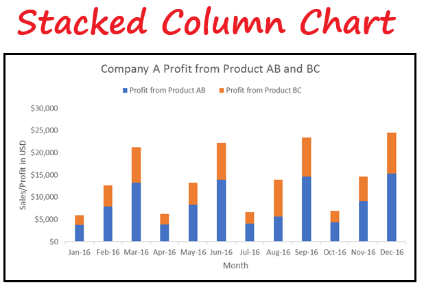
As can be seen Product AB contributes more to the profit as compared to Product BC but in August Product BC contributes more to the profit as compared to Product AB. This will be clearer in the next chart type 100% Stacked Column.
3. 100% Stacked Column Chart
A 100% Stacked Column Chart shows the relative percentage of multiple data series in the stacked column where the total of the stack column is always equal to 100%. This type is commonly used to show the part to the whole comparison over time.
In a stacked column chart, it’s difficult to compare the relative size of the components that make up each column and to comprehend that 100% stacked Column Chart was introduced in Excel. It helps in our day-to-day operations, unlike to display the proportion of quarterly revenue per region or to represent the proportion of monthly commission payment that goes towards vendors or agents etc.
As you can see, in the following 100% stacked column chart, we have designed the chart that shows the percentage of profit being subsidised by Product AB and BC.
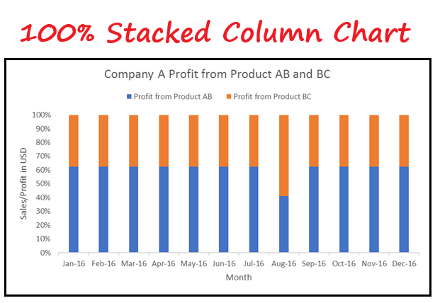
As can be seen from the above chart, Product BC usually contributes to around 38% but in Aug ’16 it contributed close to 60% of the overall profit.
Steps to create a 2D column Chart
To make a column chart in Excel, follow the below given steps:
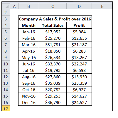
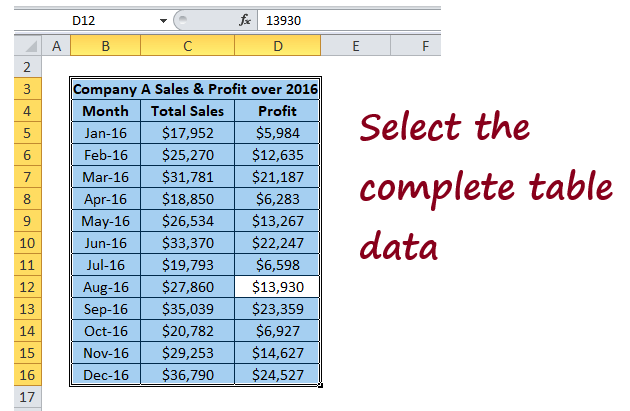
1. Before creating the chart, it is important to insert data in table format in your Excel spreadsheet. For instance, here we have data showing sales and profit of company A and identify the trend.
2. Select the entire table (place your cursor on your table and press the shortcut key ctrl + A).
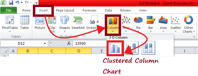
3. Go to Insert tab -> Under Charts group -> click on the Insert Column. The column chart dialogue box will be displayed. Since we have to compare the sales figure with profit, we will go with a 2-D Clustered Column Chart.
4. As shown below, the clustered column chart will be inserted within your Excel worksheet.

5. Next step is to add formatting to your chart. You can write the correct chart title, axis titles and try different ways to format the chart.
NOTE: You can customize the column chart to make it more readable and also comprehensible.
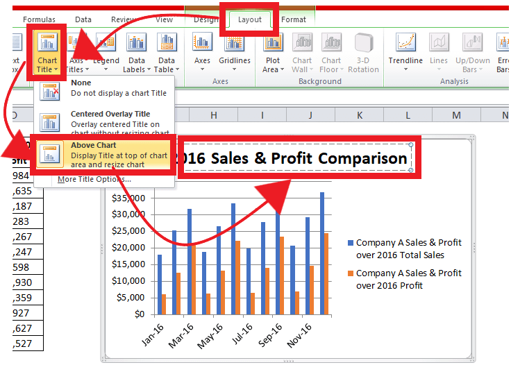
6. From chart tools, click on layout -> chart title -> above chart (to display the chart at the top of the chart area). You will notice that a rectangular box will be inserted at the top of your chart window. Type the appropriate title and click on enter.
7. From chart tools, add axis titles and data labels. As shown in the chart below, the data values are inserted at the end of every bar, and the horizontal and vertical axes are also defined.
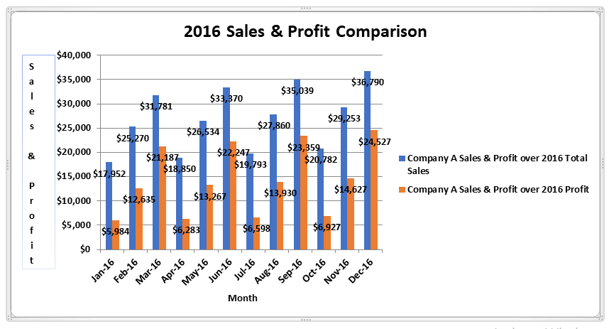
Though our clustered chart is ready but you can format it further, try different bars, layouts, design approaches. You can also go with 3-Dimensional column charts to make the charts look more lively.
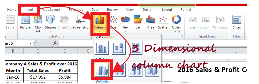
Steps to create a 3D column Chart
To make a 3D column chart in Excel, follow the below given steps:
- At first we will insert data in table format in our Excel spreadsheet. For instance, here we took the same data that we have used for creating the above 2D column chart.

- Select the entire table (place your cursor on your table and press the shortcut key ctrl + A).
- Go to Insert tab -> Under Charts group -> click on the Insert Column. The column chart dialogue box will be displayed. Since we have to compare the sales figure with profit, we will go with a 3-D Clustered Column Chart.
- As shown below, the 3D clustered column chart will be inserted within your Excel worksheet.
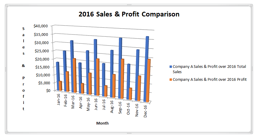
You can also navigate to different formatting tools to make your chart more comprehensive.
Difference between 2D and 3D Column Chart
Column charts are available in Excel in various formats, but 2D column charts and 3D column charts are commonly used. The main difference between 2D and 3D column charts is -2D charts show the bars in 2-dimensional viewpoint and also use a third value axis. At the same time, the 3D column chart shows the bars in a 3-dimensional perspective. But unlike the 2-dimensional column chart, it also does not use a depth axis (third value axis).