CSS clip-path
This CSS property is used to create a clipping region and specifies the element’s area that should be visible. The area inside the region will be visible, while the outside area is hidden. Anything outside the clipping will be clipped by browsers, including borders, text-shadows, and many more.
It allows us to define a particular region of the element to display, instead of displaying the entire area. It makes it easier to clip the basic shapes by using ellipse, circle, polygon, or inset keywords.
Syntax
The CSS clip-path property has four values:
- clip-source
- basic-shape
- geometry-box
- none
Let’s discuss the above property values.
clip-source: It is a url that reference to an SVG <clippath> element.
basic-shape: It clips the element to a basic shape. It has four basic shapes: circle, ellipse, polygon and inset.
It is a shape in which the value of <geometry-box> defines position and size. If there is no geometry-box is defined, then the border-box will be used as a reference box.
geometry-box: The <geometry-box> defines the reference box for the basic shape. If it is defined with the combination of the <basic-shape>, then it will act as the reference box for the clipping done by the <basic-shape>.
It can have the below values:
margin-box: It can be used as the reference box. It can be defined as the shape specified by the outside margin edge and includes the corner radius of the shape.
border-box: It can be used as the reference box. It is a value that is defined by the outside border edge.
padding-box: It can be used as the reference box.. It specifies the shape which is enclosed by the outside padding edge.
content-box: It can be used as the reference box.
fill-box: The object bounding box can be used as the reference box.
stroke-box: The stroke bounding box can be used as the reference box.
view-box: It uses the closest SVG viewport as the reference box.
Defining basic shapes with clip-path
As discussed above, there are four basic shapes. Let’s discuss them with an example of each.
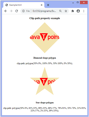
polygon
It is one of the shapes of the available basic shapes. It allows us to define any amount of points. The given points are in the pair of X and Y coordinates of any unit (such as percent based or pixel-based).
We can understand this basic shape by using the below example. In the following example, we have defined two polygon shapes: diamond shape polygon and star shape polygon.
Example
Output
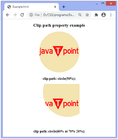
circle
The default syntax of defining the circle is the circle(radius at posX posY). The position is optional, and its default value is 50% 50%.
Example
Output
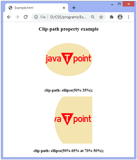
ellipse
The syntax to define ellipse is: ellipse(radiusX radiusY at posX posY). Like the circle, the position in it is optional and default to 50% 50%.
Example
Output
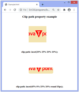
inset
Using inset, we can define an inner rectangle, and anything outside will be discarded. It makes the cropping of an image or an element easier.
Example
Output
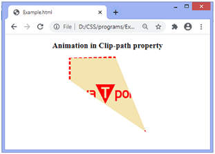
Adding animation
We can also apply animation to this property. Animation and transitions will create interesting effects with this CSS property.
Let’s see the illustration for the same.
Example
Output