Data Visualization in Python using Bokeh Library
Bokeh is a Python library which is used for data visualization through high-performance interactive charts and plots. It creates its plots using HTML and JavaScript languages. The output of the bokeh library can be generated on several platforms such as browser, HTML, server, and notebook. It is also possible to create the bokeh plots in Django and flask applications.
The bokeh library provides two visualization interfaces to the users:
- models: it is a low-level interface which provides high flexibility to the application developers.
- plotting: it is a high-level interface which is used for creating visual glyphs.
In this tutorial, we will learn how to create different types of data visualization graphs and charts using the bokeh library in Python.
Installation:
To install the bokeh library, we can use the following command:
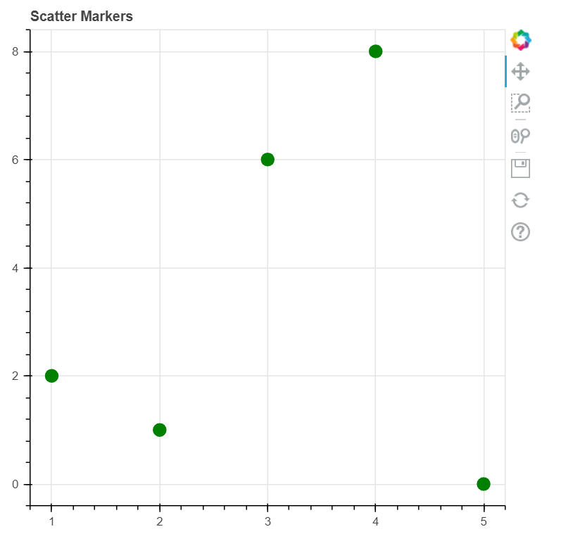
Code 1: To Create Scatter Circle Markers
We can create Scatter Circle Markers on the Plot by using the bokeh library. For this, we will use the circle() function.
Example:
Output:
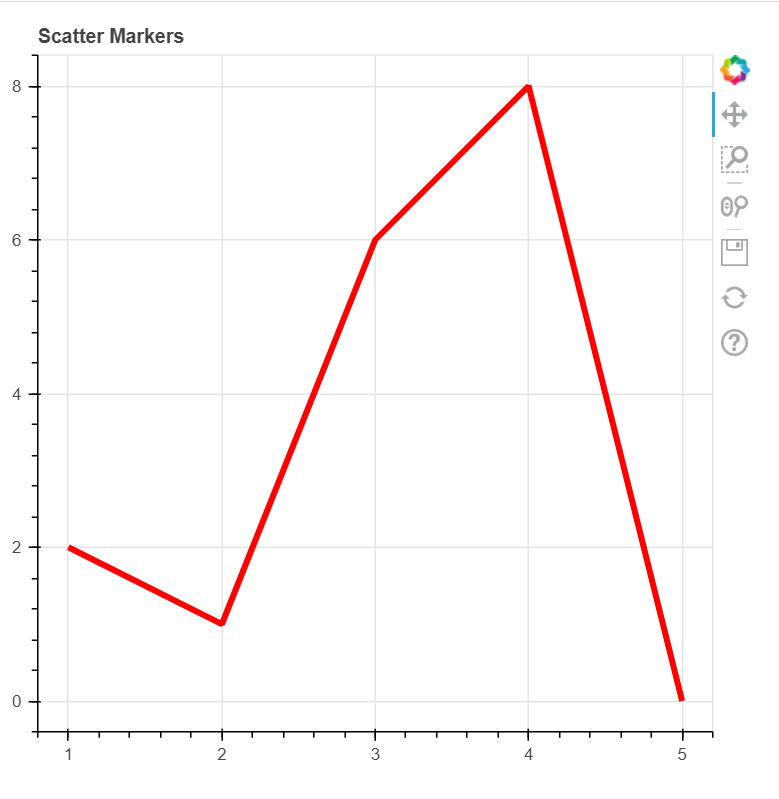
Code 2: To Create a Single Line
We can create a single line by using the bokeh library in Python. For this, we will use the line() function.
Example:
Output:
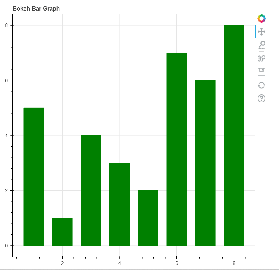
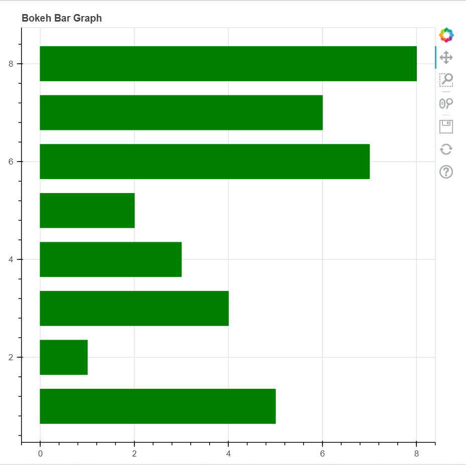
Code 3: To Create a Bar chart
Bar charts are used for representing the categorical data with rectangular bars. The length of the bar is proportional to the values they are representing.
Example: Vertical Bar Chart
Output:
Example 2: Horizontal Bar Chart
Output:
Output:
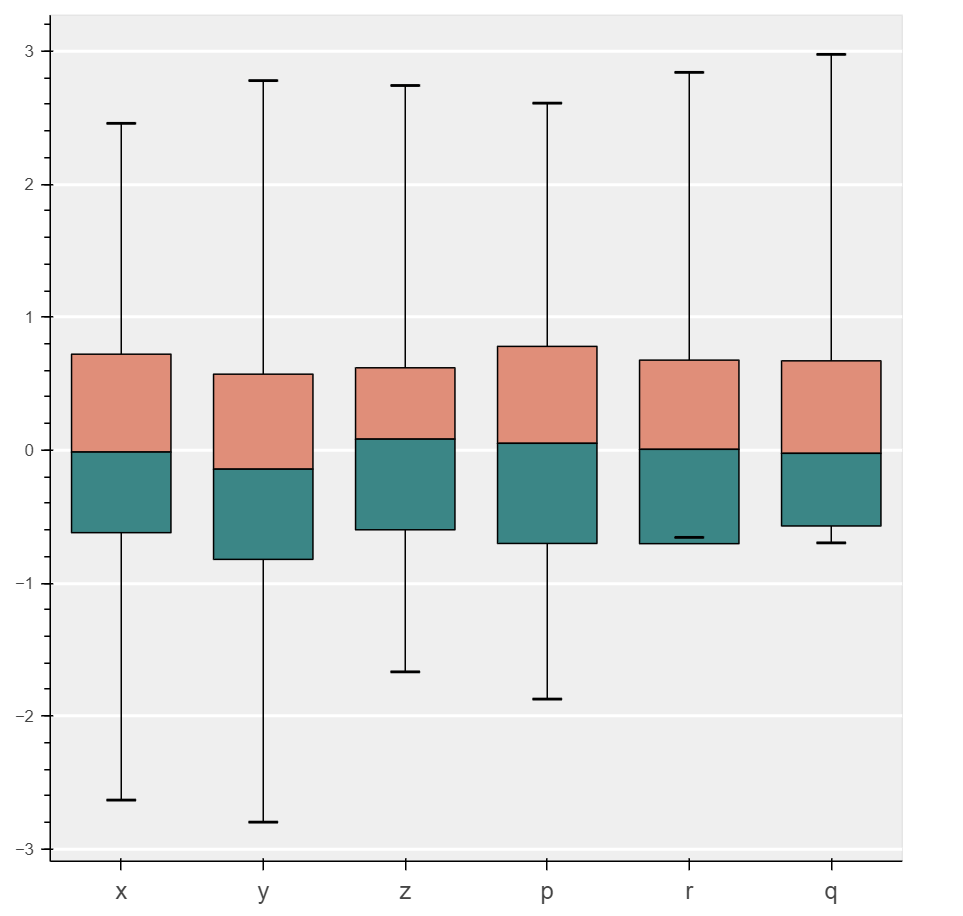
Code 4: To Create Box Plot
Box plot is used for representing the statistical data on the plots, and it is helpful for summarizing the statistical properties of several groups present in the dataset.
Example:
Output:
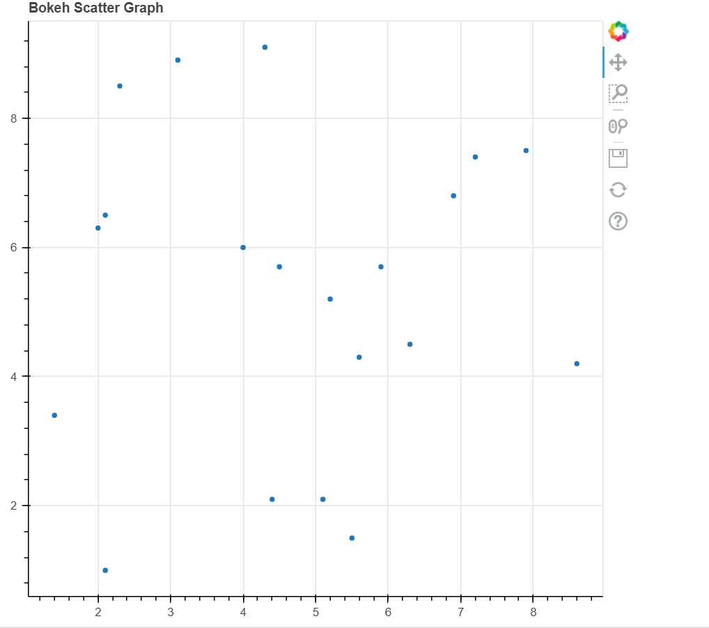
Code 5: To Create Scatter Plot
A Scatter plot is used for plotting values of two variables in a dataset. It is helpful in finding the correlation between the two variables which are selected.
Example:
Output:
Conclusion
In this tutorial, we have discussed various types of data visualization, namely Bar chart, Box plot, Scatter Markers, Scatter Plots, and Single lines, which can be created using the bokeh library in Python.