Top 10 Data Visualization Tools
There are tools which help you to visualize all your data in a few minutes. They are already there; only you need to do is to pick the right data visualization tool as per your requirements.
Data visualization allows you to interact with data. Google, Apple, Facebook, and Twitter all ask better a better question of their data and make a better business decision by using data visualization.
Here are the top 10 data visualization tools that help you to visualize the data:
1. Tableau
Tableau is a data visualization tool. You can create graphs, charts, maps, and many other graphics.
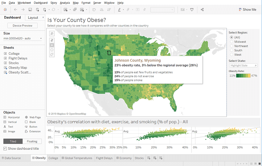
A tableau desktop app is available for visual analytics. If you don’t want to install tableau software on your desktop, then a server solution allows you to visualize your reports online and on mobile.
A cloud-hosted service also is an option for those who want the server solution but don’t want to set up manually. The customers of Tableau include Barclays, Pandora, and Citrix.
2. Infogram
Infogram is also a data visualization tool. It has some simple steps to process that:
- First, you choose among many templates, personalize them with additional visualizations like maps, charts, videos, and images.
- Then you are ready to share your visualization.
- Infogram supports team accounts for journalists and media publishers, branded designs of classroom accounts for educational projects, companies, and enterprises.
An infogram is a representation of information in a graphic format designed to make the data easily understandable in a view. Infogram is used to quickly communicate a message, to simplify the presentation of large amounts of the dataset, to see data patterns and relationships, and to monitor changes in variables over time.
Infogram abounds in almost any public environment such as traffic signs, subway maps, tag clouds, musical scores, and weather charts, among a huge number of possibilities.
3. Chartblocks
Chartblocks is an easy way to use online tool which required no coding and builds visualization from databases, spreadsheets, and live feeds.
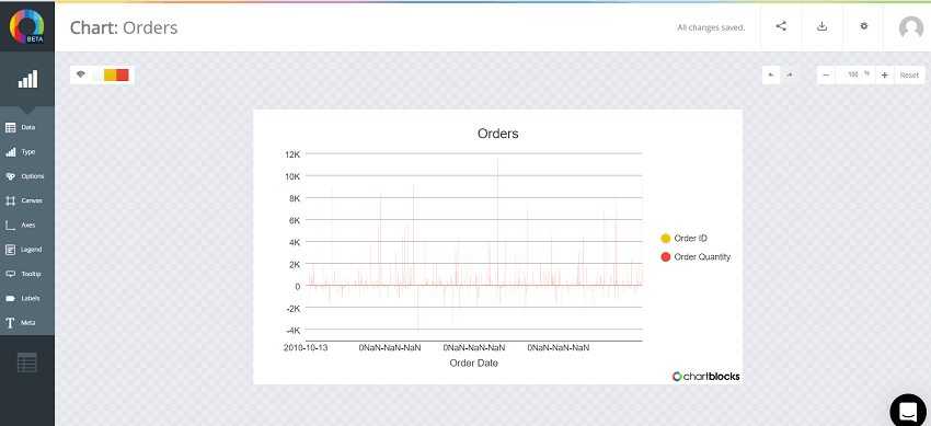
Your chart is created under the hood in html5 by using the powerful JavaScript library D3.js. Your visualizations is responsive and compatible with any screen size and device. Also, you will be able to embed your charts on any web page, and you can share it on Facebook and Twitter.
4. Datawrapper
Datawrapper is an aimed squarely at publisher and journalist. The Washington Post, VOX, The Guardian, BuzzFeed, The Wall Street Journal and Twitter adopts it.
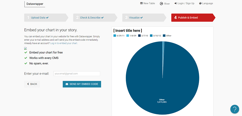
Datawrapper is easy visualization tool, and it requires zero codings. You can upload your data and easily create and publish a map or a chart. The custom layouts to integrate your visualizations perfectly on your site and access to local area maps are also available.
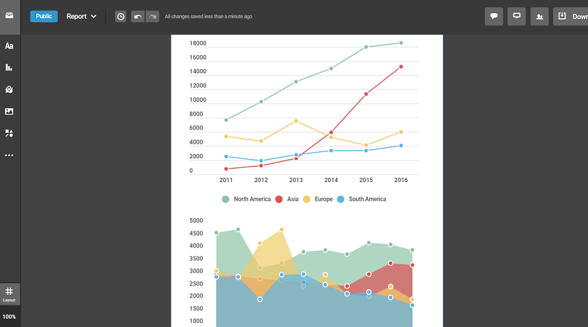
5. Plotly
Plotly will help you to create a slick and sharp chart in just a few minutes or in a very short time. It also starts from a simple spreadsheet.
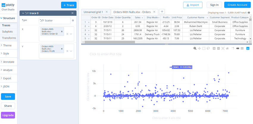
The guys use Plotly at Google and also by the US Air Force, Goji and The New York University.
Plotly is very user-friendly visualization tool which is quickly started within a few minutes. If you are a part of a team of developers that wants to have a crack, an API is available for JavaScript and Python languages.
6. RAW
RAW creates the missing link between spreadsheets and vector graphics on its home page.
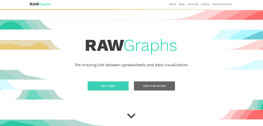
Your Data can come from Google Docs, Microsoft Excel, Apple Numbers, or a simple comma-separated list.
Here the kicker is that you can export your visualization easily and have a designer to make it look sharp. RAW is compatible with Inkscape, Adobe Illustrator, and Sketch. RAW is very easy to use and get quick results.
7. Visual.ly
Visual.ly is a visual content service. It has a dedicated data visualization service and their impressive portfolio that includes work for Nike, VISA, Twitter, Ford, The Huffington post, and the national geographic.
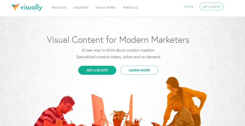
By a streamlined online process, you can find entire outsource your visualizations to a third-party where you describe your project and connected with a creative team that will stay with you for the entire duration of the project.
Visual.ly sends you an email notification for all the event you are hitting, and also it will give you constant feedback to your creative team. Visual.ly offer their distribution network for showcasing your project after it’s completed.
8. D3.js
D3.js is a best data visualization library for manipulating documents. D3.js runs on JavaScript, and it uses CSS, html, and SVG. D3.js is an open-source and applies a data-driven transformation to a webpage. It’s only applied when data is in JSON and XML file.
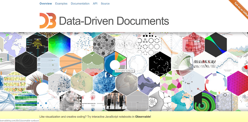
D3.js emphasis on web standards gives you the full capabilities of modern browsers without tying yourself to a single framework and combining powerful visualization components.
D3.js is as powerful as it is a cutting-edge library, so it comes with no pre-built charts and only IE9+ supports this library.
9. Ember Charts
Ember charts are based on the ember.js and D3.js framework, and it uses the D3.js under the hood. It also applied when the data is in JSON and XML file.
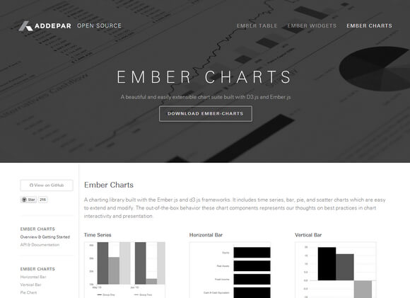
It includes a bar, time series, pie, and scatter charts which are easy to extend and modify. These chart components represent our thoughts on best practices in chart presentation and interactivity.
The team behind Ember Charts is also the same that created Ember.js. It puts a lot of focus on best practices and interactivity. Error handling is very graceful, and your app will not crash after finding irrelevant data or corrupt data.
10. NVD3
NVD3 is a project that attempts to build reusable charts and components. This project is to keeps all your charts neat and customizable.
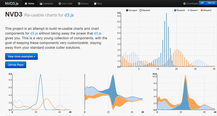
NDV3 is a simpler interface on the top of the D3.js and keeps all of its powerful features under the hood.
The front end engineers develop NDV3, and they use their insight into charting technology. This charting technology is used to provide powerful analytics to clients in the financial industry.