Formatting Charts
After inserting your Chart, the next step is to format it according to your data specification to make it look visually appealing. In this tutorial, we will learn more about charts and their various formatting options.
Chart Tools
Once you insert the chart in your excel worksheet, you will notice you will get an extra tab named as Chart tools, which contains various different tabs such as:
1. Design Tab
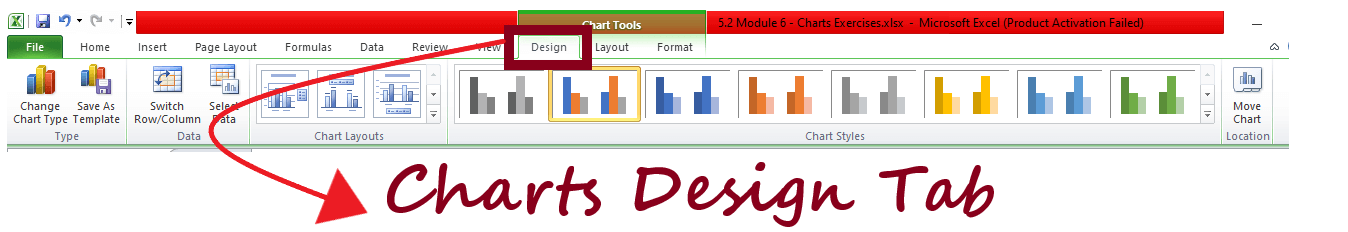
This tab has ready-made formats for Chart Layouts and Chart Styles – you can see the different options and their impact on the chart by scrolling over the different options. You can also select different chart types or change the data for a graph.
2. Layout Tab
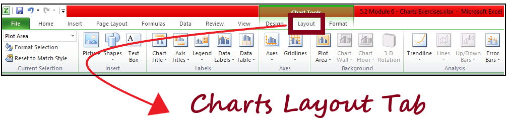
This tab is used to add/remove/edit chart titles, data labels, and Axis titles. We can also insert shapes, pictures in a chart. Another important use of this tab is ‘Trendline’.
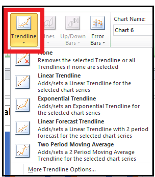
You can add a ‘Linear Trendline’, ‘Exponential Trendline’ to your graph. The linear (or exponential) trendline is based on a linear (or exponential) equation that is fit by excel to the data provided. You can also view the equation by right-clicking on the trendline and selecting ‘Format Trendline’, and then click on ‘Display Equation on chart’. R2 (R square) shows the amount of variation in the dependent variable being explained by the model. The higher the value, the better the equation – it should lie between 0 and 1, but a good model will have its R2 around 0.7-0.8.
3. Format Tab
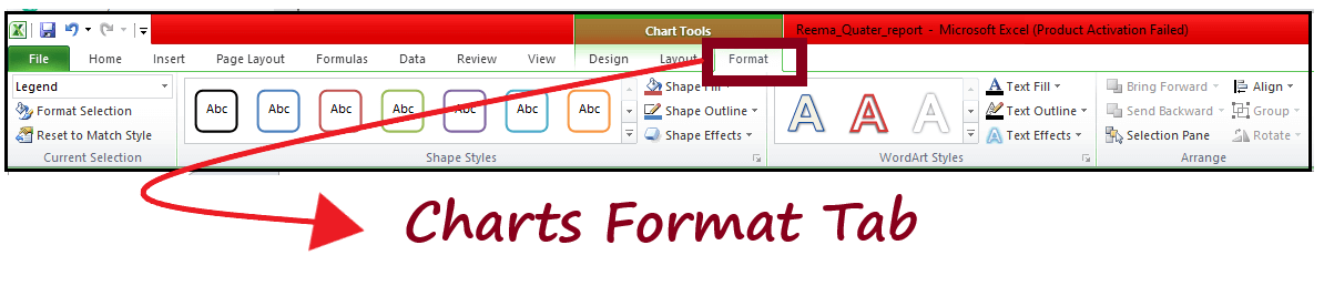
This tab is used to edit or beautify the chart. It gives you the option to select shape styles, WordArt styles, shape effect, shape fill option, etc.,
Format Chart Area
You can format charts using Toolbar or right-clicking on the chart and selecting option ‘Format Chart Area’. When you click on a chart a conceptual tab ‘Design’ also gets created which gives a lot of quick options to format the chart.
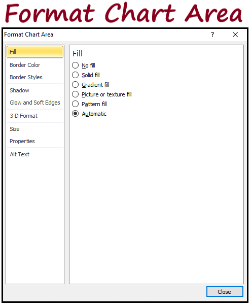
‘Format Chart Area’ – these options are used to ‘beautify’ your chart once it has been created –
- Fill – you can color, add a picture, change the pattern of that area of the chart where graph is not present
- Border Color – By default there is no color on the border of the graph, but you can select your choice of border color by going through the options ‘Solid Line’, ‘Gradient Line’
- Border Styles – You can select if you want a thick border line or a really thin line
- Shadow – By default this setting is white but by changing it to any other color, you will create a slight shadow of the chart. By playing around with other options in ‘Shadow’ you can change the appearance of the shadow of the chart
- Glow and Soft Edges – You can add a ‘glow’ surrounding your chart – by default this is white i.e. no color. By changing soft edges, you can change the way the edges of the chart appear
- 3-D Format – This is also used to change the way the chart appears. Try the different options available.
- Size – Related to the size of the chart – you can increase/decrease height or width from here or you can also select the chart and move around your mouse to see what you are comfortable with
- Properties – Default is ‘Move and Size with Cells’ – by that it means if the column width is changed and the chart is over that column, then it will also broaden or shrink – if you add a new column, then the chart will extend and will also shift (if you had a column before the columns on which chart is present). By selecting the other options ‘ Move but don’t size’, the size of the chart will not change and with the third option, the chart will also not move irrespective you add a column or delete one (same with rows).
Plot Area
When you do a right-click on the area where the chart has been plotted also known as the ‘Plot Area’, you get options which have the same functionality as ‘Format Chart Area’ options, just that the impact will now only be on the plot area and not the outside area which does not consist of the graph.
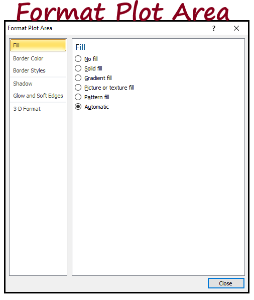
- Fill
- Border Color
- Border Styles
- Shadow
- Glow and Soft Edges
- 3-D Format
The last 6 have the same functionality as for a ‘Chart Area’.
Format Legend
When you do a right-click on the legend – you get ‘Format Legend’ option in which you have the following options –
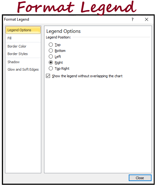
- Legend Options – Legend Position – where you want the legend to appear in the chart area – do you want it on the top, bottom, right or left
- Fill
- Border Color
- Border Style
- Shadow
- Glow and Soft Edges
The last 5 have the same functionality as for a ‘Chart Area’ or a ‘Plot Area’.
Format Data Series for Column or Bar Chart
When you do a right-click on the data-point which has been plotted for a Column or Bar chart, you get an option ‘Format Data Series’ –
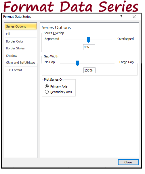
- Series Options – if you have 2 series which have different scales (cannot be compared like Age and Salary), the most important option over here is ‘Plot Series On’ Primary or Secondary Vertical Axis. Using Gap Width we can change the gap between 2 data-points on x-axis – do look at the example below of a large gap and no gap
- Fill
- Border Color
- Border Styles
- Shadow
- Glow and Soft Edges
- 3-D Format
The last 6 have the same functionality as for a ‘Chart Area’ or a ‘Plot Area.
Format Data Series for Line Chart
When you do a right-click on the data-point which has been plotted for a Line chart, you get an option ‘Format Data Series’ –
- Series Options – if you have 2 series which have different scales (cannot be compared like Age and Salary), the most important option over here is ‘Plot Series On’ Primary or Secondary Vertical Axis
- Marker Options – you can change the markers and the size which highlight a data-point
- Marker Fill – you can change the color of the marker
- Line Color – you can change the color of the line which joins the different markers i.e. data-points
- Line Styles – this helps in increasing/decreasing the width of the line along with the type of line we want
- Marker Line Color – changes the line color of the marker – by default it is the color of the marker
- Marker Line Style – you can change the line style and width of the marker – by default it is a line with 0.75mm width
- Shadow
- Glow and Soft Edges
- 3-D Format
The last 3 have the same functionality as for a ‘Chart Area’ or a ‘Plot Area’.
Format Data Labels
When you do a right-click on the data-labels which have added to the plot are, you get an option ‘Format Data Labels’ –
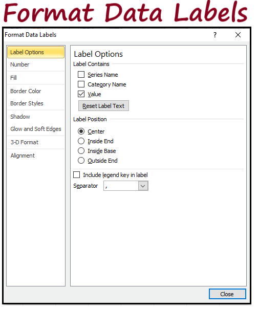
- Label Options – default it is Value, but you can also add Column Name by clicking on ‘Series Name’ and you can also add the observation name corresponding to which this value belongs within ‘Series Name’. Label Position helps in changing the position of the label on the plot area
- Number – you can change the format of the label depending if it is a date or a number, percentage etc.
- Alignment – you can change the way the text appears within a label by selecting vertical alignment, horizontal alignment. You can also change the custom angle of the text
- Fill
- Border Color
- Border Styles
- Shadow
- Glow and Soft Edges
- 3-D Format
The last 6 have the same functionality as for a ‘Chart Area’ or a ‘Plot Area’.
Format Axis
When you do a right-click on the vertical axis, you get an option ‘Format Axis’ (horizontal also has the same functionality) –
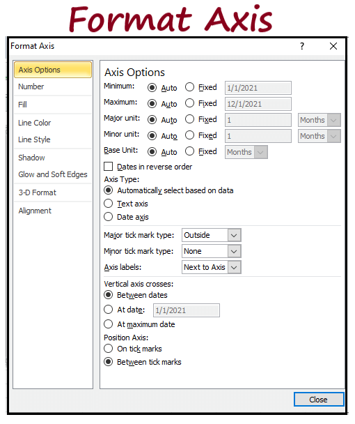
- Axis Options –
- Minimum – Lowest value to be shown on the vertical scale – you can change it – by default it is 0
- Maximum – Highest value which is shown on the vertical scale – excel automatically puts it based on the data you have
- Major & Minimum Units – they change the scale values – having small major units will mean that there will be too many scale values present and having a large minimum unit will mean to few scale values
- Display Units – if the values on axis are in thousands or millions or even more, then you can replace those 000’s with units
- Number
- Alignment
- Fill
- Border Color
- Border Styles
- Shadow
- Glow and Soft Edges
- 3-D Format
The last 8 have the same functionality as has been discussed earlier.
Format Chart Title
When you do a right-click on the chart title & Axis title which have added to the plot are, you get an option ‘Format Chart Title’ –
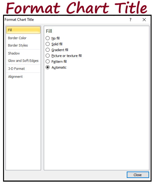
- Fill
- Border Color
- Border Styles
- Shadow
- Glow and Soft Edges
- 3-D Format
- Alignment
All these have the same functionality as has been discussed earlier. Using the ‘Format’ conceptual tab, you can achieve the same results as mentioned earlier.
Copying a chart
You can simply copy a chart by clicking on it and copying it first (Ctrl + C) and then pasting it (Ctrl + V) somewhere else – you can then change the data-source as well but the format of the chart will remain the same.
Sparkline Charts
Sparkline charts are nothing but cell sized graphs. They are of 3 types in excel –
- Line: Sparkline Line chart is similar to a line chart.
- Column: Sparkline Column Chart is similar to a column chart.
- Win/Loss: Sparkline Win/Loss is a type of chart that displays each data point as a high block or a low block. This chart comes in handy when we want to plot the changes in a particular item as we move from one time point to another – if the change is positive that it is represented by a high bar in blue else low bar in red and for months where no change takes place – it will show no bar.
In the below picture, table one consists of expenditure of a household over 12 months and the table also consists of line and column Sparkline charts.
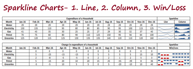
The second table showing the Win/Loss graph consists of changes in the expenditure as we move from one month to another over.
Date Axis (Group – Axis)
Usually when you plot time based data, it is assumed that the data-points are at equal intervals. But this may not always be the case and in order to avoid making a wrong conclusion, you can use the ‘Date Axis’ option.
You will need to specify the cells consisting of the dates and then select OK – if data for some dates is missing, Sparkline will ensure that the data is spaced at equal intervals.