7 QC Tools
- 7 QC tools is a scientific and systematic technique for problem-solving techniques.
- We use 7 QC tools to solve a number of shop floor problems with no trouble, and improve our workplace.
- In other words, 7 QC tools mean systematic and scientific procedures for problem-solving, and it is used for process and product improvement.
Why We Use the 7 QC Tools for Process Development?
- 7 QC tools are essential concept which we use to enhance the product and process quality.
- We use 7 QC tools to analyze the production sequence, recognize the key problems, control product quality variations, and offer solutions to evade future defects.
- It is a collection of graphical methods identified as most useful in troubleshooting problems regarding quality.
- The 7 QC tools are simple to comprehend and implement and do not require complex analytical/ statistical ability, so it is powerful and simple.
Advantages of 7 QC Tools
There are various advantages of 7 QC tools:
- 7 QC tools are simple to comprehend and implement; yet extremely useful.
- Helps in recognizing and examining issues during the process.
- For quality improvement and problem-solving, it offers a more structured path.
- Enhance client experience and client satisfaction.
- Improvement in the quality of products and services.
- Provides a more structured path for quality improvement and problem-solving.
7 QC Tools:
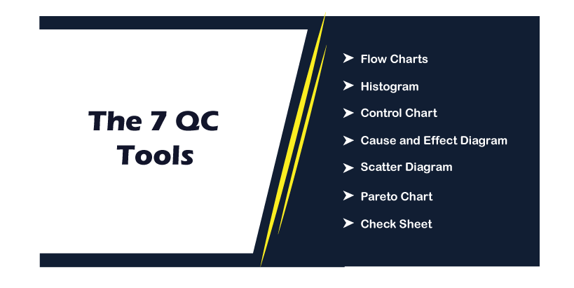
Let’s discuss the 7 QC tools one-by-one
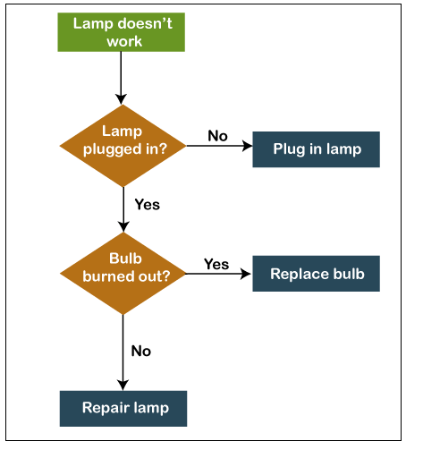
1. Flow Charts
Flow Charts are the most popular tool for quality control. We can use this tool in order to visualize the series of steps in a process, system, workflow, event, etc. Besides displaying the process as a complete, the flowchart additionally features the association among phases and the process boundaries.
In the flowchart, we utilize the standard arrangement of symbols, and it is essential to standardize the use of these symbols so that everyone can understand and use the flow charts easily.
Uses of Flowcharts
The following are the uses of flow charts:
- Flow chart is used to build a general understanding of a process.
- Flow chart is used to standardize the procedures for everybody to follow the similar steps.
- Flow chart is used to examine the process and determine areas of problems, blockers, inadequacies, etc.
How to make a Flowchart
- First, we have to gather the employee’s team that is elaborate in carrying out the process for analyzing it.
- Then we have to make a list of each phase which is included in the process from begin to finish.
- In case we are using an online tool such as Creately, then we can first write the steps of the process and recorder them later on the canvas when we identify the flow.
- Recognize the step’s order; whenever representing the flow with our flowchart, display it from top to bottom or left to right.
- Link the shapes using arrows to specify the flow.
Advantages of Flowchart
There are various advantages of Flowchart:
- A flowchart is an excellent means of communicating the system’s logic to all involved or concerned.
- Using a flowchart, the process can be examined proficiently hence reducing cost and time wastage.
- In debugging process, a flowchart is useful.
- A flowchart works as a blueprint or guide during the system analysis and phases of program development.
- Using a flowchart, the operating system’s maintenance becomes easy. It helps programmers to apply efforts on that part more efficiently.
Disadvantages of Flowchart
- We cannot type the flowcharts symbols, so flowchart’s reproduction becomes a problem.
- Sometimes the logic of the program is relatively little bit complex. In that situation, the flowchart becomes clumsy and complex. It can become a trouble for the user, resulting in a waste of money and time trying to resolve an issue.
- Alterations and modifications are difficult in a flowchart, if alteration is needed, then we have to draw the entire flow-chart again, and in this way, more time is wasted.
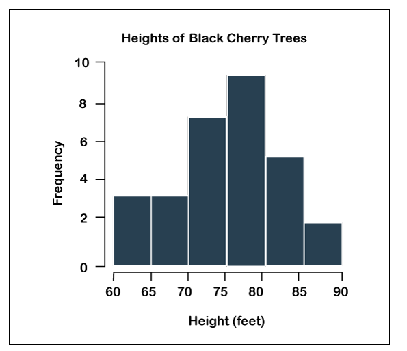
2. Histogram
The histogram is another quality control tool. It is a kind of bar chart that can visualize the distribution of numerical data. In histogram, numbers are grouped into ranges, and the bar’s height shows how many falls into each range. The histogram is an excellent quality planning and control tool which supports us to comprehend protective and appropriate actions
Types of Histogram
There are various types of the histogram:
- Multipeaked or Multimodal
- Normal Distribution
- Truncated or Heart cut Histogram
- Skewed Distribution
- Edge Peaked or Bimodal
- Double-Peaked Histogram
Uses of Histogram
There are various uses of the histogram:
- A histogram is used to simply interpret a huge amount of data and recognize patterns.
- We can use the histogram to make predictions of the process performance.
- With the use of histogram, we can find out the different causes of quality problems.
How to Create a Histogram
- First, we have to gather the data for analysis. Using a tally chart, record occurrences of particular ranges.
- Analyze the data at hand and break the data into gaps or bins.
- Then we have to count the values that decrease in each bin.
- The frequency of events for each bin appears with the height of the bar in the graph.
Advantages of Histogram
There are various advantages of Histogram:
- The histogram shows a huge amount of data.
- Histograms can be used to display the future performance of a process.
Disadvantages of Histogram
There are various disadvantages of Histogram:
- In histogram, we can only use continuous data.
- Tougher to compare two data sets.
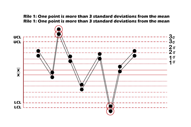
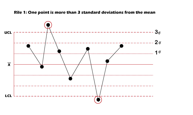
3. Control Chart
The control chart is a kind of run chart that we use to detect and study process variation arising from a standard or definite cause over a time. It is also called “Shewhart Control charts. With the help of the control chart, we can measure the variations and visualize it in order to display whether the variation is within an adequate bound or not. Using control charts, we can track metrics like cost per unit inventory on hand, production time, etc.
We use control charts in manufacturing, process improvement methodologies such as stock trading algorithms, Six Sigma.
Uses of Control Chart
There are various uses of control chart:
- We use control chart in order to check whether a process is stable or not.
- With control chart we can recognize abnormal variations in a process.
- A control chart is used to find the process’s trend.
How to Create a Control Chart
There are various steps that we use to create a control chart:
- First, we need to gather the data.
- Then, we have to collect the subgroup average.
- Next, we determine the overall average.
- Calculate the range.
- Compute the range’s average
- Next, calculate the control limit
- Plot the data in the graph
- Then we have to interpret the graph.
Advantages of Control Chart
There are various advantages of control chart:
- The control chart ensures the quality level of the product.
- The control chart gives information related to the process selection and setting up of the tolerance limits.
- The control chart regulates the process variability and finds unusual differences in a process.
4. Cause and Effect Diagram
It is also called Fishbone diagram. We use the cause-and-effect diagram for finding out several aspects (causes) leading to a problem (effect). This ultimately supports us in finding the root cause of the problem by which we can find the correct solution efficiently.
It is an expressive association between an effect and its causes.
In the cause-and-effect diagram, we can find the possible causes by using the 6M concepts like man, material, measurement, method, machine, and mother nature.
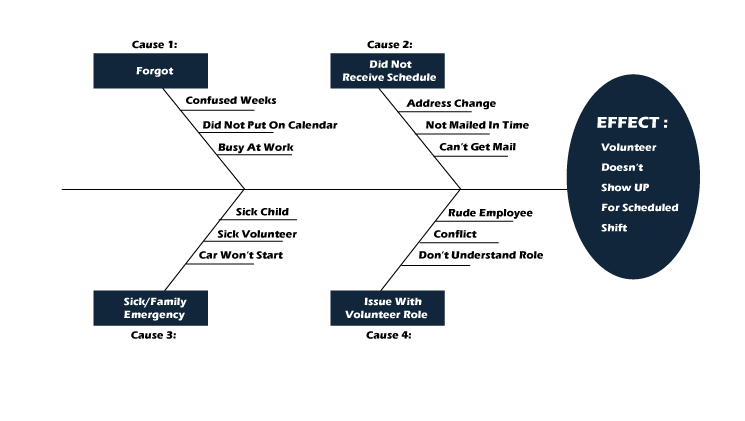
Uses of Cause-and-Effect Diagram
There are various uses of the cause-and-effect diagram:
- We can use a cause-and-effect diagram in problem-solving and finding the root causes of an issue.
- Gathering different perspectives on the case during the group brainstorming session.
- Exposing the association between various reasons leading to an issue.
How to Use the Cause-and-Effect Diagram
- Cause-and-Effect diagram finds the issue area which required to be examined and writes it at the top of the diagram.
- Find out the core reasons of the problem. These are the tags for the key branches of the fishbone diagram. These main categories comprise a material, machinery, methods, procedures, policies, people, etc.
- Identify probable sub-cases of the main causes and join them as sub-branches of the main branches.
- Examine the major and minor causes in-depth; refer to the diagram we created.
- When we identify the root cause, make an action plan outlining our strategy in order to overcome the problem.
Advantages of Cause-and-Effect Diagram
There are various advantages of the Cause-and-Effect diagram:
- It encourages group participation
- Increases process knowledge
- With a cause-and-effect diagram, we can determine the root causes.
- Shows possible causes of variation.
- Find out the areas for collecting.
Disadvantages of Cause-and-Effect Diagram
There are various disadvantages of the cause-and-effect diagram:
- It requires expertise and skills.
- Democratic selection of causes.
- Lack evidence
- Overemphasis gives irrelevant outcomes
- Multiple root causes
- Wastage of time and effort on unrelated causes.
- Tough to depict complex correlations among causes.
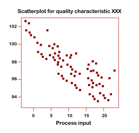
5. Scatter Diagram
The scatter diagram is also known as scatterplots, scatter graphs, scatter charts, scattergrams. Scatter diagram is one of the most popular 7 QC tools, which supports us in recognizing how two variables are associated with each other.
This diagram displays the values of the 2 variables, which are plotted along the 2 axes of the graph. The resulting point’s pattern discloses the correlation.
Uses of Scatter Diagram
There are various uses of scatter diagram:
- We use a scatter diagram in order to validate the association between causes and effects.
- Using a scatter diagram, we can know the causes of poor performance.
- We use a scatter diagram, to know the consequence of the independent variable over the dependent variable.
Advantages of the Scatter Diagram
The advantages of scatter diagram are:
- Plotting the diagram is so easy.
- It displays the association between 2 variables.
- A Scatter diagram is a great technique to display you a non-linear pattern.
- Observing and reading are simple.
Disadvantages of Scatter Diagram
There are various disadvantages of scatter diagram:
- The scatter diagram is incapable of providing you the exact extent of the correlation.
- The scatter diagram cannot display the quantitative measure of the association among the variables; scatter diagram only displays you the quantitative expression of the quantitative alteration.
How to Make a Scatter Diagram
- First, we have to collect the necessary data for validation. Recognize the cause-and-effect relationship between two variables.
- Find dependent and independent variables. The dependent variable, which is plotted along the vertical axis, is known as the measure parameter, and the independent variable, which is plotted along the horizontal axis, is known as a control parameter.
- Then we draw the graph according to the collected data. Add vertical and horizontal axis names and plot the trend line.
- On the basis of the trend line, examine the diagram in order to understand the correlation that can be characterized like No relation, Strong and Moderate.
6. Pareto Chart
A Pareto chart means the combination of a line graph and a bar graph. With pareto chart, we can find the facts required to set priorities.
The Pareto Chart organizes and presents data, to makes it more obvious the general significance of different issues or reasons for problems.
Pareto Chart contains a vertical bar chart and shows faults in order (from highest to lowest), while the line graph shows the cumulative percentage of results.
Uses of Pareto Chart
There are various uses of the Pareto Chart:
- It is used to find out the relative importance of the causes of a problem.
- With the help of the Pareto chart, we can calculate the impact of the defect on production.
- Using Pareto Chart, teams can identify the causes which will have the effect more when solved.
How to Create a Pareto Chart
- First, we have to choose the problem for investigation as well as choose a method and time for gathering information. If needed, then make a check sheet in order to record information.
- When we collect the data, experience it and organize in order to compute the cumulative percentage.
- Then we have to plot the graph, bars, cumulative percentage line, and add labels.
- Examine the chart to identify some of the trivially significant problems using the 80/20 rule. Plan further action to remove recognized faults by ascertaining their root causes.
Advantages of Pareto Chart
There are various advantages of the Pareto Chart:
- Pareto chart clearly shows the significant and insignificant variables.
- Pareto chart permits us to determine which problems may be essential to be addressed first.
- With the help of the Pareto Chart, we can work with limited resources since the data is showed hierarchically.
- Pareto chart also helps in solving issues, for example, problem-solving, decision-making skills, and time management.
Disadvantages of Pareto Chart
There are various disadvantages of the Pareto Chart:
- In the pareto chart, we may need more than one chart.
- Pareto chart only displays qualitative data; we cannot use it to calculate average, mean, or other statistics that may be required.
- A mistake in scoring problems, mistake in the application.
- It cannot be applied in all cases. It is only restricted to some cases only.
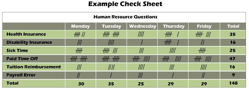
7. Check Sheet
- Check Sheet is a structure which is created for gathering and examining data.
- The data which is gathered by the check sheet is used like an input of the other tool, and data can be gathered on the basis of asking a question by what, when, where, how.
- The main objective of the check sheet is to summarize the data and to count the occurrences of an event.
- The number of occurrences of an event is counted in the check sheet, like non-conformance or defects. Hence the check sheet is also known as “tally sheet”.
- It is a systematic way to collect, record, and present qualitative and quantitative data about issues related to the problems.
How to Make a Check Sheet
- First, we need to find the required information.
- Why do we need to gather the data?
- What kind of information should we gather?
- How much data is important?
- Where should we collect the data?
- How should we collect the data?
- When should we collect the data?
- How should you measure the data?
- Next, we have to create our sheet on the basis of the title, content, information, and source information.
- Then, test the sheets. Ensure that each row and column in it are needed and appropriate and that the sheet is simple to reference and use. Test it with other collectors and make adjustments on the basis of the feedback.
Advantages of Check Sheet
There are various advantages of Check Sheet:
- In the Check Sheet, patterns of information are detected and shown clearly.
- In the Check Sheet, data is easy to understand from a simple process.
- The Check Sheet is based on facts, not opinions.
- Forces agreement on the definition of every condition.