An ogive is a graph that shows how many data values lie above or below a certain value in a dataset. This tutorial explains how to create an ogive in Excel.
Example: How to Create an Ogive in Excel
Perform the following steps to create an ogive for a dataset in Excel.
Step 1: Enter the data.
Enter the data values in a single column:

Step 2: Define the class limits.
Next, define the class limits you’d like to use for the ogive. I’ll choose class widths of 10:

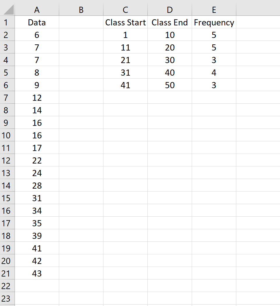
Step 3: Find class frequencies.
Next, we’ll use the following formula to calculate the frequencies for the first class:
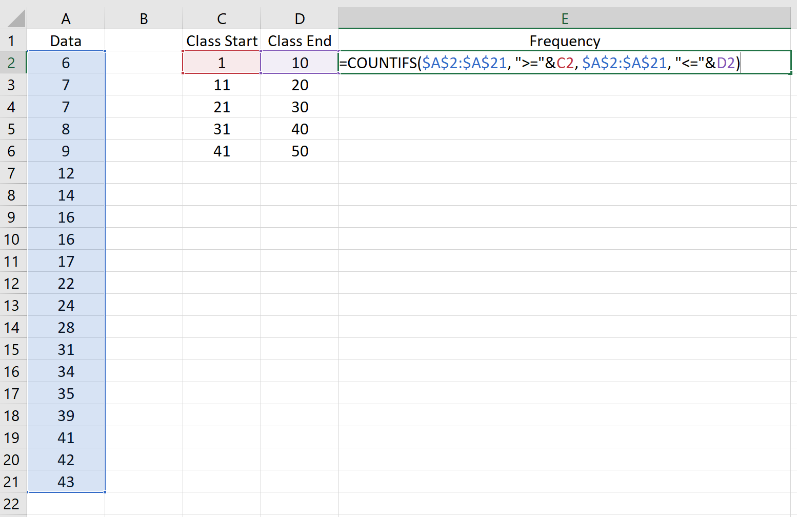
Copy this formula to the rest of the classes:
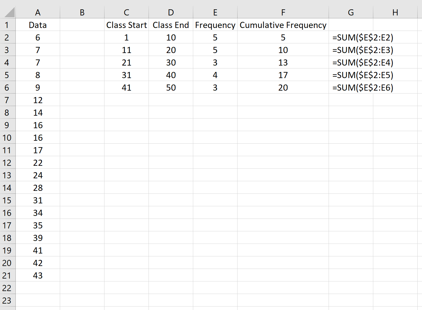
Step 4: Find cumulative frequencies.
Next, we’ll use the following formulas to calculate the cumulative frequency for each class:
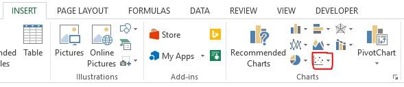
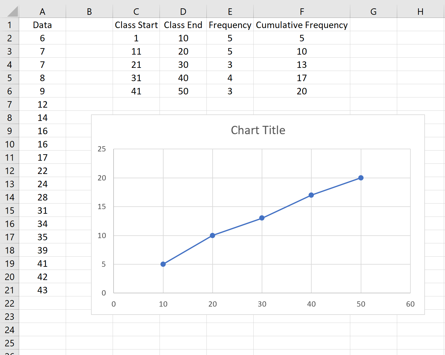
Step 5: Create the ogive graph.
To create the ogive graph, hold down CTRL and highlight columns D and F.

Along the top ribbon in Excel, go to the Insert tab, then the Charts group. Click Scatter Chart, then click Scatter with Straight Lines and Markers.
This will automatically produce the following ogive graph:
Feel free to modify the axes and the title to make the graph more aesthetically pleasing:
