100
Polymer App Layout
The app-layout elements are comprised of components such as toolbars, drawers, and headers. These are used for building high-quality, responsive layouts just with markup. Some of the elements are listed in the following table.
Table:
| Index | Elements | Description |
|---|---|---|
| 1) | app-box | This element works as container and has scroll effects, visual effects based on the scroll position. |
| 2) | app-drawer | This is a navigation drawer which will slide in and out from left or right. |
| 3) | app-drawer-layout | This will position the app-drawer and other content. |
| 4) | app-grid | This is used for creating responsive and fluid grid layouts using custom properties. |
| 5) | app-header | This element works at the top of the screen as a container for app-toolbars and has scroll effects, visual effects based on the scroll position. |
| 6) | app-header-layout | This element acts as a cover that positions the app-header and other content. |
| 7) | app-scrollpos-control | This element is used for saving and restoring the scroll position when multiple pages share the same document scroller. |
| 8) | app-toolbar | It is a horizontal toolbar which contains items that can be used for labeling, navigating, searching and other actions. |
Example:
Use the following command on command prompt to use app layout elements to move into the project directory.
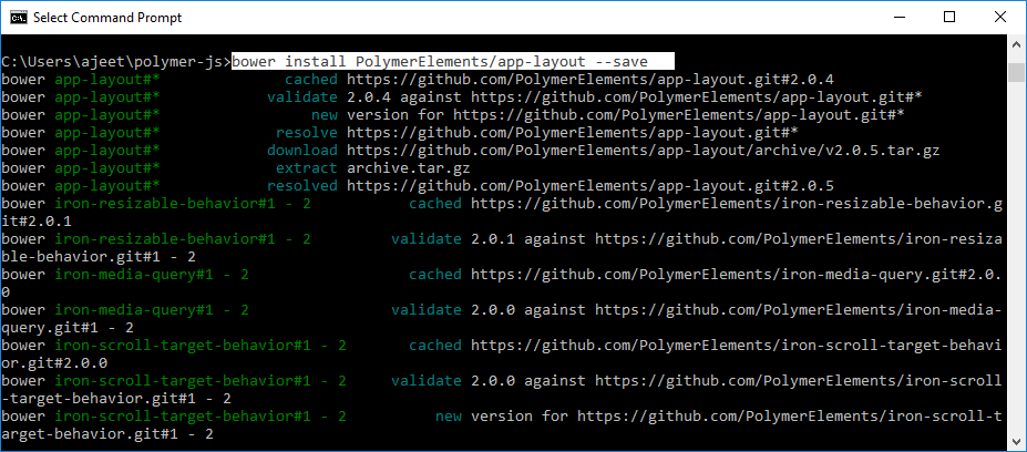
It will install the app-layout elements in bower-component folder. Then, you can import the file using <link> tag in your index.htmlfile.
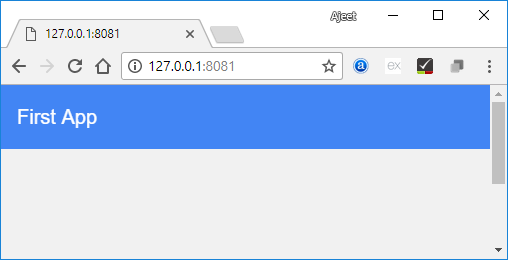
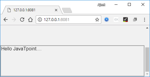
Output:
Next TopicApp Route