146
PrimeFaces ColorPicker
It is an input component with a color palette. It allows us to select and reselect color in web application. We can use it in our JSF application to get color as user input.
PrimeFaces provides <p:colorPicker> component to create ColorPicker in the web application. It has various attributes that are tabled below.
ColorPicker Attributes
| Attribute | Default value | Type | Description |
|---|---|---|---|
| id | null | String | It is an unique identifier of the component |
| value | null | Object | It is used to set value of the component. |
| required | false | Boolean | It is used to mark component as required. |
| valueChangeListener | null | ValueChangeListener | It is a method binding expression that refers to a method for handling a valuchangeevent. |
| requiredMessage | null | String | It is used to set message to be displayed when required field validation fails. |
| validatorMessage | null | String | It is used to set message to be displayed when validation fields. |
| mode | popup | String | It is used to set display mode. |
| style | null | String | It is used to set inline CSS style of the component. |
Skinning
Following are the structural style classes that are applicable on the ColorPicker.
| Style Class | Applies |
|---|---|
| .ui-colorpicker | Container element. |
| .ui-colorpicker_color | Background of gradient. |
| .ui-colorpicker_hue | Hue element. |
| .ui-colorpicker_new_color | New color display. |
| .ui-colorpicker_current_color | Current color display. |
| .ui-colorpicker-rgb-r | Red input. |
| .ui-colorpicker-rgb-g | Greed input. |
Example
Here, in the following example, we are implementing <p:colorPicker> component. This example contains the following files.
JSF File
// colorPicker.xhtml
ManagedBean
// ColorPicker.java
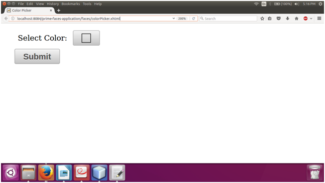
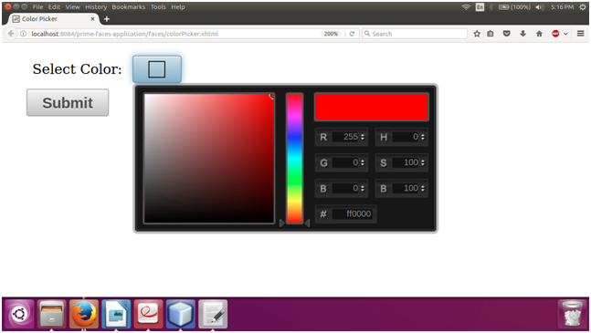
Output:
Next TopicPrimeFaces Inplace