80
PrimeFaces Inplace
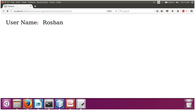
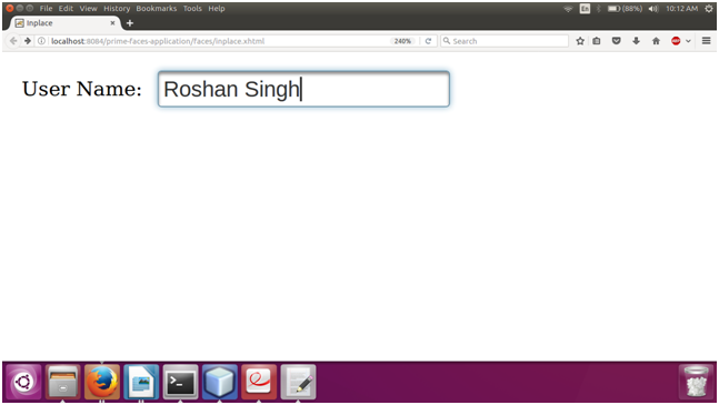
It is an input text box which provides easy editing of value at browser. It consists of two members, display element is the initial clickable label and inline element is the hidden content that is displayed when display element is toggled.
PrimeFaces provides <p:inplace> component which is used to create inplace in the JSF application. It has various attributes that are tabled below.
Inplace Attributes
| Attribute | Default value | Type | Description |
|---|---|---|---|
| label | null | String | It is used to set label to be shown in display mode. |
| emptyLabel | null | String | It is used to set label to be shown in display mode when value is empty. |
| effect | fade | String | It is used to set effect to be used when toggling. |
| effectSpeed | normal | String | It is a speed of the effect. |
| disabled | false | Boolean | It prevents hidden content to be shown. |
| style | null | String | It is used to set inline style of the main container element. |
| editor | false | Boolean | It specifies the editor mode. |
| saveLabel | Save | String | It is used to set tooltip text of save button in editor mode. |
| cancelLabel | Cancel | String | It is used to set tooltip text of cancel button in editor mode. |
| event | click | String | It is used to set name of the client side event to display inline content. |
| toggleable | true | Boolean | It defines if inplace is toggleable or not. |
Example
Here, in the following example, we are implementing <p:inplace> component. This example contains the following files.
JSF File
// inplace.xhtml
Output:
Next TopicPrimeFaces Knob