83
Pure.CSS Responsive Design
Pure.CSS uses the following classes to create a responsive design.
| Index | Class Name | Description |
|---|---|---|
| 1) | .pure-u-* | It is used to set the container to occupy required space on any device (compatibale for all devices). |
| 2) | .pure-u-sm-* | It is used for small screens. It sets the container to occupy required space on a device with width ? 568px. |
| 3) | .pure-u-md-* | It is used for medium screens. It sets the container to occupy required space on a device with width ? 768px. |
| 4) | .pure-u-lg-* | It is used for large screens. It sets the container to occupy required space on a device with width ? 1024px. |
| 5) | .pure-u-xl-* | It is used for extra-large screens. It sets the container to occupy required space on a device with width ? 1280px. |
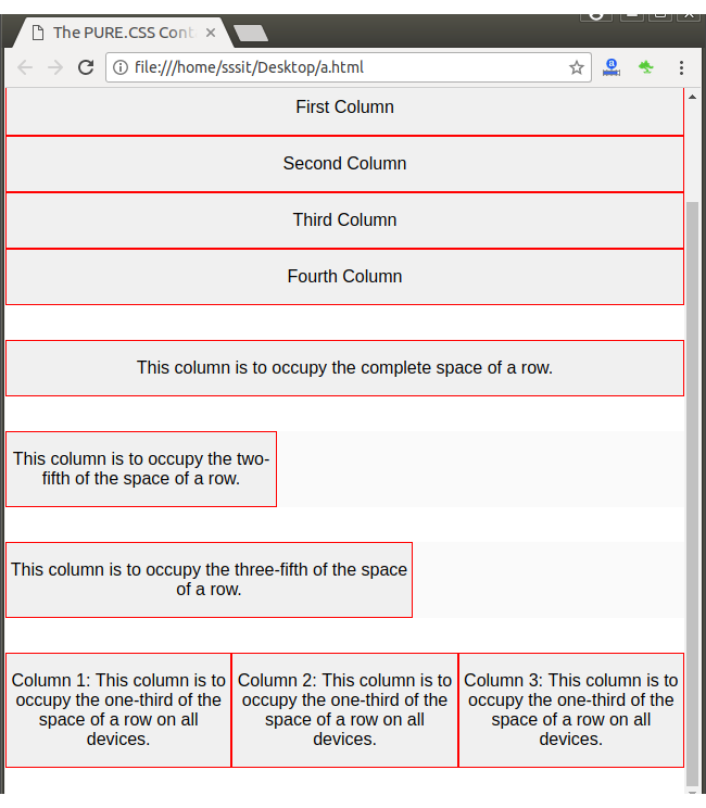
Example
Let’s create a responsive grid with a row having four columns. The columns should stack on small screens, should take up width: 50% on medium-sized screens, and should take up width: 25% on large screens.
For small screen we add: .pure-u-1 class
For medium sized screens we add: .pure-u-md-1-2
and for large sized screen: .pure-u-lg-1-4
See this example:
It will be look like this:
Output:
Next TopicPure.CSS Buttons