R Bar Charts
A bar chart is a pictorial representation in which numerical values of variables are represented by length or height of lines or rectangles of equal width. A bar chart is used for summarizing a set of categorical data. In bar chart, the data is shown through rectangular bars having the length of the bar proportional to the value of the variable.
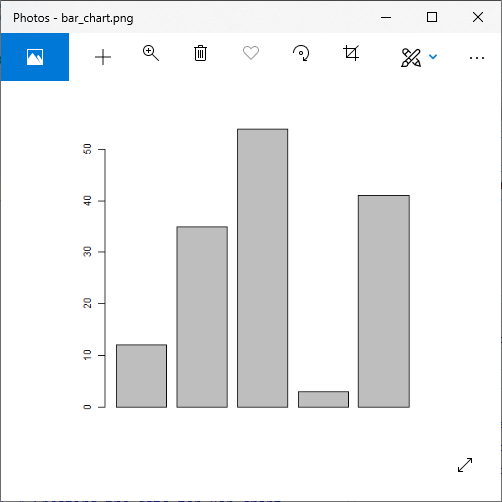
In R, we can create a bar chart to visualize the data in an efficient manner. For this purpose, R provides the barplot() function, which has the following syntax:
| S.No | Parameter | Description |
|---|---|---|
| 1. | H | A vector or matrix which contains numeric values used in the bar chart. |
| 2. | xlab | A label for the x-axis. |
| 3. | ylab | A label for the y-axis. |
| 4. | main | A title of the bar chart. |
| 5. | names.arg | A vector of names that appear under each bar. |
| 6. | col | It is used to give colors to the bars in the graph. |
Example
Output:
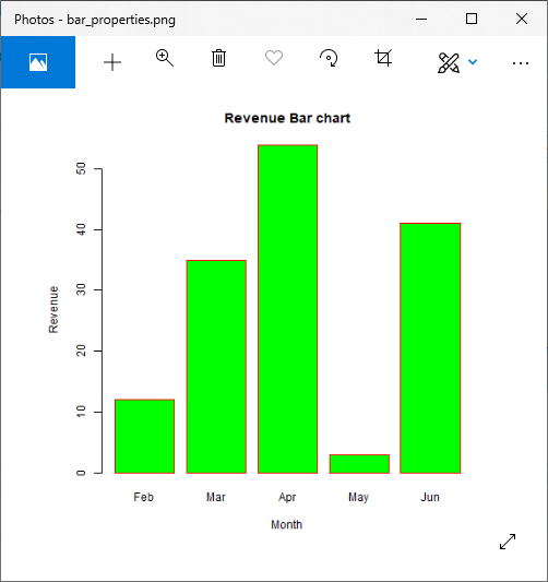
Labels, Title & Colors
Like pie charts, we can also add more functionalities in the bar chart by-passing more arguments in the barplot() functions. We can add a title in our bar chart or can add colors to the bar by adding the main and col parameters, respectively. We can add another parameter i.e., args.name, which is a vector that has the same number of values, which are fed as the input vector to describe the meaning of each bar.
Let’s see an example to understand how labels, titles, and colors are added in our bar chart.
Example
Output:
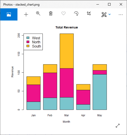
Group Bar Chart & Stacked Bar Chart
We can create bar charts with groups of bars and stacks using matrices as input values in each bar. One or more variables are represented as a matrix that is used to construct group bar charts and stacked bar charts.
Let’s see an example to understand how these charts are created.
Example
Output: