R Scatterplots
The scatter plots are used to compare variables. A comparison between variables is required when we need to define how much one variable is affected by another variable. In a scatterplot, the data is represented as a collection of points. Each point on the scatterplot defines the values of the two variables. One variable is selected for the vertical axis and other for the horizontal axis. In R, there are two ways of creating scatterplot, i.e., using plot() function and using the ggplot2 package’s functions.
There is the following syntax for creating scatterplot in R:
Here,
| S.No | Parameters | Description |
|---|---|---|
| 1. | x | It is the dataset whose values are the horizontal coordinates. |
| 2. | y | It is the dataset whose values are the vertical coordinates. |
| 3. | main | It is the title of the graph. |
| 4. | xlab | It is the label on the horizontal axis. |
| 5. | ylab | It is the label on the vertical axis. |
| 6. | xlim | It is the limits of the x values which is used for plotting. |
| 7. | ylim | It is the limits of the values of y, which is used for plotting. |
| 8. | axes | It indicates whether both axes should be drawn on the plot. |
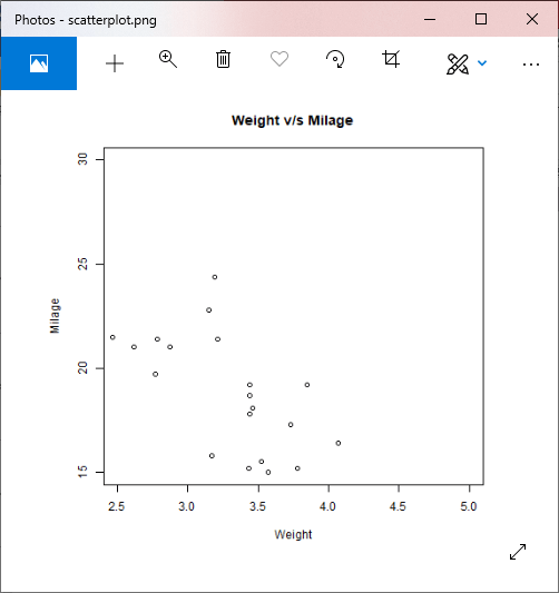
Let’s see an example to understand how we can construct a scatterplot using the plot function. In our example, we will use the dataset “mtcars”, which is the predefined dataset available in the R environment.
Example
Output:
Scatterplot using ggplot2
In R, there is another way for creating scatterplot i.e. with the help of ggplot2 package.
The ggplot2 package provides ggplot() and geom_point() function for creating a scatterplot. The ggplot() function takes a series of the input item. The first parameter is an input vector, and the second is the aes() function in which we add the x-axis and y-axis.
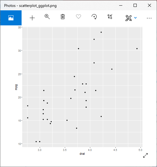
Let’s start understanding how the ggplot2 package is used with the help of an example where we have used the familiar dataset “mtcars”.
Example
Output:
We can add more features and make a more attractive scatter plots also. Below are some examples in which different parameters are added.
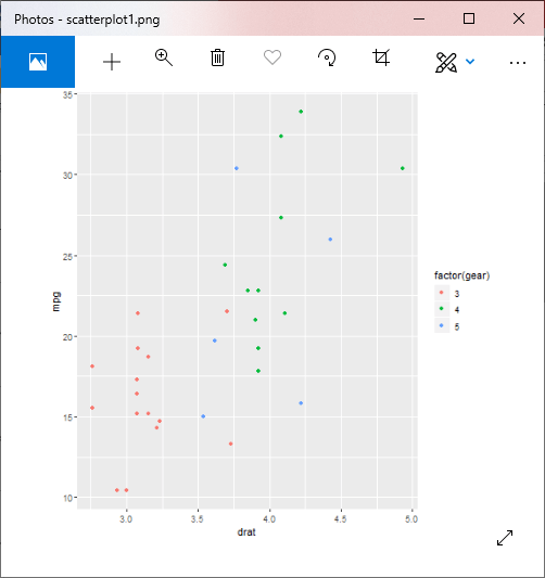
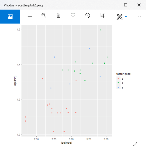
Example 1: Scatterplot with groups
Output:
Example 2: Changes in axis
Output:
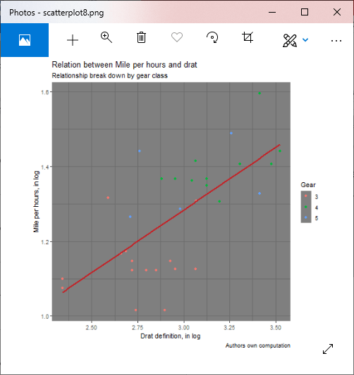
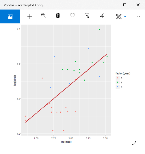
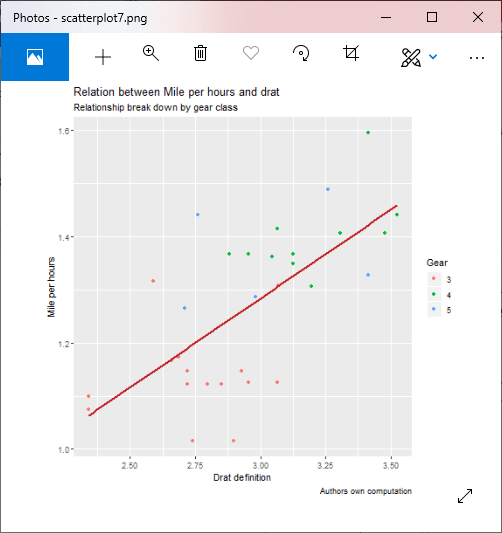
Example 3: Scatterplot with fitted values
Output:
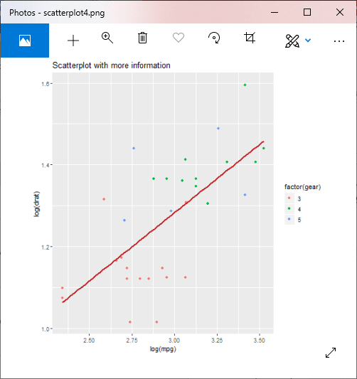
Adding information to the graph
Example 4: Adding title
Output:

Example 5: Adding title with dynamic name
Output:
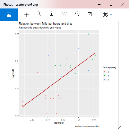
Example 6: Adding a sub-title
Output:
Example 7: Changing name of x-axis and y-axis
Output:
Example 8: Adding theme
Output: