React Native Layout and Flexbox
React Native Flexbox is an algorithm to specify the layout of component’s children. It provides a consistent layout on different screen sizes.
Property of Flexbox
Flexbox provides three main properties to achieve the desired layout. These properties are: flexDirection, justifyContent, and alignItems.
| Property | Values | Description |
|---|---|---|
| flexDirection | ‘column’, ‘row’ | Used to align its elements vertically or horizontally. |
| justifyContent | ‘center’, ‘flex-start’, ‘flex-end’, ‘space-around’, ‘space-between’ | Used to distribute the elements inside the container. |
| alignItems | ‘center’, ‘flex-start’, ‘flex-end’, ‘stretched’ | Used to distribute the element inside the container along the secondary axis (opposite to flexDirection). |
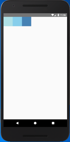
React Native Flex Direction
The flexDirection adds the style to the component in a primary axis of its layout. It has a property row and column to organize children horizontally and vertically respectively. The default flexDirection is a column.
Output
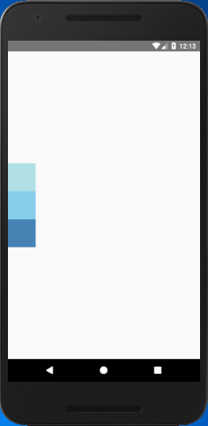
React Native Justify Content
The justifyContent determines the distribution of children component along the primary axis. The children component are distributed at the start, end, center, or space evenly.
Output
React Native Align Items
The alignItems determine the alignment of children component along the secondary axis. If the primary axis is a column, then the secondary is a row, and when a primary axis is a row, then the secondary is a column. Using the alignItems, the children are aligned at start, end, center, or stretched.
Output
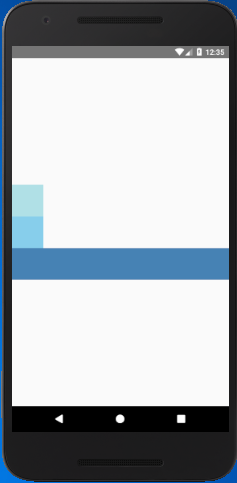
Note: The stretch does not work if the children have a fixed dimension along the secondary axis. In above example, the alignItems: stretch will not work until we remove width: 50.