React Time-Picker
Time picker allows users to select any one time.
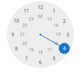
Time Picker allows the users to select a single time (in an hour or a minute format). The filled circle is indicating the selected time at the end of the clock.
Time picker for the React application.
- It supports any language virtually.
- Just install npm to execute the add react-time-pickeror yarn add react-time-picker operator.
- Then, Import it by adding the TimePicker from ‘react-time-picker’.
- We can use it by adding <Time Picker />
Note: React-time-picker will use better with react-date-picker or react-date time-picker.
Getting Started
The project uses the React 16.3 or later version. If we use an older version of React, then refer to the below given table to find the appropriate react-time-picker version.
| React Version | Latest compatible react-time-picker version |
|---|---|
| 16.3 | latest |
| 16.0 | 3. x |
Legacy browser
If we want to support older browsers which are Internet Explorer 10, then we will need to use Intl.js or Intl polyfill with React-Date-Picker.
Installation Process:
Firstly, Add the react-time-picker to the project by executing the npm install react-time-picke and yarn add react-time-picker.
Example 1:
Custom Style
We import the react time picker without importing the Time Picker from the ‘react-time-picker/dist/entry.nostyle‘ if we use the default react time picker then it will not work.
The styles loaded by the default input file are React-time-picker/dist/TimePicker.css and React-clock/dist/Clock.css.
You need to copy it into the project to build it.
User guide
It displays the input field with the custom input, native input, and a clock.
Property:
| Prop name | Description | Default value | Example values |
|---|---|---|---|
| amPmAriaLabel | aria-label is mainly used in AM/PM selection in amPmAriaLabel. | N/A | “Select AM/PM” |
| className | Class name(s) is added with “react-time-picker” to the parent React-Time-Picker <div> element. | N/A | String: “class1 class2” Array of strings: [“class4”, “class5 class6”] |
| autoFocus | autoFocus focuses at the input part. | n/a | true |
| clearAriaLabel | cleararia-label is used for the delete button. | n/a | “Clear value” |
| clockAriaLabel | aria-label is used for the clock button. | n/a | “Toggle clock” |
| clearIcon | It is the Delete button content. which will setting the value of null will hide the icon. | (default icon) | String: “Clear” React element: <ClearIcon /> |
| clockClassName | Class name is used to added with “react-clock” to the parent React-Clock <time> with the element. | n/a | String: “class1 class2” Array of strings: [“classA”, “classB classc”] |
| clockIcon | It is used in Clock content button. The value to null can hide the icon. | (default icon) | String: “Clock” React element: <ClockIcon /> |
| disabled | The time selector will be disabled. | false | true |
| closeClock | It will close the watch on the value selection. | true | false |
| disableClock | When set to true, it removes the clock and button by toggling the visibility. | false | true |
| hourAriaLabel | It is the area-label for the input time. | n/a | “Hour” |
| format | It supports the Input format based on the Unicode Technical Standard. The values which are supported is: hh, m, mm, s, ss, a, H, HH, h. | n/a | “h:m:s a” |
| hourPlaceholder | The placeholder for the time entry. | “–“ | “hh” |
| isOpen | Used to open the watch features. | false | true |
| locale | It is the IETF language tag. | User’s browser settings | “hu-HU” |
| minuteAriaLabel | minuteAria-label is used for minutes input. | n/a | “Minute” |
| maxDetail | It can be “hour”, “minute” or “second”. The detailed selection will be used here. | “minute” | “second” |
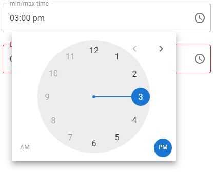
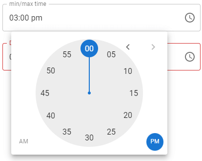
| maxTime | The user can select the maximum time here. | n/a | Date: new Date() String: “23:11:00” |
| minTime | The user can select the minimum time here. | n/a | Date: new Date() String: “12:18:00” |
| nativeInputAriaLabel | nativeAria-label is a native time input. | n/a | “Time” |
| onChange | It is called where the user choosing a valid time. | n/a | (value) => alert(‘New time is: ‘, value) |
| onClockOpen | When the watch is opened, onClockOpen is used. | n/a | () => alert(‘Clock opened’) |
| onClockClose | When the clock closes it works. | n/a | () => alert(‘Clock closed’) |
| required | If the entry of the date is req. | false | true |
| secondAriaLabel | secondAria-label is used in the second input. | n/a | “Second” |
| openClockOnFocus | Used to open the clock in input focus. | true | false |
| secondPlaceholder | Second placeholder is mainly used in the second entry. | “–“ | “ss” |
| value | It is just Input value what we used. | n/a | Date: new Date() String: “20:11:00” |
Clock:
The time picker component will passes the props of react-clock, except the classname which is used in the clockClassName.
Types of Time Pickers
Various types of time selectors which are dropdown, scroll, and wheel. The UI design of the time picker helps us determine the type you use in React.
1. Dropdown
The dropdown time picker is the easiest time pickers and generallyused to select the hour and minute at the dropdown format. It is not as inherent as other time pickers, but it is better than a traditional text box because it let us select options instead of letting the user text on own own. It helps clear the confusion at the needed format.
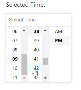
Image courtesy of Clue Mediator
2. Displacement
When we use the scroll selector as the name suggests,, the user will scrolls to select the needed date or time infor.
Image courtesy of Hossein
Wheel
The wheel time selector simulates a real clock and makes it easier for the customer to select the exact time.
It asking about the time or intuitively changes where the numbers at the wheel immediately selects the next minutes. We can change the minute value in many ways depending at the implementation.
Some wheel time selectors display the numeric digits (as, hours or minutes) after selecting them, and have some buttons we can select. The buttons are simple arrows that allow s to toggle between the hours and minutes clock arrow.
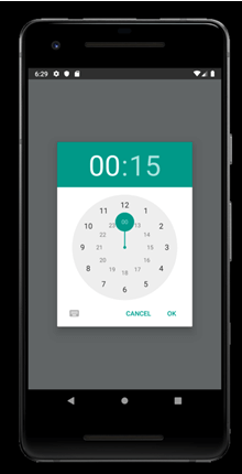
Image courtesy of Vonovak
Implementation of the time picker
Now that we know that how useful time pickers is, you will learn that how to create it with the help of React. This tutorial focuses on a time picker with a Material-UI, as it is the most popular React library on the GitHub.
We have to download and install Node.js and npm in the system before we start.
Create the app
We need to build your React app in the same place where we eventually build our time picker to get started. Run the below command in the CMD:
This command generates React app with the below files:
Installing Libraries
We need to install two libraries before using the time picker in our Material-U: First is the Material-UI library and second is the library that will handle our dates.
Many developers use Moment.js because it is easy to use; however, the package size of date-fns is four times smaller (19.5 kB) than that of Moment.js (71.9 kB), making date-fns a faster option.
To install the libraries, we have to use npm, which is the default package for the React app.
Start to change the directory of the current project (which is installed previously) with the command cd time-picker.
Lastly, install the Material-UI and date-fns libraries here:
cd time selector
Create Time Picker
Now, we are going to build a time picker. You have many options to choose in the Material-UI library:
- Desktop date: It selects dates with the suitable user interface for our desktop
- Date mobile: It selects dates with the suitable user interface of mobile devices
- Time: It is a selector used mainly for time
- Date and time: It is the selector which has built-in date and time capabilities here.
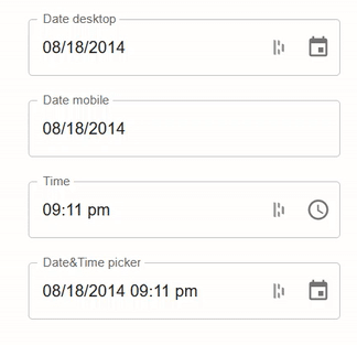
Now take a look at every option in action:
In this code, we import the required libraries. It includes React and many time pickers Like: (DateTimePicker, DesktopDatePicker, TimePicker, and MobileDatePicker) from the Material-UI library.
The code will include the adapter for the date-fns (AdapterDateFns) which handles dates and import format which help structure the page.
Here, we define the app component and export it by using the app’s default export function. You can define it without export default and export it by using the export default apps; however, the solution is the simplest option.
We need to keep track of the date and store a new value every time it is changed after exporting the component. If you don’t track the changes, the date and time will not update when you select a new time. In the above code, the useState () hook initializes the date (2014-08-18T21:11:54), and handleChange function will handle the changes.
Now we want JSX, the React extension to the JavaScript language syntax, to create a realtime selector here:
JSX provides a structural component that is rendered by using the syntax familiar to the developers. It is the same as the appearance of HTML.
Above, we also create the selectors by using the selector modules in Material-UI, with appropriate props for label, value, onChange, and inputFormat, that indicate the format where the dates are displayed.
After that, we use LocalizationProvider to combine individual modules into single-parent elements. It indicates that you are using the date-fns library to handle the dates.
Finally, we have to apply a margin so that the time pickers line up in the middle of the web page. It is done by enclosing the code in the div element and applying the margin to it by using the inline style.
Below is the code snippet that needs to be placed in src/App.js for the App component to be exported in the index.js and displayed at the screen:
Start the application by using the npm start command and navigate the URL http://localhost:3000/ on the browser.
Style the Time Picker
Most organizations have their brand that they want to add at time picker, so Material-UI lets you add two imports to add any theme to the page. One import lets us create and apply themes, and the other will let us add any specific color.
To start styling time picker, add the below imports at the top of the src/App.js file:
Next, we must create a theme for your component (by createTheme function). In the example, we will focus on typography and color, but we can customize the time picker as much as we want.
We need to add the following code between imports and app component in our src/App.js file to create a theme:
The last step in the styling process is we have to apply the theme to component. For that, we need to wrap the div element with the ThemeProvider element and pass the theme:
The code applies the theme with the parameters we choose in the createTheme() function to the website.
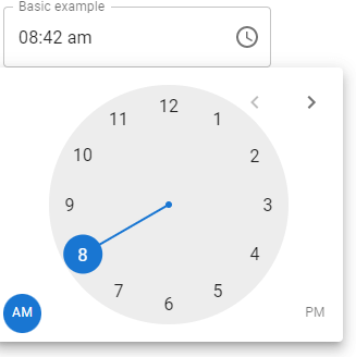
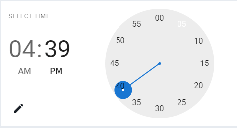
Basic Usage of Time-picker
The time picker is rendered as a modal dialog in the mobile, and a textbox is also used with the popup on the desktop.
Output:

When we click here and put the time with AM/PM then, it will come like this:
Static mode
It’s possible to read any time picker inline. It will enable building custom popover/modal containers.
Output:
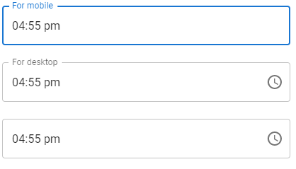
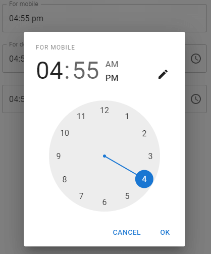
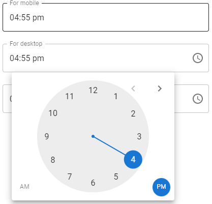
Responsiveness
The time picker component is increased by the device which will runs.
- The MobileTimePicker component works for small screens and touch devices.
- The DesktopTimePicker component works for big and large devices and mouse devices like, Laptop and Pcs.
- By default, The timePicker component will read the desktop version if the @media(pointer:good) query matches the timepicker. It can be customized with the desktopModeMediaQuery properties.
Output:
When we click for mobile apps:
When we click for desktop:
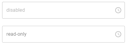
Form props
The time picker will disable or read-only.
Output:
Time validation
Output:
Landscape
Output:
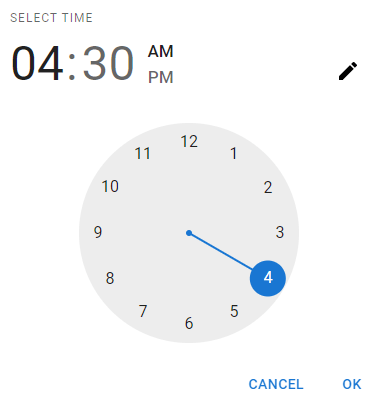
Sub-components
Some lower-level sub-components (ClockPicker) are exported. It is being read without any wrapper and outer logic that are masked input, date values parsing and validation, etc.
Output:
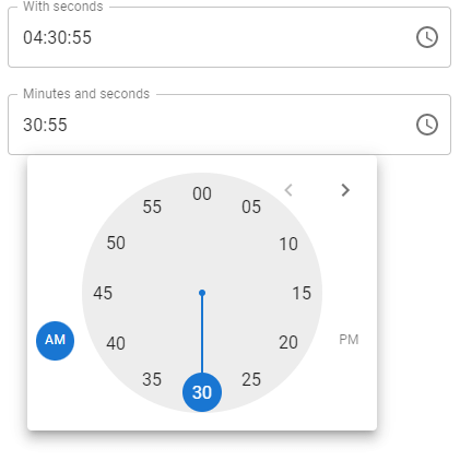
Second:
The input second is used as a selection of the accurate time point.
Output:
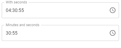
When we need with the second:
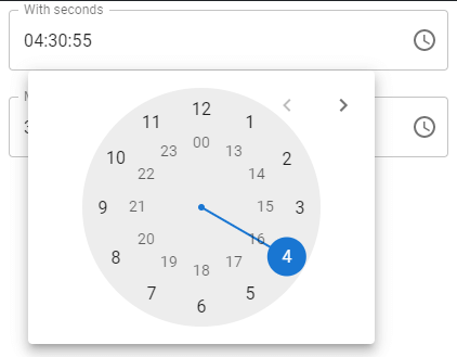
When we want the minutes and second both: