88
RichFaces <rich:calendar>
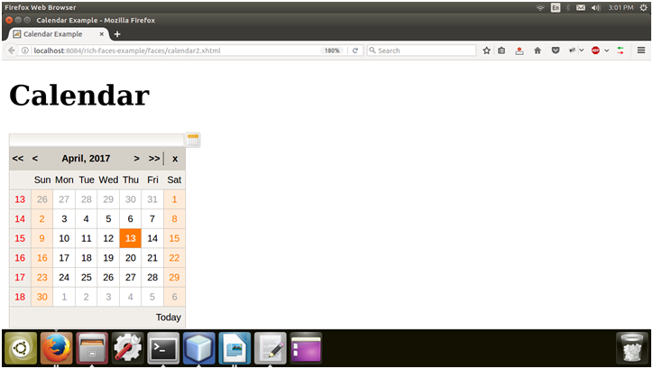
It is used to enter a date and time through a pop-up calendar. The pop-up calendar can navigate through months and years. We can also customize its look and feel.
The <rich:calendar> component requires only one value attribute which holds the current selected date.
Style classes and skin parameters
The following table contains the Style classes (selectors) and corresponding skin parameters for the calendar component.
| Class | Function | Skin Parameters | Mapped CSS properties |
|---|---|---|---|
| .rf-cal-extr | It is used to define the styles for a pop-up calendar exterior. | panelBorderColor | border-color |
| .rf-cal-btn | It is used to define styles for a calendar button. | No skin parameters. | |
| .rf-cal-hdr | It is used to define the styles for a calendar header. | panelBorderColor additionalBackgroundColor | border-bottom-color background-color |
| .rf-cal-hdr-optnl | It is used to define the styles for an optional header. | additionalBackgroundColor generalSizeFont | background-color font-size |
| .rf-cal-hdr-month | It is used to define the styles for the month header. | headerSizeFont headerFamilyFont | font-size font-family |
| .rf-cal-ftr | It is used to define the styles for a calendar footer. | additionalBackgroundColor generalSizeFont | background font-size |
| .rf-cal-ftr-optnl | It is used to define the styles for an optional footer. | additionalBackgroundColor generalSizeFont | background font-size |
| .rf-cal-tl | It is used to define the styles for calendar toolbars. | headerSizeFont headerFamilyFont | font-size font-family |
| .rf-cal-tl-ftr | It is used to define the styles for a toolbar item in the calendar footer. | generalSizeFont generalFamilyFont | font-size font-family |
| .rf-cal-tl-btn | It is used to define styles for a toolbar button. | No skin parameters. | |
| .rf-cal-tl-btn-dis | It is used to define styles for a disabled toolbar button. | No skin parameters. | |
| .rf-cal-tl-btn-hov | It is used to define the styles for toolbar items when it is hovered over with the mouse cursor. | calendarWeekBackgroundColor generalTextColor | background-color color |
| .rf-cal-tl-btn-press | It is used to define the styles for toolbar items when it is pressed. | panelBorderColor | border-right-color, border-bottom-color |
| .rf-cal-tl-close | It is used to define styles for a Close button in a toolbar. | No skin parameters. | |
| .rf-cal-c | It is used to define the styles for regular calendar cells. | tableBackgroundColor generalSizeFont | background-color font-size |
| .rf-cal-c-cnt | It is used to define styles for the content of a cell. | No skin parameters. |
Example
Here, in the following example, we are implementing <rich:calendar> component. This example contains the following files.
JSF File
// calendar.xhtml
Managed Bean
// Calendar.java
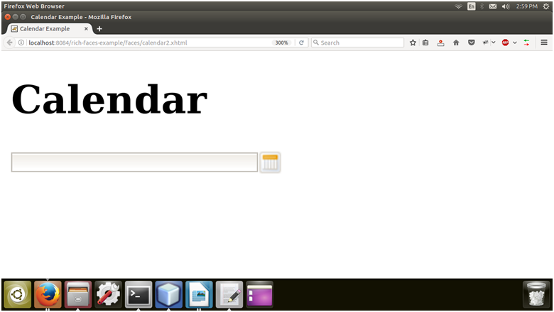
Output:

Now, click on the calendar icon and select date from the pop up.

After selecting date.

Next TopicRichFaces <rich:editor>
