78
RichFaces InplaceInput
RichFaces provides <rich:inplaceInput> component which is used to create a editable text box. It allows text to be entered in-line in blocks of text. It improves readability of the text.
It has three functional states:
- View state: In this state, the component displays its initial setting, such as click to edit.
- Edit state: In this state, the user can input text.
- Changed state: In this state, the new value for the component has been confirmed but can be edited again if required.
Style classes and skin parameters
The following table contains Style classes and corresponding skin parameters for inplaceInput.
| Class | Function | Skin Parameters | Mapped CSS properties |
|---|---|---|---|
| .rf-ii | It is used to define styles for the in-place input when it is in the default state. | editorBackgroundColor | background-color |
| .rf-ii-act | It is used to define styles for the in-place input when it is in the editing state. | No skin parameters. | |
| .rf-ii-chng | It is used to define styles for the in-place input when it is in the changed state. | No skin parameters. | |
| .rf-ii-dis | It is used to define styles for the in-place input when it is in the disabled state. | No skin parameters. | |
| .rf-ii-fld | It is used to define styles for the in-place input field. | editBackgroundColor generalTextColor | background-color, border-bottom-color color |
| .rf-ii-lbl | It is used to define styles for the label of the in-place input. | generalSizeFont | font-size |
| .rf-ii-dflt-lbl | It is used to define styles for the default label of the in-place input. | No skin parameters. | |
| .rf-ii-btn | It is used to define styles for the buttons for the in-place input. | tabBackgroundColor | background-color |
| .rf-ii-btn-p | tabBackgroundColor | background-color | |
| .rf-ii-btn-set, .rf-ii-btn-prepos, .rf-ii-btn-pos | It is used to define the positioning of the buttons. | No skin parameters. | |
| .rf-ii-btn-shdw | It is used to define styles for the button shadows for the in-place input. | No skin parameters. | |
| .rf-ii-btn-shdw-t, .rf-ii-btn-shdw-b, .rf-ii-btn-shdw-l, .rf-ii-btn-shdw-r | These classes define the top, bottom, left, and right edge of the button shadows. | No skin parameters. | |
| .rf-ii-none | It is used to define styles for the in-place input when it cannot be edited. | No skin parameters. |
Example
Here, in the following example, we are implementing <rich:inplaceInput> component. This example contains the following files.
JSF File
// inplace-input.xhtml
Managed Bean
// User.java
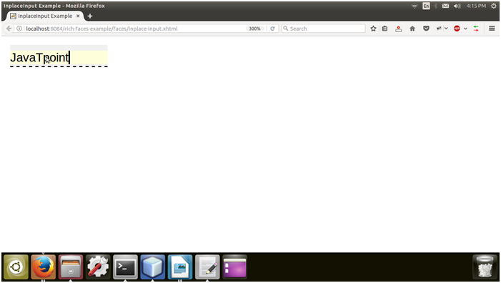
Output:
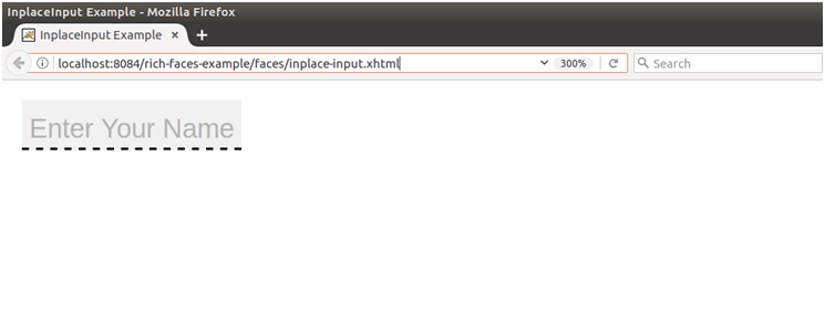
Now, Enter text
Next TopicRichfaces <rich:inplaceselect>