RichFaces <rich:panelMenu>
This component is used in conjunction with <rich:panelMenuItem> and <rich:panelMenuGroup> to create an expanding, hierarchical menu. The <rich:panelMenu> component?s appearance can be highly customized, and the hierarchy can stretch to any number of sub-levels.
The <rich:panelMenu> component does not need any extra attributes declared for basic usage. However, it does require child <rich:panelMenuGroup> and <rich:panelMenuItem> components.
Style classes and skin parameters
The following table contains the style classes and corresponding skin parameters for the panelMenu.
| Class | Function | Skin Parameters | Mapped CSS properties |
|---|---|---|---|
| .rf-pm | It is used to define styles for the panel menu itself. | No skin parameters. | |
| .rf-pm-gr | It is used to define styles for a panel menu group. | panelBorderColor | border-top-color |
| .rf-pm-exp, .rf-pm-colps | These classes define styles for the panel menu when it is expanded or collapsed. | No skin parameters. | |
| .rf-pm-ico | It is used to define styles for the panel menu icons. | No skin parameters. | |
| .rf-pm-ico-exp, .rf-pm-ico-colps | These classes define styles for the panel menu icons when they are expanded or collapsed. | No skin parameters. | |
| .rf-pm-hdr-exp, .rf-pm-hdr-colps | These classes define styles for the panel menu headers when they are expanded or collapsed. | No skin parameters. | |
| .rf-pm-itm | It is used to define styles for a panel menu item. | panelBorderColor generalTextColor | border-top-color color |
| .rf-pm-itm-gr | It is used to define styles for a panel menu item as part of a panel menu group. | No skin parameters. | |
| .rf-pm-itm:hover | It is used to define styles for a panel menu item when the mouse hovers over it. | additionalBackgroundColor | background-color |
| .rf-pm-itm-sel | It is used to define styles for a panel menu item when it is selected. | No skin parameters. | |
| .rf-pm-itm-dis | It is used to define styles for a panel menu item when it is disabled. | tabDisabledTextColor | color |
| .rf-pm-itm-ico | It is used to define styles for the icon in a panel menu item. | No skin parameters. | |
| .rf-pm-itm-exp-ico | It is used to define styles for the icon in a panel menu item when it is expanded. | No skin parameters. | |
| .rf-pm-itm-lbl | It is used to define styles for the label in a panel menu item. | generalSizeFont generalFamilyFont | font-size font-family |
| .rf-pm-gr | It is used to define styles for a panel menu group. | panelBorderColor | border-top-color |
Example
Here, in the following example, we are implementing <rich:panelMenu> component. This example contains the following files.
JSF File
// panel-menu.xhtml
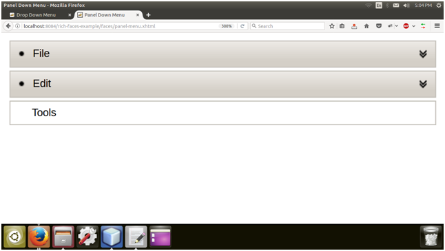
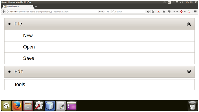
Output:
By default panel is collapsed.

We can expend panel by clicking.

