130
RichFaces <rich:tooltip>
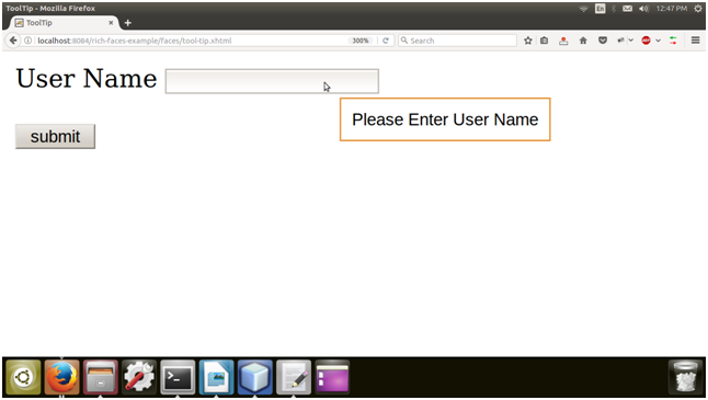
This component provides an informational tool-tip. We can attach tool-tip any control and is displayed when hovering the mouse cursor over the control.
We need to use values attribute for tool-tip text and is usually shown when the mouse cursor hovers.
Style classes and skin parameters
The following tables contains the style classes and corresponding skin parameters for the tooltip.
| Class | Function | Skin Parameters | Mapped CSS properties |
|---|---|---|---|
| .rf-tt | It is used to define styles for the tool-tip itself. | No skin parameters. | |
| .rf-tt-loading | It is used to define styles for the tool-tip when it is loading. | No skin parameters. | |
| .rf-tt-cnt | It is used to define styles for the tool-tip content. | No skin parameters. | |
| .rf-tt-cntr | It is used to define styles for the progressed portion of the progress bar. | tipBorderColor generalFamilyFont generalSizeFont | border-color font-family font-size |
Example
Here, in the following example, we are implementing <rich:tooltip> component. This example contains the following files.
JSF file
// tool-tip.xhtml
ManagedBean
// User.java
Output:
Next Topic#