A boxplot (sometimes called a box-and-whisker plot) is a plot that shows the five-number summary of a dataset, which includes the following values:
- Minimum
- First Quartile
- Median
- Third Quartile
- Maximum
Using these five values, we can create a boxplot to gain a solid understanding of the distribution of values in a given dataset.
We can also compare two or more boxplots to quickly visualize the differences between two or more datasets.
The following step-by-step example shows how to create side-by-side boxplots in Excel.
Step 1: Enter the Data
First, let’s enter the values for three datasets in Excel:

Step 2: Create the Side-by-Side Boxplots
Next, highlight cells A1:C21.

Next, click the Insert tab along the top ribbon. Then click Recommended Charts.

Next, click All Charts and then click Box & Whisker. Then click OK.

The following side-by-side boxplots will automatically appear:

Step 3: Customize the Plot
Next, click the gridlines in the background of the plot and then click delete.
Then click the green plus “+” sign in the top right corner of the plot. Then check the box next to Legend and select Bottom as the position:

Lastly, feel free to click on any of the individual boxplots and change the colors to anything that you’d like.
Here’s what our final side-by-side boxplots look like:
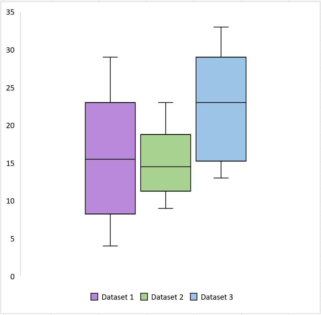
We can make the following observations from the boxplots:
- Dataset 1 has the highest variance (since it’s the longest boxplot)
- Dataset 2 has the lowest variance (since it’s the shortest boxplot)
- Dataset 3 has the highest median value (as indicated by the horizontal bar in the middle of the box)
Additional Resources
How to Create a Stem-and-Leaf Plot in Excel
How to Create a Dot Plot in Excel
How to Create a Double Doughnut Chart in Excel