Views in Xamarin
The building blocks of cross-platform mobile application is Xamarin.Forms views. Views are the user-interfaces objects such as labels, buttons, and sliders which are known as controls or widgets in other programming environments.
Views can be divided into several categories:
Views for Presentation
Xamarin.Forms have three primary views for working with text:
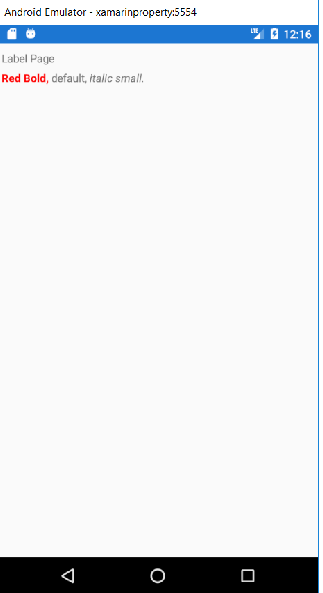
- Label
The label is used to show the text in a single or multi-line text. Here, we can show the text with multiple formatting options in the same line. - Entry
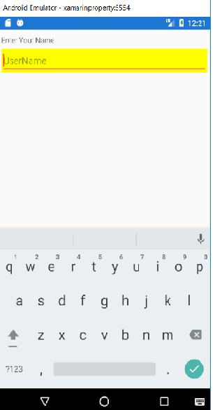
To enter the text in a one-line uses the Entry. The entry has password mode. - Editor
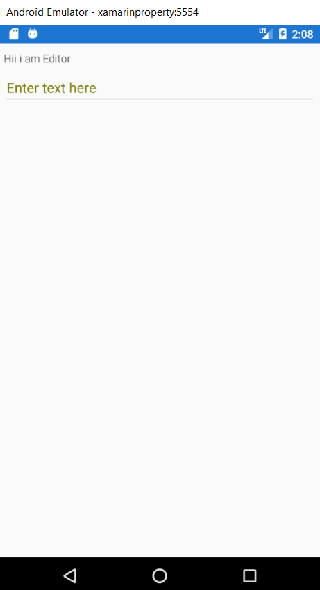
To enter the text, which can take more than one line.
Label: Label view is used to display the text. We can show multiple lines of text or a single line of text. Label can present text with multiple formatting options used in inline. The label view can wrap or truncate the text when it can’t fit on one line.
MainPage.Xaml
Entry: Entry is used to accept the single-line text. Entry offers controls over colours and fonts. Entry has a password mode and can show placeholder text until we entered the text.
MainPage.XAML
Editor: Editor is used to enter the multi-line text input. Editor offers the controls over colours and fonts. Editor like other-text presenting views shows the text property. Editor can be used to set and read the text presented by editor.
- Image
Image displays the Bitmap. In the common project,Bitmaps can be downloaded over the web and can embedd as a resource . We can share the images across platforms with Xamarin.Forms. Images are the important part of application navigation,branding and usability. Xamarin.Forms application needs to be share images across all the platforms. It also displays different images on each platform. Platform-specific images are also required icons and splash screens.
Display images
Xamarin.Forms use the image view to display the images on a page. It has two important pages:
- Source: An image source instance that can be file, Uri, Resources which sets the image to display.
- Aspect: how to size the image within the bounds it is being displayed within.
- ImageSource: Instances can be obtained using the static method for each type of image source.
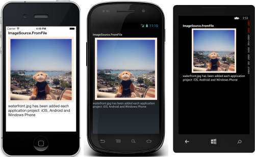
- From File: Requires a name of the file(filename) or path of the file (Filepath) which can be resolved on each platform.
To show the image on the Xamarin. Forms we should have to follow the following steps:
Here, we are going to add the image through the file name. For that firstly, we should have to download the image (“jpg image download”). Copy the image from the folder where we saved the file and paste it into a drawable folder for this we should have to follow these steps: the Android-> Resources-> Drawable.
MainPage.XAML
Output
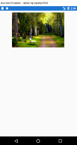
Now we will learn how we can use the image in the backend code.
MainPage.XAML
MainPage.XAML.CS
Output

- FromUri: Requires Uri (Uniform Resource Indicator)object e.g. new Uri (“https://sample-videos.com/download-sample-jpg-image”).
Here, we will display the images through the URI in which we give the path from the internet to the source. - From resource: Requires resource identifier to an image file embedded in the application or .Net Standard Library Project with a BuildAction: EmbeddedResource.
- FromStream: Requires a stream that supplies the image data.
- Aspect: Aspect property determines how the image will be scaled to fit the display area:
- Fill: Stretches the image to completely and fill the display area. The result of this can be an image is being distorted.
- AspectFill: Clips the images so that it fills the display area while preserving the aspect (i.e. no distortion).
- AspectFit: Letterboxes the image (if required) so that the entire image fits into the display area, with blank spaces added to top/bottom depend on whether the image is wide or tall.
Images can be loaded from Local file, embedded resource or downloaded.
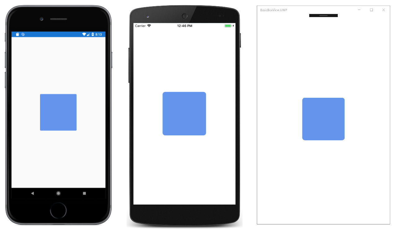
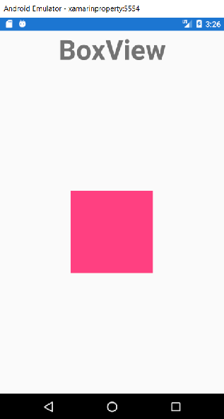
- BoxView: BoxView is a simple rectangle of specified width, height, and colour. We can use BoxView for decoration, rudimentary graphics, and interaction with the user through touch.
MainPage.XAML
BoxView might seem simple at the first look, but it can be versatile and can produce almost all the visuals that are usually possible only with the vector graphics.
- WebView: WebView is a view for displaying the web and HTML content on our app. WebView displays the HTML content inside our app.
- Content
WebView supports the following types of content:- HTML & CSS website: WebView supports all the websites that are written using the HTML & CSS, which includes the support of javascript.
- Documents: WebView is implemented using the native component on each platform that’s why WebView is capable of showing the documents that are viewable on each platform. This means that PDF files work on iOS and Android.
- HTML Strings: WebView can show HTML strings from memory.
- Local Files: WebView can type of content in the app.
- Content
MainPage.XAML
MainPage.XAML.CS
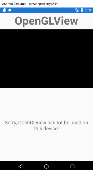
OpenGLView
MainPage.XAML
Views that initiate the command
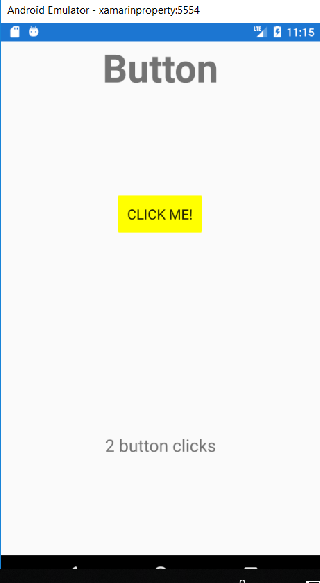
Buttons
When we click on a button, it responds and will perform a particular task in an application. In all the Xamarin.Forms button plays an important role. The button displays the short text string when it follows the command. Button can also display a bitmap image or a combination of text and image. To initiate the command user presses the button with a finger or with the mouse.
MainPage.XAML
Coding behind the button_click here, button will count how many times button pressed.
MainPage.XAML.CS
OUTPUT:
ImageButton
The ImageButton displays an image and responds to tap or click, which directs an application to perform a particular task.
ImageButton View combines the Button view and Image view to create a button whose content is an image. When we press the button with our finger or click it with the mouse, it will perform a particular task for the application.
Setting the image source
ImageButton defines a source property which should be configured to display the image on the button
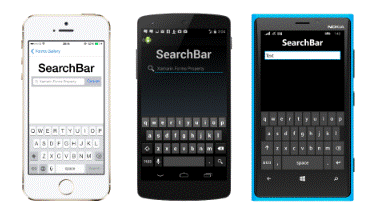
SearchBar
It is a part of the UI elements of Xamarin.Forms. It is used to search the data from a list or web page or anything. We can place the search bar to do a search from the web or from anywhere else. Mostly we use a search bar on Google homepage or any search engine.
Implementation
Here, we will code in the following steps:
- Creating the UI class
- Make a class and set the binding to the list view.
- Add data to the list and add functionality to the search bar
Creating a UI
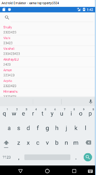
Firstly we will create Xamarin.Forms project. Here, we will create an application and will make a ListView and search bar on a XAML file. Here, we can use Stack Layout and add a search bar and list view in the stack layout. The search bar will place on the top of the list.
MainPage.Xaml
Now we will create a class which contains two property Name and NUM like this:
Contacts.CS
Now we will add the binding to text cell of listview.
Here, class is create and binding is done. Now we will do coding in Xaml.CS file.
To add the data is ListView and functionality to search bar. Here, firstly we create a contact class then initialize it and add some new data. After this, we will set the item source of ListView to the list of contacts.
Code to add the data to our ListView:
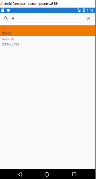
Here we will make an event handler of Text Changed functionality of search bar like this:
Code
Whenever the text in the search bar is changed, it can work on two possible conditions. If the text is null or empty, we will set the item source of list to temp data. Temp data contains the list of all the data. Else this can change the item source of list according to the LINQ query. This query works on temp data and finds the given text in the character match with the starting value of the name. Now we will see to search the some data:
Complete XAML code and CS code
MainPage.XAML
MainPage.XAML.CS
Views for setting the Values
ListView
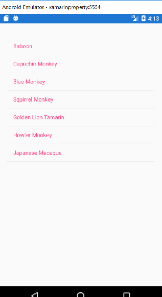
ListView is a view for presenting a list of data, especially the long list which needs scrolling. Xamarin.Forms provide ListView Control which can be used for displaying the scrollable list of data. ListView control is best for homogeneous data.
MainPage.XAML
This code defines the user interface for the page which consists the ListView in a StackLayout. The ListView.ItemSource property specifies the item to display.
Output
Populate with Data
Here, we will populate the data using the ItemSource property, which is of type IEnumerable. Here we will fill the ListView with data from a collection of the object of objects stored in it.
Monkey class will add
Monkey.cs
This code defines the Monkey object which stores the name, location and URL of an image which represents the monkey. Also, the class overrides the ToString method to return the name property.
DatePicker
Xamarin.Form view allows the user to select the date. The Xamarin.Forms DatePicker invokes the platform’s date-picker control that enables the user to select a date. DatePicker defines the eight properties.
- MinimumDate: This is a type of DateTime, which it defaults to the first day of the year 1900.
- MaximumDate: This is the type of DateTime, which is the default of the last day of the year 2100.
MainPage.XAML
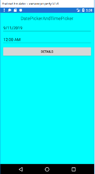
TimePicker
Xamarin.Forms view allow the user to select a time. Xamarin.Forms TimePicker invokes the platforms time-picker control and enables the user to choose a time.
MainPage.XAML
MainPage.XAML.CS
OUTPUT
TableView
TableView is a view for displaying the scrollable list of data or choices where there are rows which don’t share the same template. TableView does not have the concept of ItemSource, so here we will add the items manually.
Structure: Elements in TableView are organized in sections. At the root of the TableView is the TableRoot which is a parent to one or more TableSection instances. Each TableSection consist of the heading and one or more ViewCell cases.
MainPage.XAML
Output