WPF CheckBox Control
From the CheckBox Control we can select or unselect the item. CheckBox provides a list from where the user can select(check) the item. And we will use this list in most of the application. CheckBox control allows the user to toggle the option on or off. CheckBox shows us the value in the form of the Boolean value.
Properties used in the CheckBox
Here is the list of the properties used in the CheckBox.
| Sr. No. | Property | Description |
|---|---|---|
| 1. | Background | The background property is used to Gets or Sets the brush, which will provide us with background control. |
| 2. | BorderBrush | BorderBrush property is used to Gets or Sets the brush, which we use to fill the border of the control. |
| 3. | Content | The content property is used to gets or sets the content of the control. |
| 4. | ClickMode | ClickMode property is used to gets or sets the value when we click on the event according to the behavior of the device. |
The method used in CheckBox
Here is the list of the methods used in the CheckBox.
| Sr. No. | Property | Description |
|---|---|---|
| 1. | ClearValue | ClearValue method is used to clear the local value of the dependency property. |
| 2. | FindName | With the help of the FindName method, we will retrieve the object. The object contains a unique name. |
| 3. | OnContentChanged | OnContentChanged method is used to invoke the value of the content property. |
| 4. | OnDragEnter | OnDragEnter method is used to call when the DragEvent occurs. |
| 5. | SetBinding | SetBinding method is used to attach the binding with the FrameworkElement by using the binding object. |
| 6. | OnToggle | OnToggle method is used when the toggle button receives invoke instruction of the toggle. |
Events used in CheckBox
Events used in CheckBox are as follows:
| Sr. No. | Events | Description |
|---|---|---|
| 1. | Checked | We will fire the Checked event when we check the ToggleButton. Checked event is inherited from the ToggleButton. |
| 2. | Click | Click event will occur when we click on the button. Click event is inherited from the ButtonBase. |
| 3. | DataContextChanged | This event will occur when the value of the FrameworkElement.DataContext property changes. |
| 4. | DragEnter | DragEnter event will occur when the input system reports the drag event. The drag event will occur with the element as the target. |
| 5. | DragLeave | DragLeave event will occur when the input system reports the drag event with the element in the form of the origin. |
| 6. | DragOver | DragOver event will occur when the input system reports the event in the potential drop of the target. |
| 7. | DragStarting | DragStarting event will occur when the drag operation is initialized. |
| 8. | GotFocus | GotFocus event will occur when the user interface element receives the focus. |
| 9. | IsEnabledChange | IsEnabledChange event will occur when the IsEnable property changes. |
| 10. | SizeChanged | SizeChanges event will occur when the value of the actual height and ActualWidth changes on the FrameworkElement. |
| 11. | Unchecked | Unchecked events will occur when we unchecked the toggle button. |
Here we will explain how to create and use the CheckBox control in WPF with the help of the XAML and C#.
Creation of CheckBox
In XAML, checkbox element is shown by the WPF CheckBox control.
<CheckBox></CheckBox>
Here we will explain the features of the different attributes.
- The content attribute will show the text of the CheckBox.
- The name control shows the Name attribute; the name is known as the control’s unique identifier.
- FontFamily, FontStyle, FontSize, FontStretch all these attributes are related to the font.
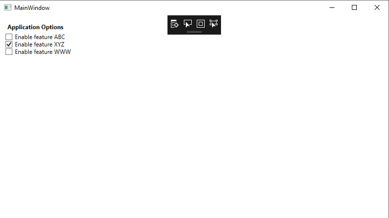
We will write the XAML code, through which we will create the CheckBox control and set the name of the checkbox, content, foreground, and font-related properties of the checkbox control. Here we will also show the functioning of the IsChecked attribute.
MainWindow.XAML
The output of the above code is shown below:
In the above code, we defined the state of the IsChecked property in the checkbox control.
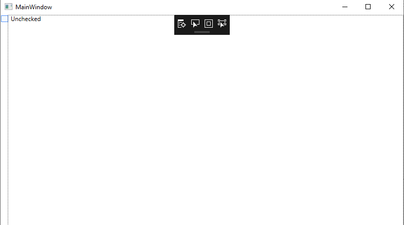
Add event handler in the CheckBox.
The checked and unchecked attribute of the checkbox element will add the checked and unchecked event handler. We will fire these events when the state of the CheckBox is changed.
The code for the event handler will look like as shown below:
MainWindow.XAML
OUTPUT
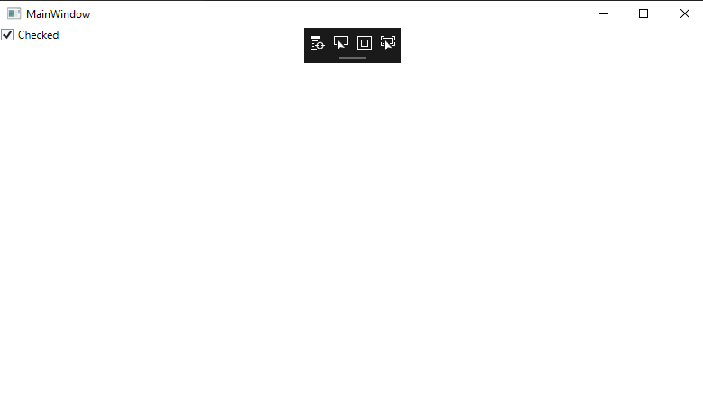
When we click on the checkbox, the state of the checkbox is changed as shown in the below screenshot:
Wrap Up
Here in the above, we have described the creation of the checkbox control at the time of the designing by using the WPF.