WPF RadioButton Control
With the help of the RadioButton Control, we can get the list of the possible different options where we will select only one option at a time. We can get the same functionality with the help of the ComboBox control. ComboBox control uses less space, but the use of the RadioButton gives us a better experience.
Now we will write a XAML code which contains the Label with the question mark and three radio buttons as well with the possible answer. In the RadioButton, we will set the default option by using the property IsChecked on the last RadioButton. We can change the default option by clicking on the other button.
MainWindow.XAML
The output of the above code is shown us like as in the below screenshot:
OUTPUT
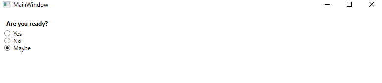
Group of RadioButton
As we can see above, with the help of the RadioButton, we can check only one button, but there can be a situation that arises when we need to select different options at the same time. Then, in that situation, we will need to add the Group of the RadioButton. The groups of the RadioButton has individual selection identity.
MainWindow.XAML
OUTPUT
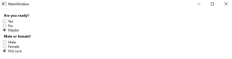
With the help of the RadioButton we can do the multiple selection from the both the of the group. Without the use of the RadioButton we can select only one item from all the six items.
Custom Content
We can inherit the RadioButton control from the ContentControl class that means we can show custom content. WPF will put the text in the TextBlock control and will show it.
For this we will write the below XAML code:
MainWindow.XAML
The output of the above code will look like as shown in the below screenshot:
OUTPUT
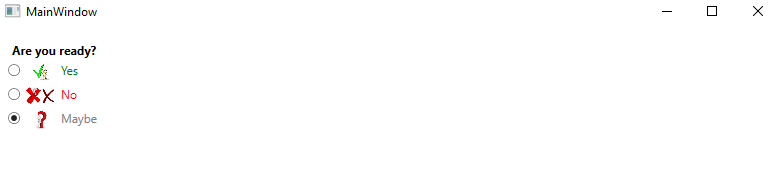
RadioButton concept is very simple. All the RadioButton contains the WrapPanel with the image along with the text inside it. Here we will use the Image Control to show the image as per our choice.