CanvasJS

We often come across charts on analytics-based sites or some websites that contain surveys on some common agendas like population, percentage, and whatnot. These charts are often used in the Data Interpretation field to create network shares or profit distribution in core sectors. However, if we collectively observe, these charts or bar distributions are renderable. They can change when values plotted on the graph are changed. To ease constructing these renderable charts, JavaScript has tremendous support from libraries. One such library specifically for charts is CanvasJS. Let’s learn about it from scratch.
What is CanvasJS?
As depicted in the official world of libraries in JavaScript, CanvasJS is the popular charting library. It is easy to use JavaScript and HTML5 based library that can be built on the Canvas element. It has a wide range of device influences, including Android, iPhone & iPad, Windows Phone, Microsoft Surface, Desktops, etc.
CanvasJS is a hardcore chart creator library that enables users to create rich UI dashboards and charts that can work on all devices without compromising functionality or maintenance for our web application. It already comes with dynamic and awesome themes, and it is 10x faster than the conventional SVG Charts and Flash. Users can easily create responsive, dynamic, renderable, lightweight, and rich UI dashboards using CanvasJS.
Download
Users can download CanvasJS with a simple npm command given below.
After this step, we need to import it first. It can be done in multiple ways depending on the type of module and the application pattern being considered.
CanvasJS package, by default, works on CommonJS that can be easily put on to use with property/webpack, as shown below.
The above-shown dependencies are local. For importing global dependencies, use the below code.
Note: The dist folder by default contains a minified version located at dist/canvasjs.js.min.js, and it is a production-based version wrapped up for using it with jQuery.
Concept of working with Data in Chart
To work with data in the chart in CanvasJS, we need to add data. All the data that we want to be plotted should be added to an array called “data“. It is the confined property of Chart Options. Every element of the array is treated as an object and is called data series, which is nothing but the logical grouping of data elements. Individual data elements or points are always called dataPoint. To understand how data work in CanvasJS, we will be using dataPoint and dataSeries everywhere in this tutorial for illustration.
Let’s look at the format of the dataSeries object in the data array. The sample code snippet is given below for reference.
What is dataPoint?
All the values that have to be plotted on a chart subjected to the required design are called dataPoint. We can easily add each dataPoint to the array, which becomes the member of the dataSeries. The most commonly used dataPoints used are plotted on the x,y, and label axis. See the below example of how a dataPoint is plotted.
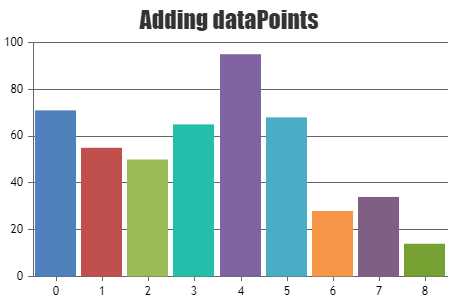
Adding dataPoints
To understand how CanvasJS works, it is important to understand that dataPoint should consist of a y value. To plot a series, only y values are treated as dataPoints. If there is no x value provided, they are by default set to the absolute value of zero. Let’s understand by an example.
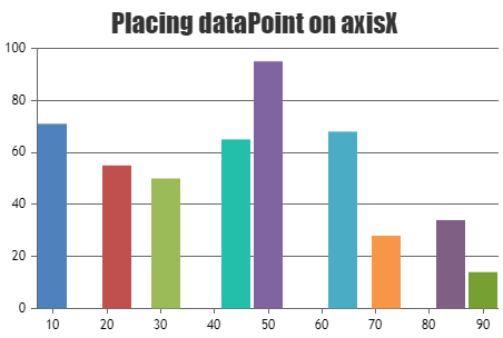
Plotting x values
In the above snippet, dataPoint has been positioned on the x-axis by setting the values in numeric value or a dateTime value.
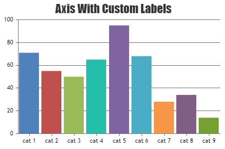
dataPoint Labelling
Labels are defined as the values that are displayed on the x-axis of the chart. If there is no x value provided, the default value is taken for the label, and it can be easily customized.
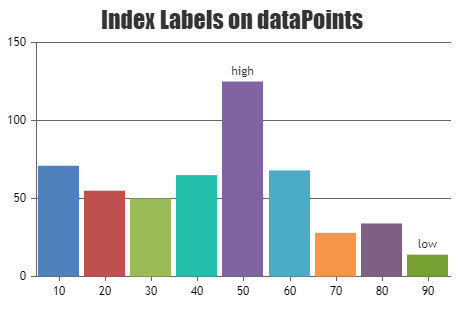
Index labeling in dataPoints
Index labels are generally positioned below or above the dataPoint.
Finishing all at once
Since we are now much familiar with using CanvasJS, let’s take some more time to create some sophisticated charts that are industrial level. To do that, we have prepared a sample example in case of users miss out on how to apply the above concepts.
In this example, we will make a Stock Chart from scratch and customize it using live examples. With every step of rendering, if we use the source code to run it on a compiler, we might understand it better.
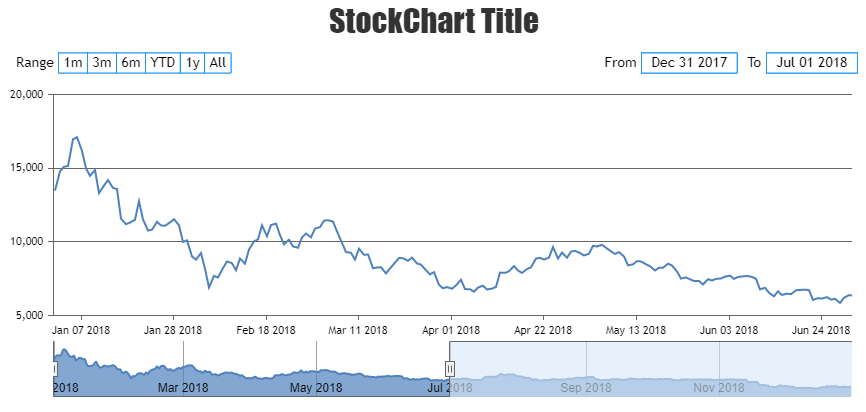
Note: The graph is easily renderable. Hence it is recommended to run it on an HTML compiler to get the feel.
Steps to run the example in our local machine are given below:
- Copy the code in the local HTML editor.
- Run the HTML file.
- We can see the Stock Chart running on our local system.
- Try to add more customized chart designs if needed.
Conclusion
In this tutorial, we came across and learned about CanvasJS and its applications. We also discovered how to render the custom components of JavaScript using CanvasJS, which can be treated as a utility tool or library in JavaScript specifically designed to work with charts. Although D3.js also offers a similar experience when taken into consideration, it is not preferred because of its robust nature and complexity. CanvasJS is lightweight, easy to handle, needs no further dependencies rather than having to import it into the main HTML file, and is super easy to learn. In the later sections, we also saw step-by-step inclusion of properties in the example and how dataPoints work along with the labels and axis. We also saw from the example above where we created a Stock Chart with not much effort.