A residual plot is a type of plot that displays the fitted values against the residual values for a regression model.
This type of plot is often used to assess whether or not a linear regression model is appropriate for a given dataset and to check for heteroscedasticity of residuals.
This tutorial explains how to create a residual plot for a simple linear regression model in Excel.
How to Create a Residual Plot in Excel
Use the following steps to create a residual plot in Excel:
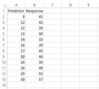
Step 1: Enter the data values in the first two columns. For example, enter the values for the predictor variable in A2:A13 and the values for the response variable in B2:B13.
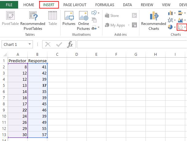
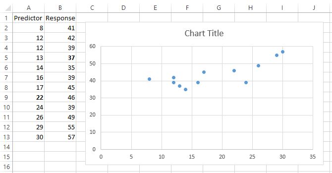
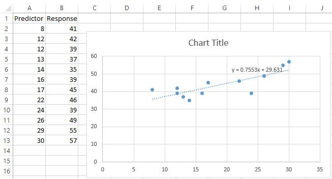
Step 2: Create a scatterplot. Highlight the values in cells A2:B13. Then, navigate to the INSERT tab along the top ribbon. Click on the first option for Scatter within the Charts area.
The following chart will appear:
Step 3: Display trend line equation on the scatterplot. Click “Add Chart Elements” from the DESIGN tab, then “Trendline”, and then “More Trendline Option. Leave “Linear” selected and check “Display Equation on Chart.” Close the “Format Trendline” panel.
The trend line equation will now be displayed on the scatterplot:
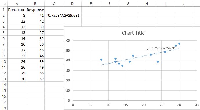
Step 4: Calculate the predicted values. Enter the trendline equation in cell C2, replacing “x” with “A1” like so:
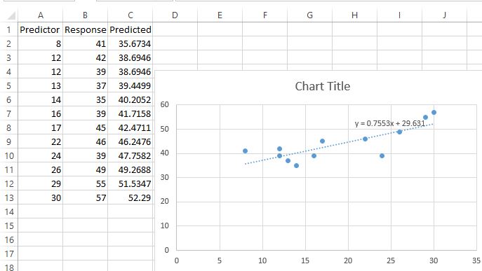
Then, click cell C2 and double-click the small “Fill Handle” at the bottom right of the cell. This will copy the formula in cell C2 to the rest of the cells in the column:
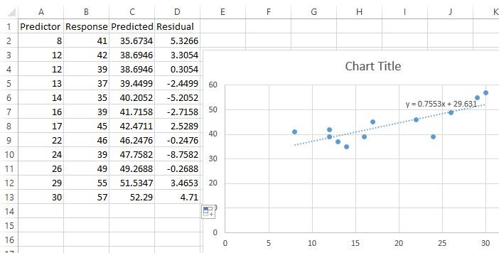
Step 5: Calculate the residuals. Enter B2-C2 in cell D2. Then, click cell D2 and double-click the small “Fill Handle” at the bottom right of the cell. This will copy the formula in cell D2 to the rest of the cells in the column:
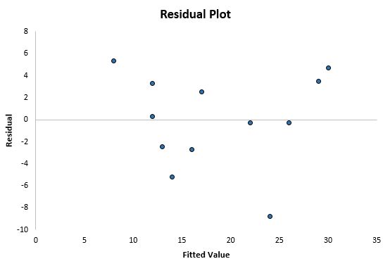
Step 6: Create the residual plot. Highlight cells A2:A13. Hold the “Ctrl” key and highlight cells D2:D13. Then, navigate to the INSERT tab along the top ribbon. Click on the first option for Scatter within the Charts area. The following chart will appear:
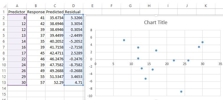
This is the residual plot. The x-axis displays the fitted values and the y-axis displays the residuals.
Feel free to modify the title, axes, and gridlines to make the plot look more visually appealing: