80
Materialize CSS Dialogs
Dialogs are used to show extra information if needed. They are originally not visible on the page. They show their content only when the user want to see it.
Materialize CSS provides various special methods to show alerts to the users.
Parameter explanation
message: It specifies the message to be displayed to the user.
displayLength: It specifies the duration of the message after which it will disappear.
className: It specifies the style class to be applied to the toast. For example, ’rounded’.
completeCallback: It specifies the callback method to be called once toast is dismissed.
Materialize CSS provides different CSS classes for dialogs:
| Index | Class name | Description |
|---|---|---|
| 1) | tooltipped | It is used to identify a component to have a tooltip. |
| 2) | data-position | It specifies the position of the tooltip; bottom, top, left, or right. |
| 3) | data-delay | It is used to set the duration of the tooltip after which it will disappear |
| 4) | data-tooltip | It is used to set the tooltip contents. |
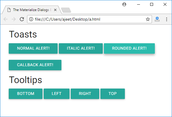
Example
Output:
Next TopicMaterialize CSS Dropdowns