93
PrimeFaces SelectOneListbox
It is an extended version of the standard selectOneListbox component. It is used to select one value from the list. PrimeFaces provides <p:selectOneListbox> component to create listbox. It is useful when we want to get user choice from the multiple options. It has various attributes that are tabled below.
SelectOneListbox Attributes
| Attribute | Default value | Return type | Description |
|---|---|---|---|
| id | null | String | It is an unique identifier of the component. |
| rendered | true | Boolean | It is used to render component. It takes boolean value. |
| binding | null | object | It is used to set an expression that maps to a server side UIComponent instance in a backing bean |
| value | null | object | It is used to set value of the component referring to a List. |
| converter | null | Converter/String | It is used to set text that defines a converter for the component. |
| required | false | Boolean | It is used to make component as required |
| widgetVar | null | String | It is a name of the client side widget. |
| disabled | false | Boolean | It is used to disable the component. |
| label | null | String | It is used to set user presentable name. |
| var | null | String | Name of iterator to be used in custom content display. |
| filter | false | boolean | Displays an input filter for the list. |
| filterMatchMode | null | String | Match mode for filtering, valid values are startsWith (default), contains, endsWith and custom. |
| filterFunction | null | String | Client side function to use in custom filterMatchMode. |
| caseSensitive | false | Boolean | Defines if filtering would be case sensitive. |
| scrollHeight | null | Integer | Defines the height of the scrollable area. |
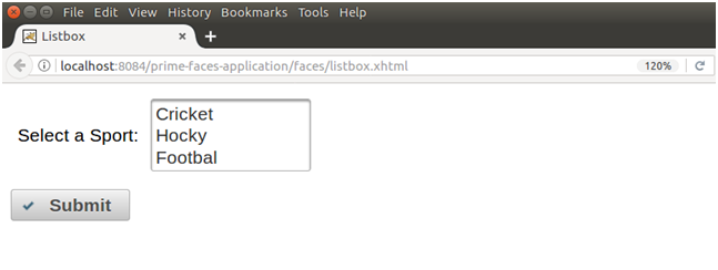
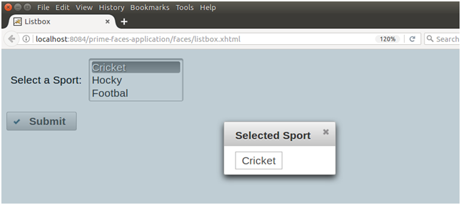
Example
Here, in the following example, we are implementing <p:selectOneListbox> component. This example contains the following files.
JSF File
// listbox.xhtml
ManagedBean
// ListBox.java
Output:
Next TopicPrimeFaces SelectManyButton