WPF Image Control
With the help of the WPF image control, we can show the images in our application. WPF image control is a versatile control. WPF image control shows the image. For that, we can use either the ImageObject or the ImageBrush object. ImageObject will display the image, and the while the ImageBrushObject will paint another object with the use of the image. The source of the image is specified by referring to the image file, which supported the different formats.
Formats supported by the Image Control are as:
- Bitmap (BMP).
- Tagged Image File Format (TIFF).
- Icons (ICO).
- Joint Photography Expert Group (JPEG).
- Graphics Interchange Format (GIF).
- Portable Network Graphics (PNG).
- JPEG XR.
Properties used in Image Control
| Sr. No. | Properties | Description |
|---|---|---|
| 1. | CanDrag | CanDrag property is used to gets or sets the value. This value is used to indicate whether we can drag the element with the use of the drag-drop operation. CanDrag property is inherited from the User Interface element. |
| 2. | Height | Height property is used to gets or sets the value. This value sets the height of the FrameworkElement. |
| 3. | PlayToSource | PlayToSource property is used to get the transmitted information when we use the images for a PlayToSource Scenario. |
| 4. | SourceProperty | the source property is used to identify the Source Dependency property. |
| 5. | Stretch | Stretch property is used to Gets or sets the value, which shows how we can stretch the image to fill the destination. |
| 6. | StretchProperty | StretchProperty is used to identify Search Dependency Property. |
| 7. | source | the source property is used to gets or sets the source of the image. |
Events used in Image Class
Events which we use in the Image class are as:
| Sr. No. | Properties | Description |
|---|---|---|
| 1. | DataContextChanged | DataContextChanged event will occur when the value of the property FrameworkElement.DataContext is changed. |
| 2. | DragEnter | DragEnter event will occur when the input system reports the drag event with the element as a target. |
| 3. | DragLeave | DragLeave event will occur when the input system reports the drag event with the elements like the origin. |
| 4. | DragStarting | DragStarting event will occur when we initialize the drag operation. |
| 5. | ImageOpened | ImageOpened event will occur when we download the source of the image and decode it without failure. We can use this event to determine the size of the image source. |
| 6. | ImageFailed | ImageFailed event will occur when we retrieve the format of the image, and then an error will happen. |
| 7. | SizeChanged | SizeChanged event will occur when the property of ActualHeight and ActualWidth is changing the value on the FrameworkElement. |
WPF image control is a versatile control.
We will add the image by using the Syntax: Image Source property.
Source Property: We use Source Property to define the image which we want to display. We use source property inside the Image Control to identify the image which we want to display. We can easily define which image we want to show in the Image Control with the help of Source property.
Now we will take an example of the WPF Image Control.
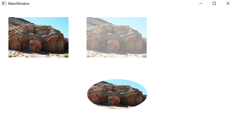
Now let us create a new WPF project, and name of the project is given as WPFImageControl. Here we will divide the screen into the two rows by using the Grid.RowDefinition. Soon we will drag the three image controls. In the below example, we are going to show the three images. In the first, we are going to show a simple image. In the second image, we will set the opacity property. In the third image, we will set the image in the eclipse and paint it with the ImageBrush.
Now we will write code through which we will add the image.
MainWindow.XAML
After the compilation of the above code, we will get the below output:
OUTPUT
WPF image control is a versatile control.
We will add the image by using the Syntax: Image Source property.
Source Property: From the above example, we have seen that the Source Property is used to define the image we want to display. We use source property inside the Image Control to identify the image which we want to display. With the help of Source property, we can easily define the image which we want to show in the Image Control. In the above example, we used the remote image from which the image will automatically fetch and display the images as soon as possible. This feature shows how versatile the image control is, but in most situations, we want to bundle the images in our application instead of loading it from the remote source.
We can add resource files to our project. Resource files can be seen in the current visual studio and also can see the folder of the image in the solution explorer.
After that, we will compile our application. We can access the file by using the URL format for the resources, so if we have an image like “google.png” inside the folder “images”. Now the syntax will look like as shown below:
Syntax: <Image Source=” WpfTutorialSamples;component/Images/google.png”;
We will call these URI as the “Pack of URI’s”.
URI: URI contains two-part. First Part includes the assembly name which is “WPFTutorialSample” name of the application which we combined with the component. The Second Part includes the path of the resource, which is “/Images/google.png”.
By using this syntax, we can easily give a reference to the resources in our application. We can add the resource in our application by using the simple url like: <Image Source=”/Images/google.png”>.
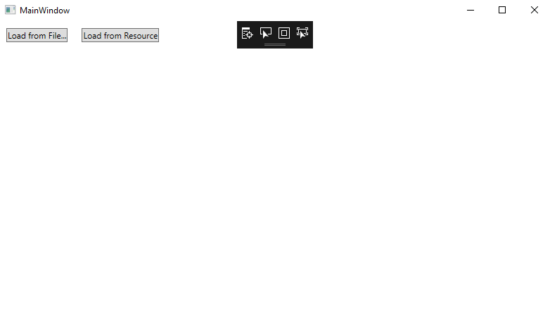
Dynamic Loading of the Images
There are the situation arises when there is a need to load the image dynamically. For example, according to our choice, we want to load the images to the application. We can do it from the code.
For this, we will write a code to load the images from our computer which is based on our selection from the OpenFileDialog:
To show the data through the file, we will write the below code:
Here if we notice that we create the instance of the BitmapImage where I passed the URI. We will select it from our selected path. We will also use the same technique for loading the image, which includes the application as a resource.
For this as well, we will use the same relative path as we used above.
For the loading of the image from the different resources in our application, we will write the below code:
MainWindow.XAML
Now we will write the code for adding the image from the different resources on the clicking of the button.
MainWindow.XAML.cs
The output of the above code before the loading from the resource is shown below:
Output
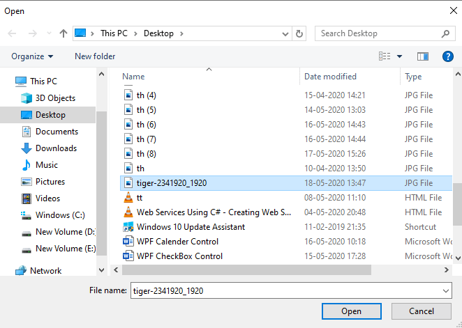
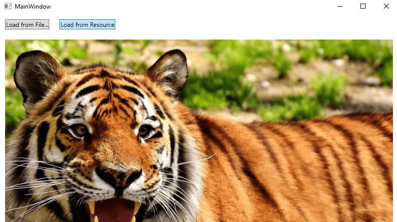
If we click on the Load from File, this will open a new window where we will select the “Image,” which we want to show in our application. After clicking on the Load from File, a new window is open where we choose the file as shown in the below screenshot:
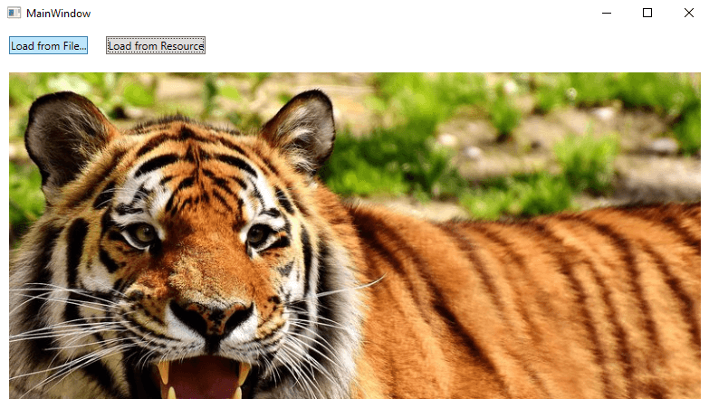
After clicking on “ok,” the image will look like as shown in the below screenshot:
Now we want to show the image through the resource file as shown in the below screenshot:
Stretch Property
As we know, the Source Property is important after that the second most important property is the Stretch Property. We will apply the stretch property when the loaded image doesn’t match with the dimension of the image control. The problem of the size unfitting will always happen because of the size of the window is controlled by others, and the size of the image control will also change.
With the help of the Stretch property, we can control the size of the image how they will look.
We will write a XAML code to define the view of the image by using the stretch property.
MainWindow.xaml
The output of the above code is as shown in the below screenshot:
Now we will explain the property of the Stretch:
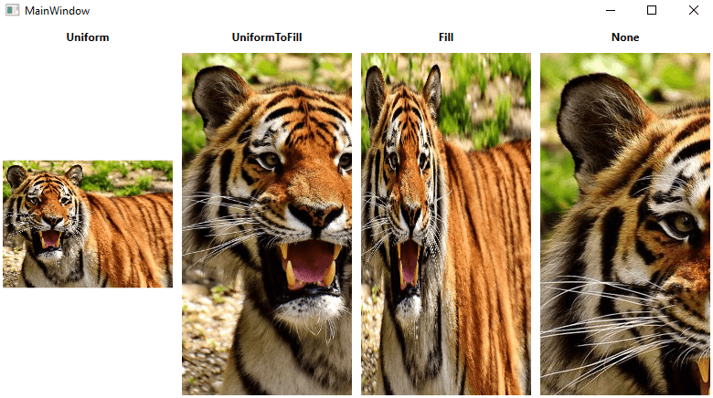
Here we have seen that all the four of the images will show the same image but containing the different values of the stretch property.
Now we will explain the working of the various modes.
- Uniform: Uniform is a default code. In uniform modes, the image will adjust itself to the area of the image. With the uniform modes, the image will set itself within the image area.
- UniformToFill: In the UniformToFill modes, the images scaled itself so that the image can acquire all the area of the image.
- Fill: Fill mode is used to fit itself according to the area of the image control. We cannot preserve the aspect ratio because we can independently scale the height and width of the image.
- None: None mode is used in those scenarios when the size of the image is small. If the size of the image is small than the image control, then there is no need to do anything. If the size of the image is bigger than the image control now, the image will be cropped itself to fit itself into the image control, which means the one Part of the image will be displayed.
Wrap up
With the help of the WPF image control, we can easily display the image in our application. The resource of the image can be remote, embedded, or a local computer.