85
PrimeFaces SelectOneButton
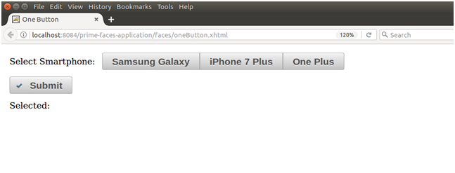
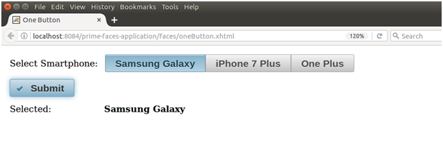
It is used to select a single item from a list using buttons. It creates items list as a list of buttons. So, we can select item by clicking on the button. The <p:selectOneButton> component is used to create list of buttons in the JSF application. It has various attributes that are tabled below.
SelectOneButton Attributes
| Attribute | Default value | Type | Description |
|---|---|---|---|
| id | null | String | It is an unique identifier of the component |
| rendered | true | Boolean | It is used to specify the rendering of the component. |
| required | false | Boolean | It is used to mark component as required. |
| converterMessage | null | String | It is used to set message to be displayed when conversion fails. |
| disabled | false | Boolean | It is used to disable the component. |
| label | null | String | It is used to set label for the component. |
| onchange | null | String | It is used to call script on value change. |
| style | null | String | It is used to set inline CSS of the component. |
| tabindex | 0 | String | It is used to set position of the element in the tabbing order. |
| unselectable | true | Boolean | It is used to unselect the component. |
Skinning
Following is the list of structural style classes;
| Style Class | Applies |
|---|---|
| .ui-selectonebutton | It applies on main container element. |
Example
Here, in the following example, we are implementing <p:selectOneButton> component. This example contains the following files.
JSF File
// oneButton.xhtml
ManagedBean
// OneButton.java
Output:
Next TopicPrimeFaces SelectOneRadio