84
RichFaces <rich:dropDownMenu>
It is used to create a drop-down or a hierarchical menu. We can use it with the <rich:toolbar> component to create menus in an application’s toolbar.
It requires the label attribute for basic usage. We can use the label attribute to set the text label that appears as the title of the menu.
Style classes and skin parameters
The following table contains the Style classes (selectors) and corresponding skin parameters for the dropDownMenu.
| Class | Function | Skin Parameters | Mapped CSS properties |
|---|---|---|---|
| .rf-ddm-lbl | It is used to define styles for the label of the drop-down menu. | headerFamilyFont | font-family |
| .rf-ddm-dis | It is used to define styles for the drop-down menu when it is disabled. | tabDisabledTextColor | color |
| .rf-ddm-lbl-dis | It is used to define styles for the label of the drop-down menu when it is disabled. | headerFamilyFont | font-family |
| .rf-ddm-pos | It is used to define the positioning of the drop-down menu. | No skin parameters. | |
| .rf-ddm-lbl-unsel | It is used to define styles for the label of the drop-down menu when it is unselected. | No skin parameters. | |
| .rf-ddm-lst | It is used to define styles for the drop-down list. | panelBorderColor additionalBackgroundColor | border-color background-color |
| .rf-ddm-lst-bg | It is used to define styles for the background of the drop-down list. | additionalBackgroundColor | border-color |
| .rf-ddm-sublst | It is used to define the positioning of the menu when used as a sub-menu. | No skin parameters. | |
| .rf-ddm-itm | It is used to define styles for a menu item. | generalFamilyFont generalSizeFont | font-family font-size |
| .rf-ddm-itm-sel | It is used to define styles for a menu item when it is selected. | tabBackgroundColor | background-color |
| .rf-ddm-itm-unsel | It is used to define styles for a menu item when it is unselected. | No skin parameters. | |
| .rf-ddm-itm-dis | It is used to define styles for a menu item when it is disabled. | tabDisabledTextColor | color |
| .rf-ddm-itm-lbl | It is used to define styles for the label in a menu item. | generalTextColor | color |
| .rf-ddm-itm-ic | It is used to define styles for the icon in a menu item. | No skin parameters. | |
| .rf-ddm-emptyIcon | It is used to define styles for an empty icon in a menu item. | No skin parameters. | |
| .rf-ddm-sep | It is used to define styles for a menu separator. | panelBorderColor | border-top-color |
| .rf-ddm-nd | It is used to define styles for a menu node. | No skin parameters. |
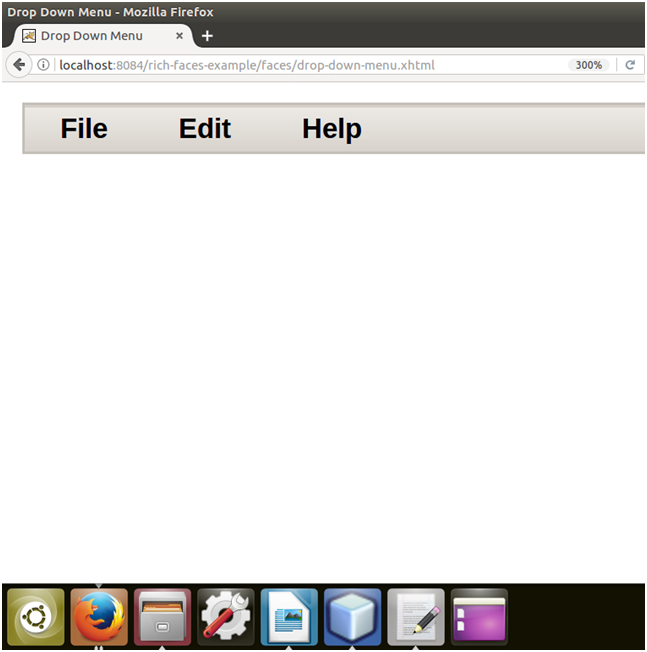
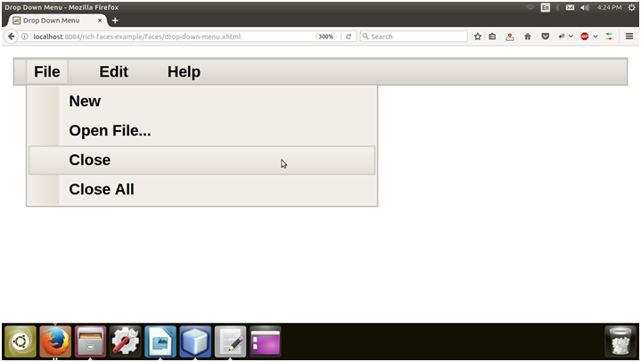
Example
Here, in the following example, we are implementing <rich:dropDownMenu> component. This example contains the following files.
JSF File
// drop-down-menu.xhtml
Output:
Next TopicRichFaces <rich:panelmenu>