Bar Graph
In mathematics, sometimes, we have large data to analyze, and it is difficult to handle large data in numbers. To remove this problem, we graphically represent the data. There are many ways to represent data graphically. But in this section, we will learn the bar chart or bar graph, types of bar graphs, usages, advantages, and how to plot a bar graph. A bar graph is a graph that represents the data in graphical form.
Definition
A bar graph or bar chart can be defined as a graph or chart that represents explicit data in the form of rectangular bars. In short, a bar graph is a graph with rectangular bars, either horizontal or vertical. A bar chart with vertical bars is also called a column chart. The length of the bars depends on the values because the bars are proportional to the values.
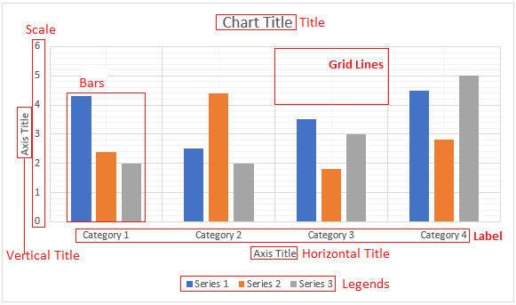
Components of a Bar Graph
- Chart Title: It denotes the name of the bar chart. In this, we can write what the chart is representing.
- Grid Lines: The vertical and horizontal lines in gray color is called grid lines.
- Bars: A bar is corresponding to a value. It may be horizontal or vertical. The largest bar represents the largest value.
- Axis Title: A bar graph has two titles one is vertical, and the other is horizontal. Both the axis is related to each other. We can write the axis title for easy understanding. Suppose, the vertical axis represents expenses. So, we can write Expenses (in rupees) on the vertical axis. The expenses may be of different types, so we can write types of expenses on the horizontal axis.
- Labels: We can also categorize the horizontal axis title. For example, types of expenses can be categorized into medical, transport, office, etc.
- Legends: A legend specifies what a bar is representing. It is also known as the key of a chart. Consider the following graph; if we write 2019 in place of Series 1, it means the blue bars in the graph represent the data of the year 2019.
- Scale: The scale represents the vertical values. It may include rupees, population, size, etc.
Advantages of Bar Graph
- It represents the data in pictorial form.
- It makes the analysis of data easy.
- We can easily compare data with other variables.
- It does not require too much effort to plot it.
- It is a widely used method of data representation.
- It is easy to understand.
- It is used in various fields such as retail, business, sports, etc.
Uses of Bar Graph
There are following two main uses of a bar graph:
- It is used to represent data in the form of graphics.
- It compares frequencies of other measures of distinct categories.
Properties of Bar Graph
- It may plot either vertical or horizontal.
- The space between bars and the width of the bars must be equal.
- The length of the bars represents the value of the variable being displayed.
- It must have a title, labels for each bar, and the scale for the length of the bar.
How to Plot a Bar Graph
- Collect Data: The collection of data is the primary step to plot any graph. Without the data, we cannot plot a graph.
- Draw the Axis: A graph has two axes, x-axis (horizontal) and y-axis (vertical).
- Label the Axis: Label both the axis x and y. On the x-axis and y-axis, we represent the categories and frequencies, So, plot the points on the y-axis accordingly.
- Draw Bars: Draw the bars from the base and extend it to their corresponding frequency. If the value lies between the two plotted frequencies, take the approximate the value between these frequencies.
- Interpret the Data: After completing all the above steps, we can interpret the graph.
Types of Bar Graph
There are three types of “bar graph:
- Vertical Bar Graph
- Horizontal Bar Graph
- Stack Bar Graph
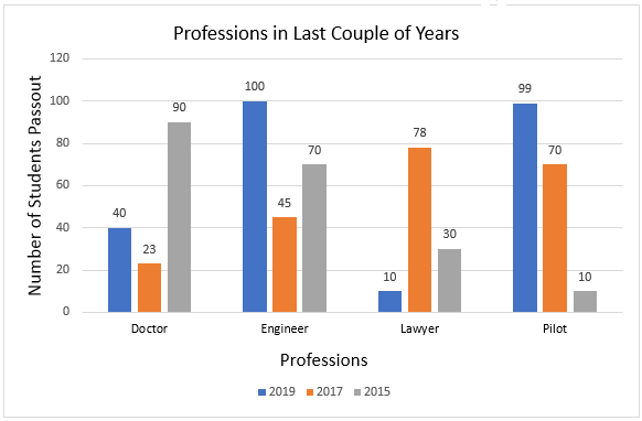
Vertical Bar Graph
It is the most common type of bar graph. It is used when we want to present a series of data over time. In a vertical bar graph, categories appear at the horizontal axis. If a bar chart is arranged in highest to lowest frequency is called a Pareto chart. We can analyze and compare the data just by looking at the graph.
In the following table, we have taken the sample data of the years 2019, 2017, and 2015 of different professions.
| 2019 | 2017 | 2015 | |
| Doctor | 40 | 23 | 90 |
| Engineer | 100 | 45 | 70 |
| Lawyer | 10 | 78 | 30 |
| Pilot | 99 | 70 | 10 |
Let’s plot a vertical bar graph for the above data. The following graph shows the number of students who pass out in different professions.
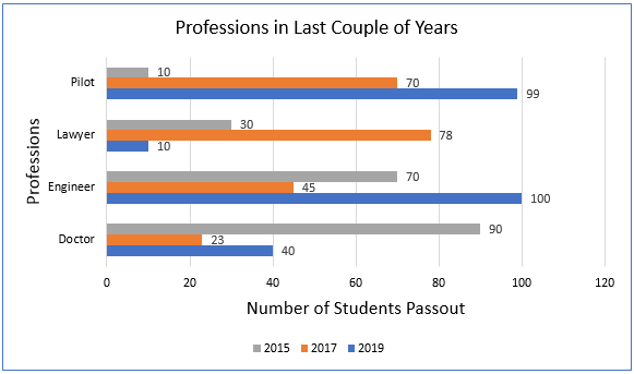
Horizontal Bar Graph
A horizontal bar graph is nothing but the representation of bars horizontally is called a horizontal bar graph. Let’s plot a horizontal bar graph for the above data.
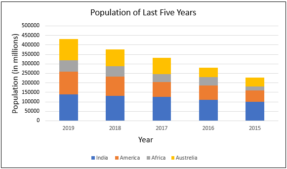
Stack Bar Graph
The stack bar graph represents a lot of information about data. It can represent more than two data series within each category. Each bar shows the total for sub-groups within each individual category.
| India | America | Africa | Australia | |
| 2019 | 140000 | 120000 | 60000 | 110000 |
| 2018 | 132000 | 100000 | 55000 | 90000 |
| 2017 | 125000 | 80000 | 40000 | 86745 |
| 2016 | 110000 | 75000 | 44000 | 50987 |
| 2015 | 100000 | 59832 | 22000 | 44981 |
In the following bar graph, a bar represents a population of four different countries in a year.
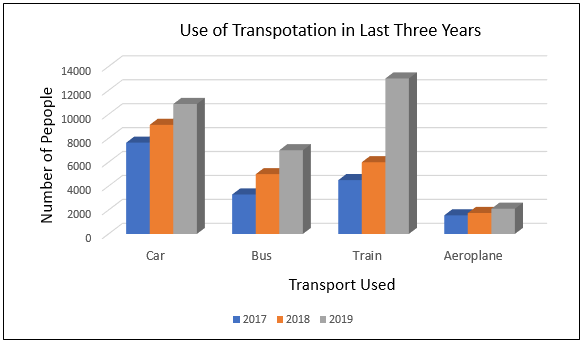
3D Bar Graph
The following bar graph shows a 3D bar graph.