Bootstrap 5 List Groups
Bootstrap 5 List groups are a versatile and effective for showing a succession of content items. Modify and expand them to accommodate virtually any content. The list group shows multiple items or contents in a single tab.
Basic list group
The basic list group shows multiple items in a single group tab. The basic <ul> and <li> html tags require for the list. The “list-group” class is required to create a list group. The “list-group-item” class contains multiple values in the “list-group” class.
Syntax
The following syntax shows how to create group list using bootstrap 5 classes.
Examples
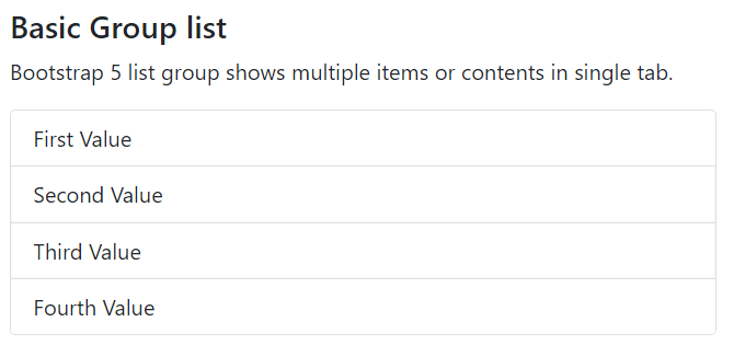
The following example shows basic list group using bootstrap 5 classes. here, we can contain four values in the group list.
Output
The following image shows the basic group list output for the web page.
Active list group
The “list-group” class is required to create a list group in the application. The list group shows multiple items in a single group tab with the active item. The “list-group-item” class comes with the “active” keyword in the “list-group” class. The active keyword shows an active or clicked item from the list.
Syntax
The following syntax shows how to create group list with active item using bootstrap 5 classes.
Examples
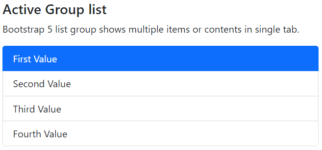
The following example shows basic list group using bootstrap 5 classes.
Output
The following image shows a group list with active item output for the web page.
Disabled list group
The list group shows multiple items in a single group tab with the disabled item. The “list-group” class is required for making a list group on the web page. The “list-group-item” class comes with the “disabled” keyword in the “list-group” class. The disabled keyword shows non-active or not usable items from the list.
Syntax
The following syntax shows how to create group list with disabled item using bootstrap 5 classes.
Examples
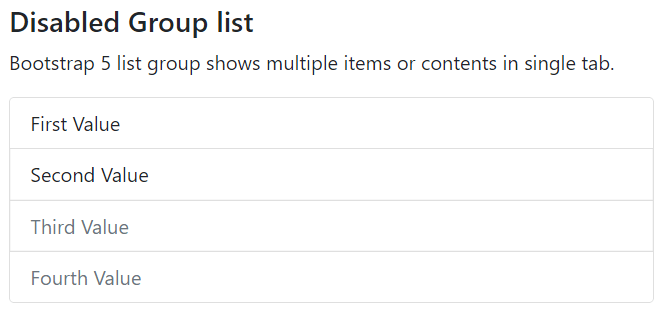
The following example shows basic list group using bootstrap 5 classes. We use disabled keyword to third and fourth value of the list group.
Output
The following image shows a group list with disabled item output for the web page.
List group with the link
The list group uses items with different functions such as links, text, and buttons. The list group contains list items in link format. The <a> tag with the “href” functions use in the “list-group” class to create link. The “list-group-item” and “list-group-item-action” classes use in the <a> tag.
We can use an active and disabled keyword per the application’s requirement.
Syntax
The following syntax shows how to create group list with link using bootstrap 5 classes.
Examples
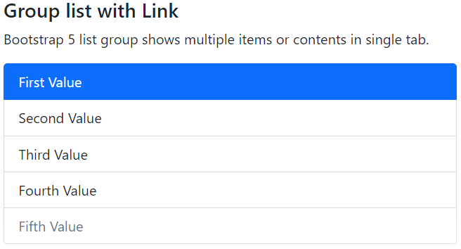
The following example shows basic list group using bootstrap 5 classes. We can see the list item with the link. Each item contains its link in the <a> tag.
Output
The following image shows a group list with link output for the web page.
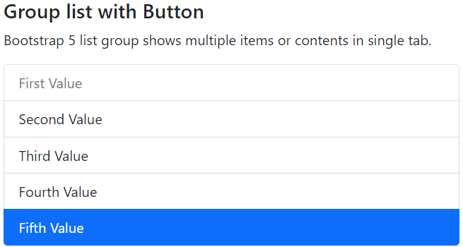
Button list group
The list group uses items with different functions such as links, text, and buttons. The list group contains list items in link format. The <button> tag with the button type requires in the “list-group” class to create a link. The “list-group-item” and “list-group-item-action” classes use in the <button> tag. We can use active and disabled keywords in the button per the application’s requirement.
Syntax
The following syntax shows how to create group list with link using bootstrap 5 classes.
Examples
The following example shows basic list group using bootstrap 5 classes. We can see the list item with the button function. Each item contains its button action in the <button> tag.
Output
The following image shows a group list with button item output for the web page.
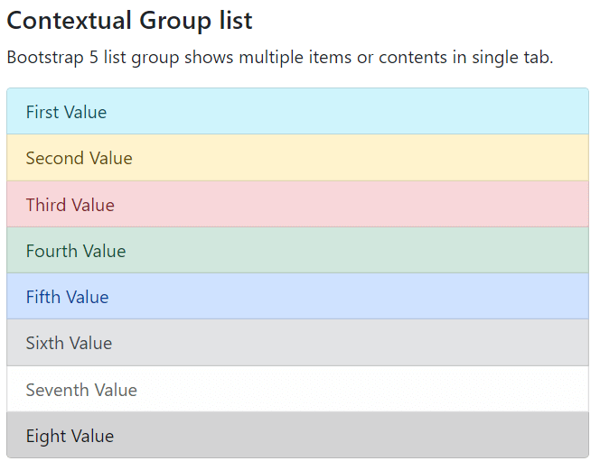
Contextual list group
The basic list group shows multiple items in a single group tab using the <ul> and <li> html tags. The “list-group-item” class contains multiple values in the “list-group” class with html list tag. The contextual list group shows different or similar background colours for the list item. The “list-group-item” with the “list-group-item-primary” class uses in the tag for the required background colour.
Syntax
The following syntax shows how to create contextual group list using bootstrap 5 classes.
Examples
The following example shows contextual list group using bootstrap 5 classes. We can contain different background color’s list item in the web page.
Output
The following image shows the contextual group list output for the web page.
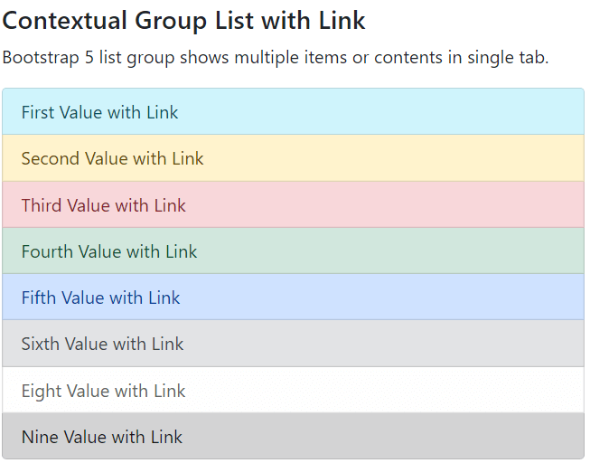
Contextual list group with the link
The basic list group shows multiple items with different background colours in a single group tab. The contextual list group requires the <ul> and <li> html tags and <a> tag needs to create link with content. The “list-group-item” class contains multiple values in the “list-group” class with html list tag. The contextual list group shows different or similar background colors for the list item. The “list-group-item” with the “list-group-item-info” class uses the required background color in the tag and shows informative content.
Syntax
The following syntax shows how to create contextual group list with link using bootstrap 5 classes.
Examples
The following example shows contextual list group using bootstrap 5 classes. We can contain different background color’s list item with the link.
Output
The following image shows the contextual group list output for the web page.
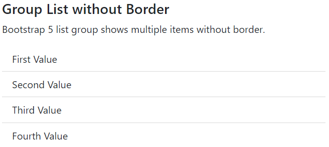
List group without border
Bootstrap 5 list groups show multiple items, either border or without border, in a single tab. The basic <ul> and <li> html tags require for the list. The “list-group” with the “list-group-flush” classes uses to remove the border of the list group function. The flush class shows a group list with a single horizontal line between two items.
Syntax
The following syntax shows how to remove border group list using bootstrap 5 classes.
Examples
The following example shows basic list group using bootstrap 5 classes. Here, we can contain four values in the group list.
Output
The following image shows a group list without border output for the web page.
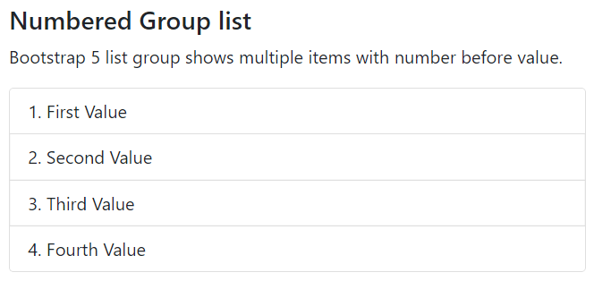
Numbered List Group
Bootstrap 5 list groups show multiple items with the number before values. The basic <ul> and <li> html tags require for the numbered list group. The “list-group” with the “list-group-numbered” classes shows numbers before listing content or item in the list group function.
Syntax
The following syntax shows how to create numbered group list using bootstrap 5 classes.
Examples
The following example shows basic list group using bootstrap 5 classes. Here, we can contain four values in the group list.
Output
The following image shows numbered group list output for the web page.
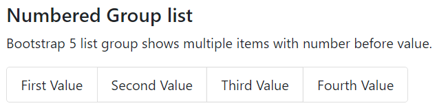
Horizontal List Group
Bootstrap 5 list groups show multiple items in a single tab horizontally. The <ul> html tag contains the “list-group” and “list-group-horizontal” classes to display list item in single row. We can use the “link”, “button”, or “li” tag in the “ul” tag using bootstrap 5 classes.
Syntax
The following syntax shows how to create horizontal list group using bootstrap 5 classes.
Examples
The following example shows horizontal or single line list group using bootstrap 5 classes. Here, we can contain four values in the single row group list.
Output
The following image shows numbered group list output for the web page.
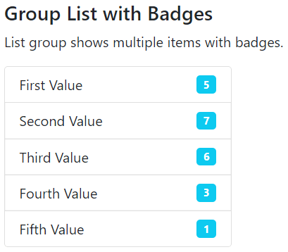
List Group with Badges
Bootstrap 5 list groups show multiple items in a single tab with badges. The <ul> html tag contains the “list-group” class to display the list item in vertical format. We can use the “link”, “button”, or “li” tag in the “ul” tag with the function of the required badge. The badge class uses inside of the <span> tag to display extra information about the context. The <span> tag uses in the <li> tag with required value.
Examples
The following example shows list group with different background color’s badges using bootstrap 5 classes. Here, we can contain five values in the single row group list with contextual badges.
Output
The following image shows the bootstrap 5 list group with badges output for the web page.
Conclusion
The list group shows multiple data in one tab with different styles and features. A bootstrap 5 list group functions contain large size and similar type data in a small space or storage function.