There are two common ways to create a graph with three variables in Excel:
1. Create a Line Graph with Three Lines
2. Create a Bar Graph with Clustered Bars
The following examples show how to create both of these graphs using the following dataset in Excel that shows the sales of three different products during various years:

Example 1: Create a Line Graph with Three Lines
We can use the following steps to plot each of the product sales as a line on the same graph:
- Highlight the cells in the range B1:D8.
- Click the Insert Tab along the top ribbon.
- In the Charts group, click the first chart option in the section titled Insert Line or Area Chart.

The following chart will appear:
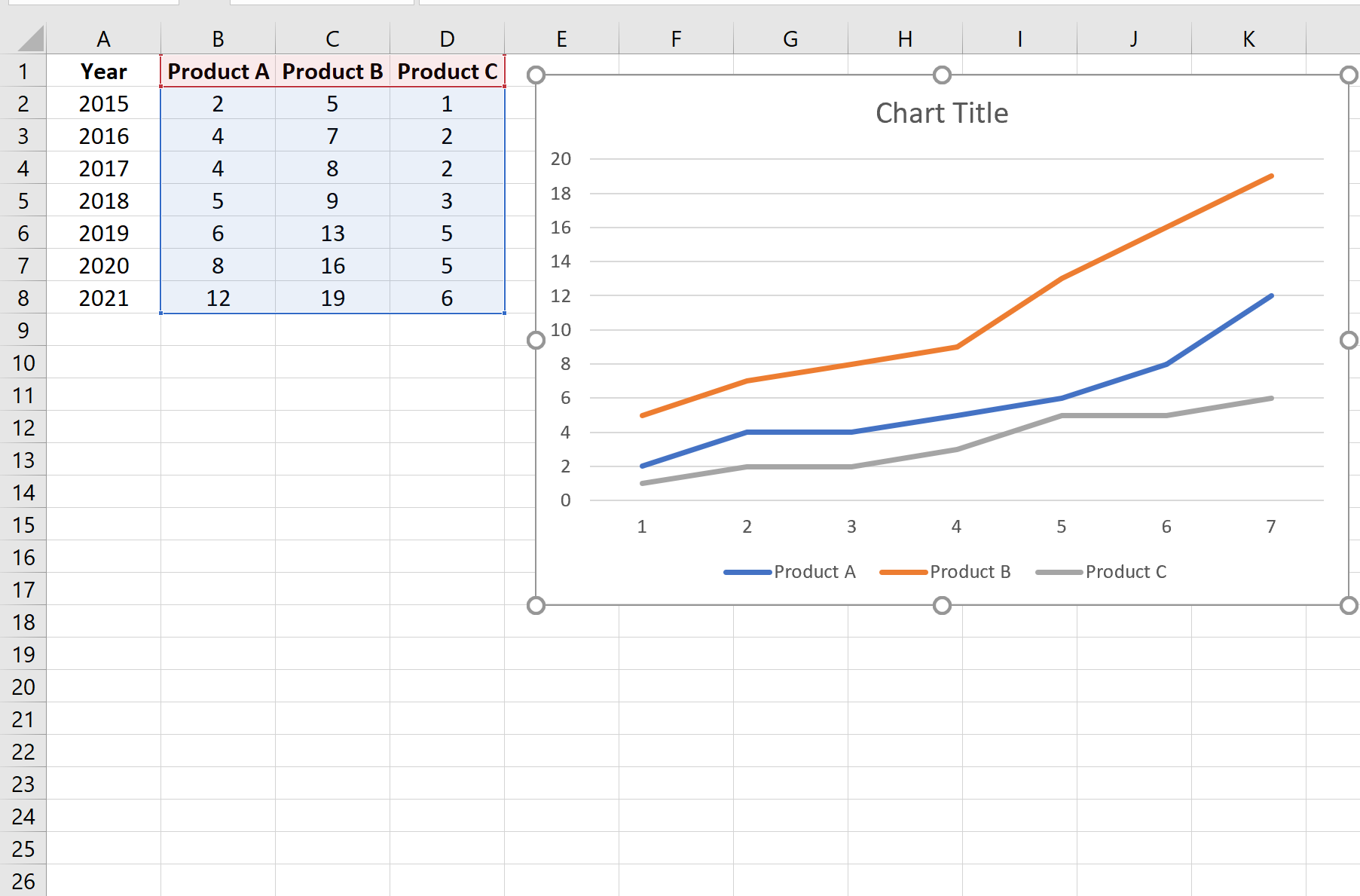
Each line represents the sales of one of the three products during each year.
Example 2: Create a Bar Graph with Clustered Bars
We can use the following steps to plot each of the product sales as a bar on the same graph:
- Highlight the cells in the range B1:D8.
- Click the Insert Tab along the top ribbon.
- In the Charts group, click the first chart option in the section titled Insert Column or Bar Chart.

The following chart will appear:

Each bar represents the sales of one of the three products during each year.
If you’d like to modify the x-axis to display the years, simply right click the x-axis and click Select Data from the dropdown.
In the new window that appears, click the Edit button under Horizontal Axis Labels:

Then choose A2:A8 as the Axis label range:

Once you click OK, the x-axis labels will be updated to display the years:

Additional Resources
The following tutorials explain how to create other common graphs in Excel:
How to Create a Stem-and-Leaf Plot in Excel
How to Create a Dot Plot in Excel
How to Create Side-by-Side Boxplots in Excel
How to Create an Ogive Graph in Excel