Design the GUI
Now that we’ve completed the basics, we are going to see how to build a Game User Interface (GUI) with reusable UI components: a life bar, an energy bar, and a bomb and rupee counters.
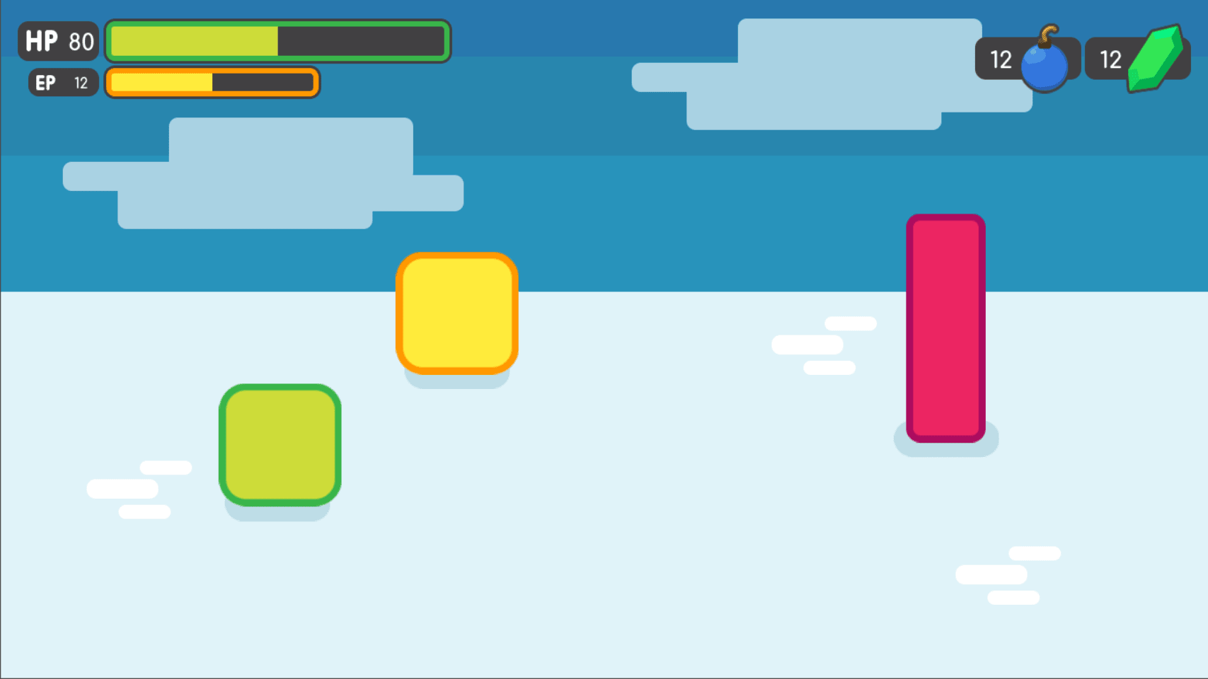
The final result
We will also learn to:
- Create flexible UI components
- Use scene inheritance
- Build a complex UI
Breaking down the UI
Down the final UI plan, the containers we will use. As in the design of a title screen, it starts with a MarginContainer. Then, we can see the three columns:
- The life and energy bars
- The life and energy counters on the left
- The bomb and rupee counters on the right
But the bar’s label and gauge are two parts of the same UI element. If we think of them this way, we are left with two columns:
- The bomb and rupee counters on the right
- The life and energy bar on the left
It makes it easier to nest containers: We have a few margins around the margin screen, use a margin container, followed by an HBoxContainer to manage our two columns. Stacks on top of each other twice inside a VBoxContainer. And we’ll need the last HBoxContainer in the right column to keep the bombs and rupee counters side by side.
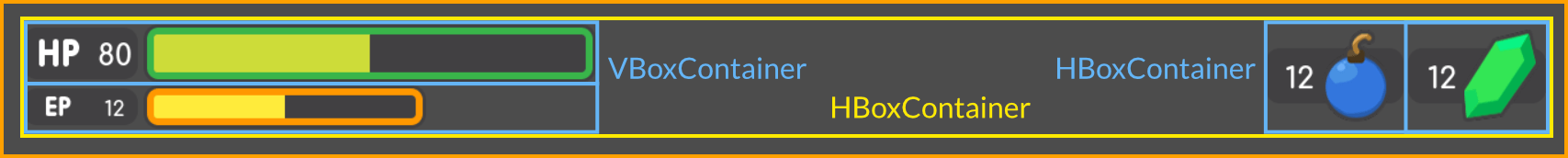
We get a clean UI layout with only four containers
We will need extra boxes inside the individual UI components, but this gives us the main GUI scene’s structure. With this plan in place, we jump into Godot and create the GUI.
Create the base GUI
Here are two possible approaches to the GUI: we can design elements in different views and put them together, or prototype everything in a single view and break it down later. I recommend working with a unique view because we can play with the placement of our UI and rapid proportions that way. Once it looks good, we can save entire sections of the node tree as reusable sub-scenes. We will do that in a moment.
For now, let’s start with containers.
Here, we are creating a new scene and add a MarginContainer. Select the node and name it GUI. After that, save the scene as GUI.tscn. It will contain the entire GUI.
Scroll down for the selected head and custom constants section for the inspector with MarginContainer. Unfold it and click the field next to each margin property. Set them all to 20 pixels. Next, add an HBoxContainer node. This one will include our two strips on the left and separate it with two counters on the right.
We have to stack the bars vertically inside the HBoxContainer. Let’s add a VBoxContainer. Select the parent HBoxContainer again, and then, add another HBoxContainer. It will hold a counter, so it is called a counter.
With these four containers, we have a basis for the GUI view.
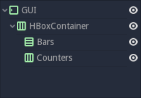
We should have four containers that look like this
Note
We can work on this method because we first broke down our UI design and take a few moments to think about the containers we use. When we follow a tutorial like this, it can seem weird. But once we are working on real games, we will see it’s an efficient workflow.
Create the bars’ base
Each stripe is divided into two sub-elements that align horizontally: labels with health calculations on the left, and gauges on the right. Again, HBoxContainer is the right tool for the job. Select the bars node and add a new HBoxContainer inside it. Then Name it, Bar.
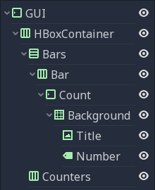
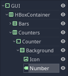
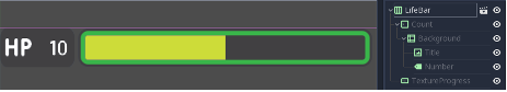
The label requires at least three nodes: a NinePatchRect for the background, on top of texture to the left, either HP or EP, and a label to the right for the value. We can nest the control nodes however we want. We can use NinePatchRect as a parent to two other elements because it contains them. In general, we want to use containers instead, as their role is to help organize UI components. We will need a MarginContainer later anyway to add some space between the life count and the gauge. Select the Bar and add a Margincontainer. Name it to count. Inside of it. Add three nodes:
- A NinePatchRect named Background
- A TextureRect named Title
- A Label called Number
To add the nodes as siblings, always choose the Count node first.
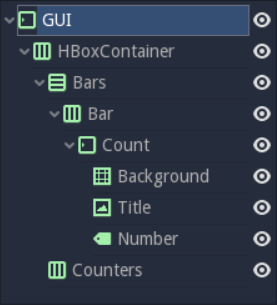
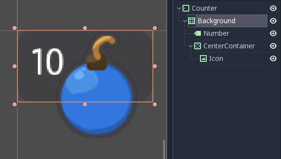
Our scene tree should look like this. We are ready to throw in some textures
Our scene is still empty. It’s time to throw in some compositions. Head to the FileSystem dock to the left of the viewport to load the textures,. Browse the res://assets/GUI folder.
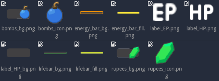
We should see a list of textures that we will use to skin our interface.
Select the Background in the Scene dock.
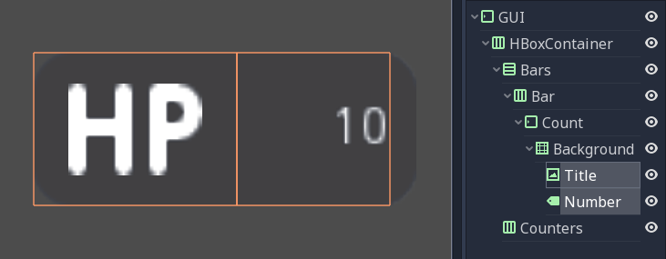
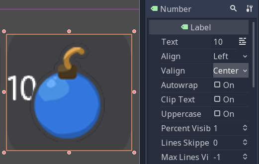
In Inspector, we should see a texture property. In the File-System tab, drag and click Label_HP_bg.png to the Text_Slot. It remains flat. Original margin to keep the minimum size select the background node. In the inspector, scroll down to the bottom section. Set to a minimum size (100,40). We should resize the background with our original containers.
Next, select the title and drag and drop label_HP.png into your texture slot. Choose the number node, press the field next to the text property, and 10. In this way, we can see both nodes in the viewport. They should stack in the upper-left corner of their parent MarginContainer.
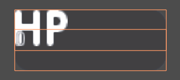
If we select both nodes, we should see something like this
As they have a container like their direct parent, we cannot move them independently: the counted node will always reset their anchor, their size, and their position. Try moving the nodes in the viewport and resizing them. Then, select any of the three textures and press Ctrl Up or Ctrl to reorder them in the scan dock. They will return to their previous shape and position.
Parental containers control the size, scale, margin, and anchor of their direct children. To modify nodes, we must nest them inside a regular control or another UI element. We will use the background as a parent for the title and number. Select both the title and name and drag and drop them onto the background.
By using the background node as the parent of the two textures, we keep the count margin away from the margin
Select Title and Inspector, change its stretch mode property to keep it centered. Next, Find the rect range in the inspector and change the size property to (50,40), so it only takes the left half of the background. Then, select the number node. In the viewport, click on the Layout menu and click Full Rectangle. The node will resize to fit the background. Right near the inspector and your align property, and change the VAlign property to the center. The text should snap to the center of the Background’s right edge. Resize the node horizontally, then it takes the right half of the Background, and there’s a bit of padding with the right side.
Replace the Label’s font
The font of the label is too small. We need to change this. Select the number node and in the inspector, scroll to the control class, and find the custom font category. Click on the field next to the Font property and click New Dynamic Font. Click on the area again and choose Edit.
We will enter the dynamic font resource. Unfold the font range and click the field next to the font data. Click on the Load button. In the file browser, navigate to the Asset / Font folder and double click Comfortaa-Bold.ttf to open it. We should see the font update in the viewport. Unfold the settings category to change the size of font. Set the size property to the higher value, such as 24 or 28.
Now we need the bottom edge of the number, the baseline of the text, to align with the HP texture on the left.
To adjust the baseline of the text, click the Font field under the Custom Font category again, and tweak the property below until the text aligns with the title node. I used a value of 2 pixels.
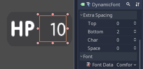
With a lower value of 2 pixels, the number aligns with the title
With this, we finished the toughest part of the GUI.
Add
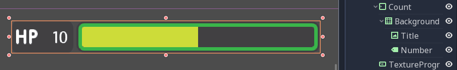
We need one last element to complete our bar: the gauge itself. Godot ships with a TextureProgress node which is everything we have.
Select the bar node and add a TextureProgress inside it. Name it, Gauge. Reveal the texture section in the inspector. Go to the FileSystem dock and drag and drop the lifebar_bg.png texture to the underbar slot.
With only five Control nodes, our first bar is ready to use.
Design bombs and rupee counters
The bomb and the rupee counter are similar to the bar’s count node. So we will duplicate it and utilize it as a template.
Under the bar node, Choose Count and press Ctrl D to copy it. Drag and drop the new node under the counters HBoxContainer under the view tree. We should resize it automatically. Don’t worry about this, for now, and we’ll fix the size soon.
Name the count2 node on the counter.
With the icon selected, in the inspector, scroll upwards to see the text slot. Go to the FileSystem dock on the left and choose bomb_icon.png. Drag and drop it to the texture slot. In the view, the tab selects both the icon and the number node. Click the Layout menu in the toolbar at the top of the viewport and choose Full Rectangle. Both nodes will update to fit the background-size
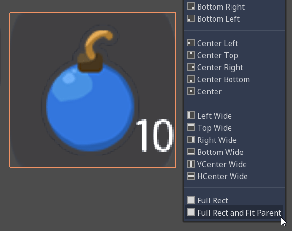
The nodes anchor to the whole Background, but their position is off
Let’s change the Number align properties to move it to the left and center of the Background. Select the Number node, and change its Align property to the left, and the VAlign property to center. Then resize its left edge a little bit to add padding between the left corner of the Background and the text.
The Number node aligned to the left and center
To overlap icons and backgrounds, we need some tweaks. First of all, our background is a bit long. This is because it is inside a margin container which is controlled by the top-most GUI node.
Choose the GUI node at the top of the view tree and shrink it vertically so that it is as thin as possible. We will see that the gauge prevents you from making it too small. A container cannot be less than the minimum size of its children. The margin of the container also has weight. We will see the gauge prevents you from making it too small. A container cannot be lower than the minimal size of its children. The container’s margins also weigh in.
Select the icon, click on the Layout menu, and select the full rectangle to center it again. We need to anchor the right edge of the background. Open the Layout menu again and choose the Right Center. Move the icon up, so it is centered vertically with the environment.
The bomb icon anchors the right edge of the background. Resize the counter container to see the icon node from the right side
Because we duplicated the counter with the count of the bar, the font of the number node is closed. Select the Number node again, go to the Font property, and click it to access the Dynamic Font resource. Change the bottom value to 0 to reset the font baseline in the Extra Spacing section, . Our counter now works as we expected.
When we are at it, we create it, so the counters snap to the right edge of the viewport. To achieve this, we will set up the Bars container to expand and take all the horizontal space. Select the Bars node and scroll to the Size Flags category. In the horizontal range, check the expansion value. The Bars node should resize and push the counter to the right of the screen.

An extended container runs away from its parents everywhere; it pushes everything.
Turn the bar and counter into reusable UI components
We have a bar and a counter widget. But we need two. We may need to change the design or functionality of the bars later. It would be great if we could have a single view to store the template of a UI element, and have child views to work on variations. Godot lets us do this with inherited scenes.
Let’s save the counter and bar branches as separate views, which we will reduce to create LifeBar, EnergyBar, BombCounter, and Rupee encounters. Select the bar HBoxContainer. Right-click on it and click on Save Branch as a scene. Save the view as Bar.tscn. You should change the node branch to a single bar node.
Note
A view is a tree of nodes. The uppermost node is the root of the tree, and the children below the hierarchy are the leaves. Any node other than root with another child is a branch. We can attach node branches to individual views, or load and merge them into one activated from other views. Right-click any node in the view dock and select Save as View or Merge Branch as View.
Then, select the counter node and do the same. Right-click, store the branch as a view and store it as Counter.tscn. A new edit scene icon occur to the right of the nodes in the view tree. Click the one next to the bar to open the corresponding view. Resize the bar node so that its bounding box fits its contents. The way we put the name and control node, we are ready to inherit this template and create a life bar. It is the same for counter.
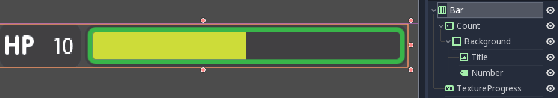
Our bar is ready to use, with additional changes
Use visual inheritance to create the remaining elements
We need two bars that work in the same way: they should feature a label on the left side, with some value, and a horizontal gauge on the right. The only difference is that one is labeled HP and is green, while the other is known as EP and is yellow. Godot provides us a powerful tool to create a common basis for reuse of all bars in the game:
Inherited footage
Built-in views help us keep the GUI view clean. Finally, we will have only containers and one node for each UI component.
On the inherited view, you can keep any property of each node of the inspector separate from its name. If you modify and save the original view, all the underlying views are updated to reflect the changes. If you change a value in an inherited view, it will always override the parent property.This is useful for UIs as they often require changes of similar elements. In general, UI design, buttons, panels etc. share a common base style and interactions. We do not want to manually copy it to all variations.
A reload icon will appear next to the properties you override. Click this to reset the value of the default of the original view.
Note
Think of visual inheritance like a node tree, or an extension of the keyword in GDScript. A legacy view does everything like its parent, but you can override properties, resources, and add additional nodes and scripts to enhance its functionality.
Enter the bar view to create LifeBar
Go to View -> New Inherited View to create a new type of bar. Select the bar view and open it. You should see a new [unsaved] tab, similar to your bar, but with all nodes except root in gray. Press Meta + S to save the newly inherited view and name it LifeBar.
We cannot rename grey nodes. It tells you they have a parent scene
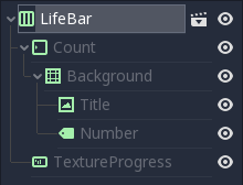
First, rename the root or top-level node to LifeBar. We always want the root to accurately describe this UI component. The name differentiates this bar from EnergyBar which we will make next. Other nodes inside the view must describe the structure of the component with broader terms, so it works with all inherited steps. Like our TextureProgress and number nodes.
Note
If we’ve ever done web design, it’s the same feeling as working with CSS: you create a base class and add variations with modifier classes. From the base button class, the user will have button-green and button-red changes to accept and reject the prompts. The new class has the name of the parent element and a new keyword to explain how it modifies.When we create an inherited scene and change the name of the top-level node, we’re doing the same thing.