Ionic Select
The Ionic select component provides a select menu with select options for the user to choose among the set of multiple options. Selects are the form controls similar to native <select> element. When you tap the select, immediately a dialog appears with all of the including options. The select menu will look different for a different platform because its styling is handled by the browser. We can access the Ionic select by using a standard <ion-select> element.
A select component always used with child <ion-select-option> element. If the <ion-select-option> does not have a value attribute, then its text will be used as the value.
If the <ion-select> component has set the value attribute, the selected options will be decided based on that value. On the other hand, if the value is not set, the select attribute will be used on the <ion-select-option>.
The select component uses the interface AtertController API for opening the overlay of options in an alert. It can be changed for using the ActionSheetController API or PopoverController API by passing action-sheet or popover to the interface property.
The select component can be of two types:
- Single-Selection
- Multiple-Selection
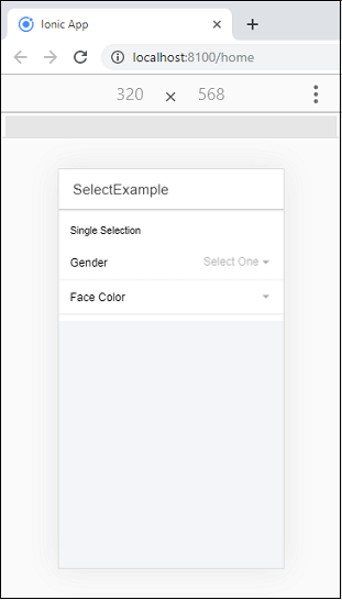
Single-Selection
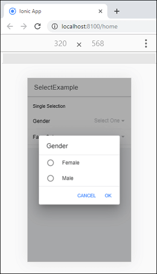
By default, the select allows you to select only one option. In this selection, the alert interface shows the radio button styled list of options. The select component’s value receives only the value of the selected option’s value.
Select Buttons
The alert interface supports two buttons which are: cancel and ok. The button text can be customized by using the cancelText and okText properties.
Example
The following example helps to understand the use of a single selection component.
Output:
When you execute the above code snippet, it will give the following output.
If you tap the select, immediately a dialog appears with all of the including options. We will get the following output.
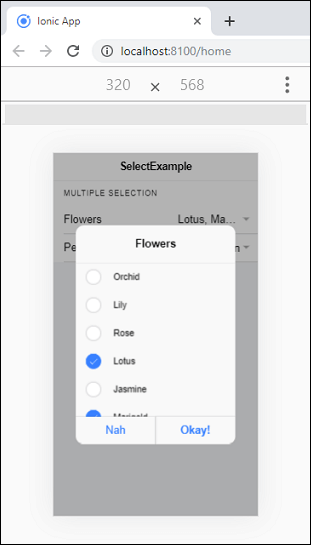
Multiple-Selection
The multiple selections use multiple attributes which allows you to select multiple options from a set of select options. In this selection, the alert interface shows the checkbox styled list of options. Here the select component’s value receives the array of all of the selected option values.
Example
Output:
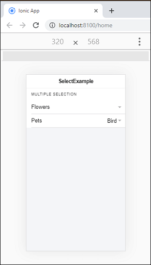
If you tap the select, immediately a dialog appears with all of the including options. Now, you can choose multiple options as you want.
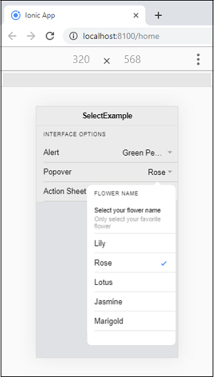
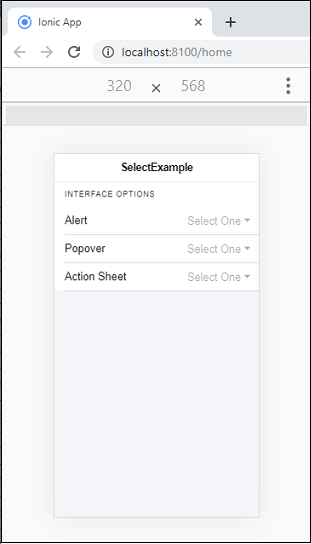
Interface Options
By default, the select component uses the interface AtertController API. But, we can also change it for using the ActionSheetController API or PopoverController API by passing action-sheet or popover to the interface property. The following example explained it more clearly.
Example
Home.page.html
Home.page.ts
Output:
When you execute the above Ionic app, it will give the following output.
Now, when you select the popover option, the following screen appears. Here, you can also check for other options such as Alert and Action Sheet.