Kibana Visualization
In this section, we are going to learn about the Visualization in Kibana. We will learn how to use Kibana to create, edit, and customize the visualization in the Kibana according to the user’s need. We will also learn how to use a pie chart and other different charts options in the Kibana to use the visualization effetely.
Creation of the Visualization
To start creating the visualization of the data in the Kibana, go to the visualization tab of the Kibana. For the reference, have a look at the image below.
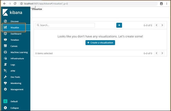
Till now, as we are very new to the Kibana tool, so we have not created any of the visualizations yet, so the space is blank. But if we would have created any of them in the past time, then they will be shown here.
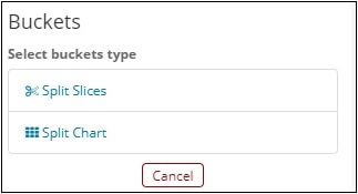
Here we also have a button of the Create Visualization by clicking on it we can start creating the visualization. It will take you to the screen, as shown below.
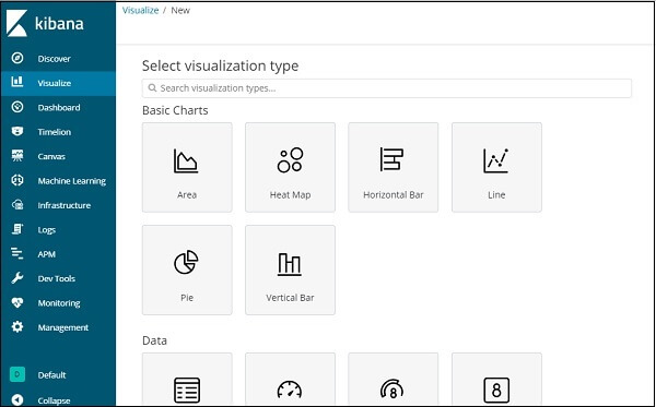
Here you can select the option to visualize your data. In the upcoming chapters, we’ll understand each of them in detail. Select the pie chart right now, to begin with.
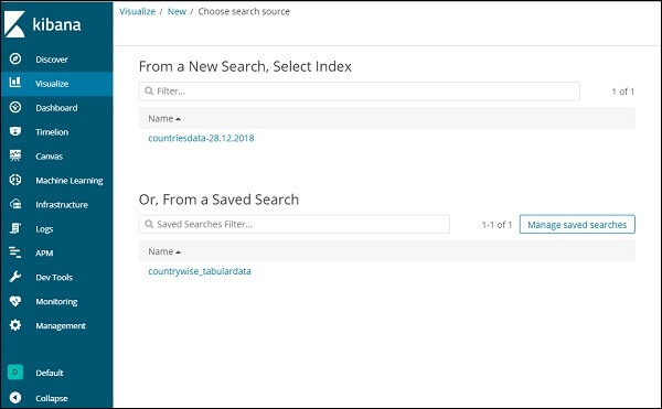
Now once we are done with the selection of the type of visualization, now it’s time to select the index on which we want to create the visualization.
For reference, we have attached the sample image.
Now we have a pie chart by design. We will use the country data-28.12.2018 to get a pie chart format of the count of regions available in the countries data.
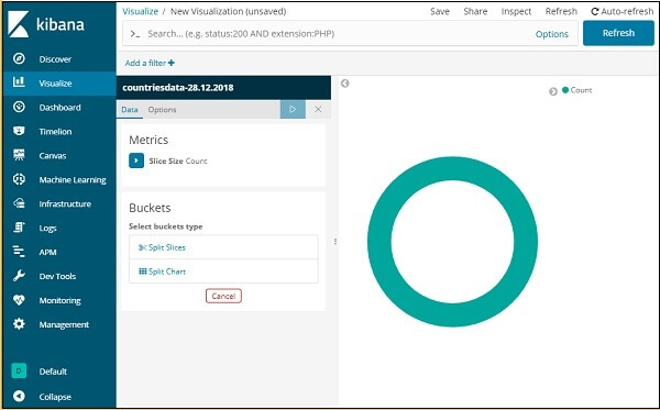
Bucket and Metric Aggregation
The left side of the window has metrics that we will use as the count. Split slices and split map options are available in Containers. We will use the Split Slices option.
Now pick Split Slices and display the following options:
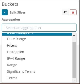
Now pick the Aggregation as Terms and display more choices to join as follows
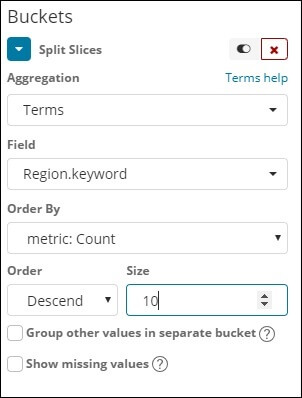
The dropdown of the Fields will have all fields selected from the index: countries data. We choose the field and Order By for the Area. We are going to order it to Descend, and the scale we took like 10. It means here, from the index of countries, we’ll get the top 10 regions list.
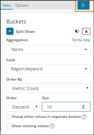
As shown below, press the review button, and you should see the pie chart revised on the right.
Pie chart display
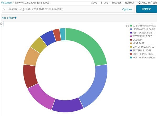
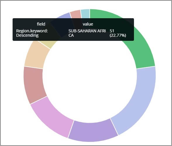
All of the blocks are specified with a particular color code. And that color identification is given at the top right corner of the chart If you hover the mouse over the pie chart it will give the region count as well as the region’s name as shown below:
So, it informs us that Sub-Saharan Afri occupies 22.77 percent of the area from the data we’ve imported from the countries.
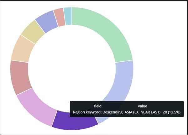
The area of Asia occupies 12.5 percent and has a count of 28.
Click on the Save button to save it. The button is present at the top right corner of the window.

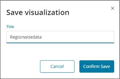
Now, if we want, we can save the processed diagram for our future use.
The data we want can also be obtained using the search method as shown below:
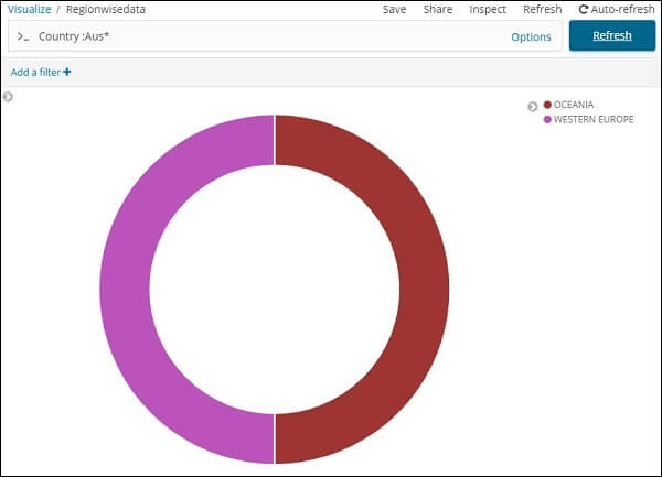
We have filtered the data for countries that stats from Aus*. We can understand more in the upcoming chapters on the pie-chart and another visualization.