Tableau Bar Chart
In Tableau, there are various types of bar chart that can be created by using the dimensions and measures.
A bar chart represents the data in rectangular bars. Tableau automatically produces a bar chart when you drag a dimension to the Row shelf and measure to the Column shelf.
The bar chart option present in the “Show Me” button. If the data is not appropriate for the bar chart, then this option will be automatically blocked out.
A bar chart can compare the data in different categories. The height of the bar represents the measured value of the category. It can be described as vertical and horizontal type bar charts. The procedure to create a bar chart is given below through an example.
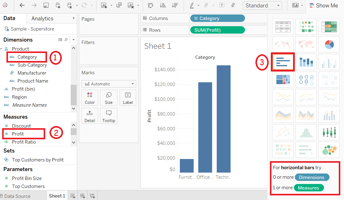
For example, consider a data source such as Sample-Superstore and its dimensions and measures.
Step1: First, go to the worksheet and,
Step2: Drag the Category field into the column shelf.
Step3: Drag Profit field into the row shelf.
Step4: By default, it creates the bar chart shown in the below screenshot.
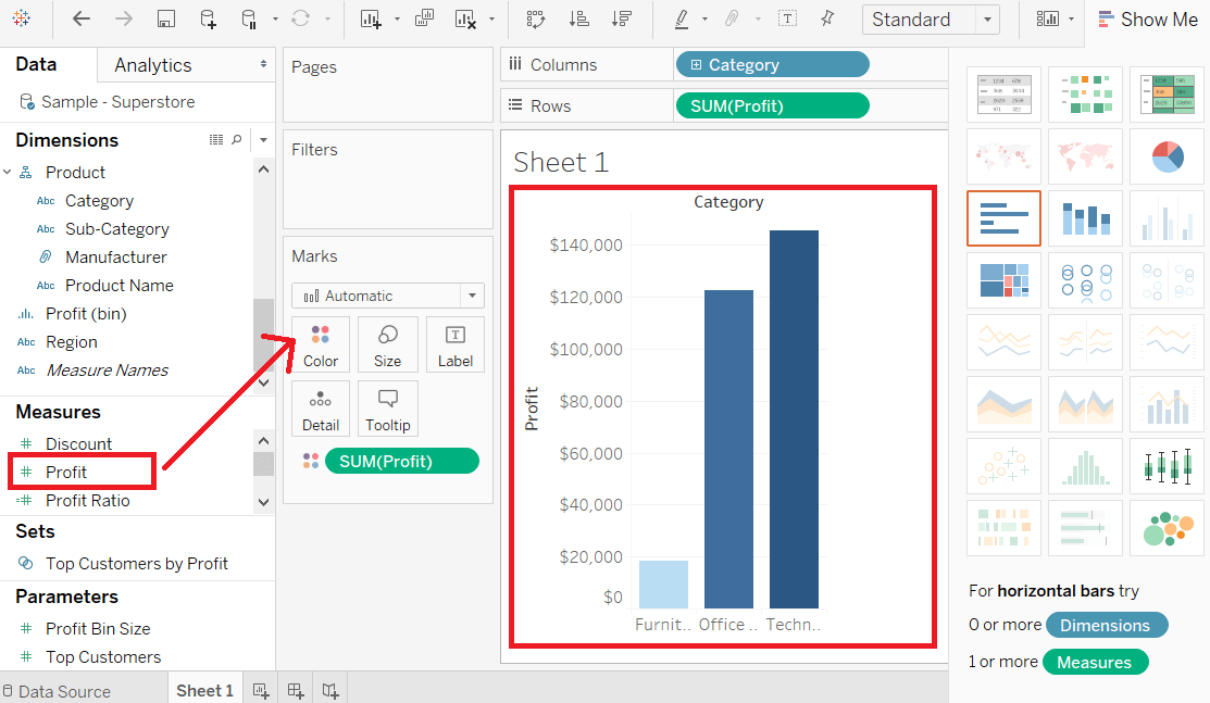
Bar Chart with Color Range
You can apply colors to the bars based on their ranges. The longer bars get darker shades, and the smaller bars get the lighter shades. Let’s see step by steps,
Step1: Drag the Category field into the column shelf.
Step2: Drag Profit field into the row shelf.
Step3: Also, drag the Profit field to the Color pane under the Marks Pane and, it produces a different color for negative bars.
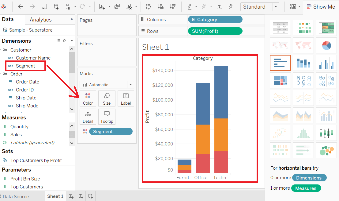
Stacked Bar Chart
You can also add one more dimension to the above bar chart to produce a stacked bar chart that shows different colors in each bar.
Step1: Drag the Segment field.
Step2: And drop the Segment field into Color pane.
The below-stacked chart appears that shows the distribution of each segment in each bar.