Tableau Bullet Chart
A bullet chart is used as a gauge or indicator to show the performance of measures. It can compare the two measures to each other using the bullet graph.
A bullet chart is also a variation of Bar chart. In the bullet chart, we compare the value of one measure with another measure in the context of finding the difference between the first measure and the second measure.
It’s like two bars drawn upon one another to indicate their values at the same position in the graph. It can be used as combining two graphs as one to view a comparative result easily.
For example, consider the data source such as Sample-Superstore and you want to compare the Estimated Profit with Actual Profit. Then you can easily compare both of them using the bullet chart.
The procedure to create a bullet chart is given as follows.
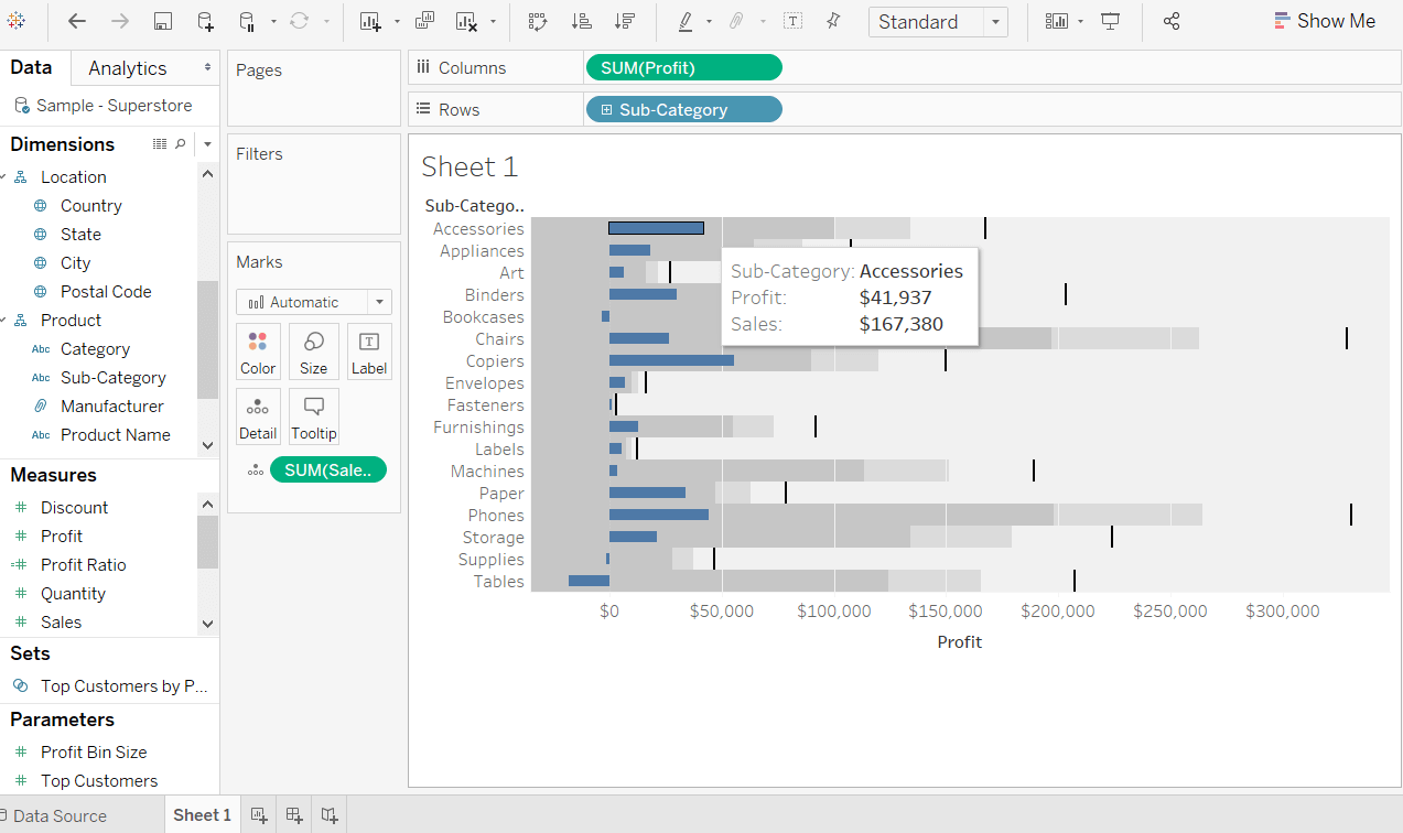
Step 1: Drag the dimension Sub-Category into the column shelf.
Step 2: Drag the measures Profit and Sales into the rows shelf.
The below graph shows that the two measures as two separate categories of bar charts and each representing the values of sub-categories.
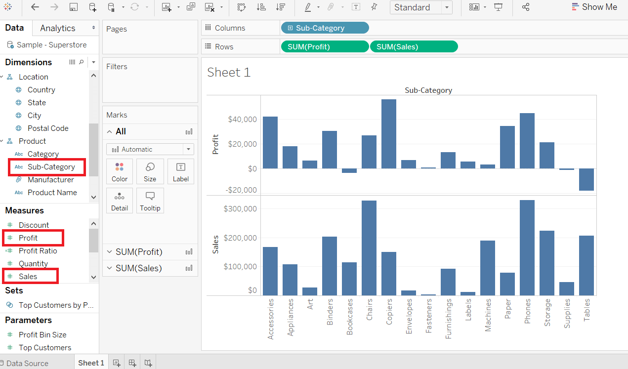
Step 3: Again, drag the measure Sales into the Detail marks pane from the rows shelf.
Step 4: Go to the Show Me option located on the top right side in the worksheet shown below:
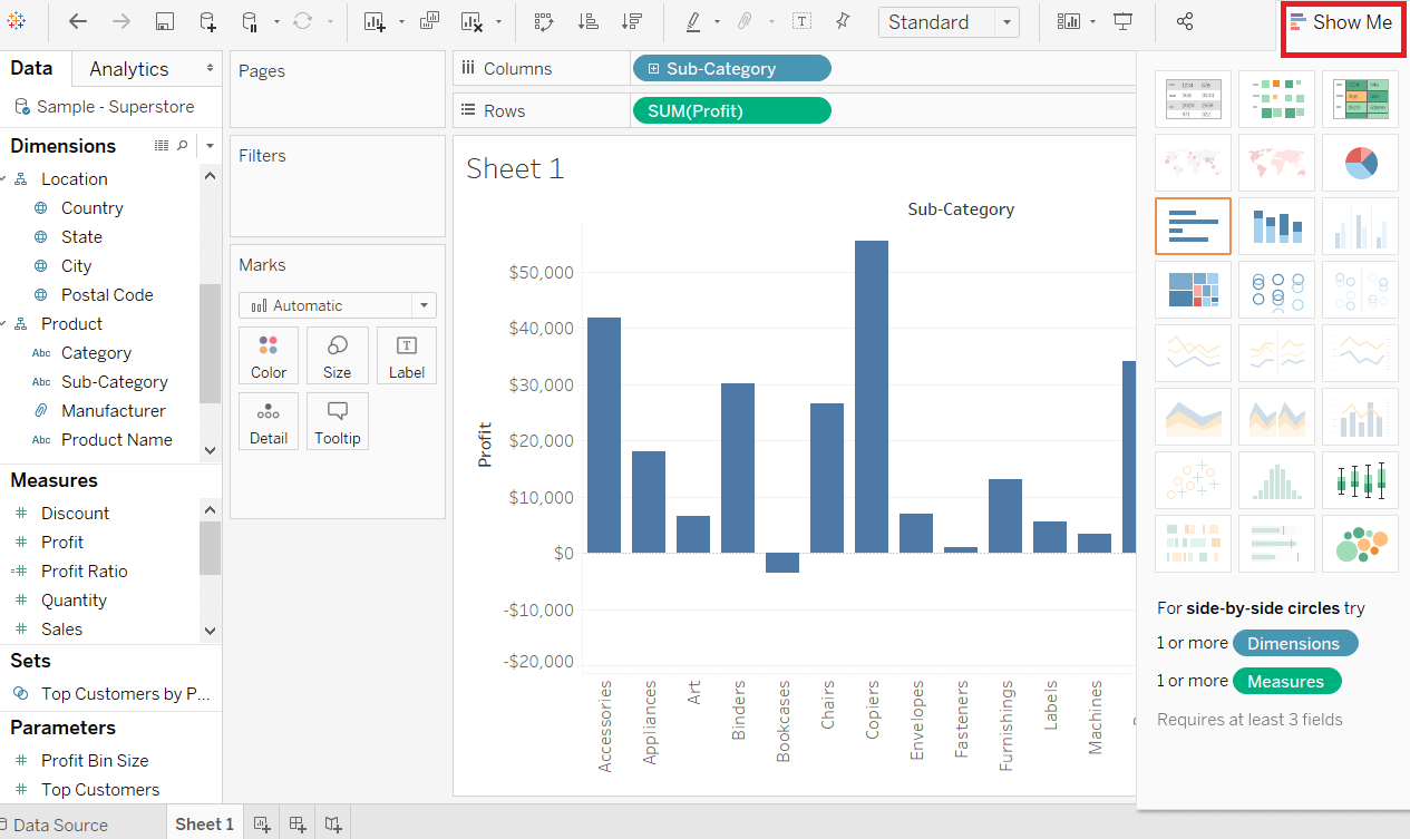
Step 5: Then, choose the bullet graph option from the Show Me graphs options and bullet graph appears shown in the below screenshot.